53 min read
Edit pageChapter 1: Build your first Astro Application
Long is the road to learning by precepts, but short and successful by examples - Seneca the Younger.
Get started with the basics of Astro by building a practical application: a personal site.


What you’ll learn
- Build a personal website with Astro.
- Set up a local development environment for Astro.
- Familiarity with Astro components, layouts and pages.
- A working knowledge of styles and scripts in Astro.
- Theming Astro sites via CSS variables.
- Leveraging markdown pages for ease.
- Deployment of a static Astro application.
Project Overview
I remember my first commercial web development project. In retrospect, it was a disaster. One built by a passionate self-taught engineer, but a disaster still.
Let’s make your first Astro project one we’ll remember for good.
Getting started
Astro is a web framework designed for speed. Before we get to the good stuff, let’s ensure we’re both on the same page.
Install Node.js
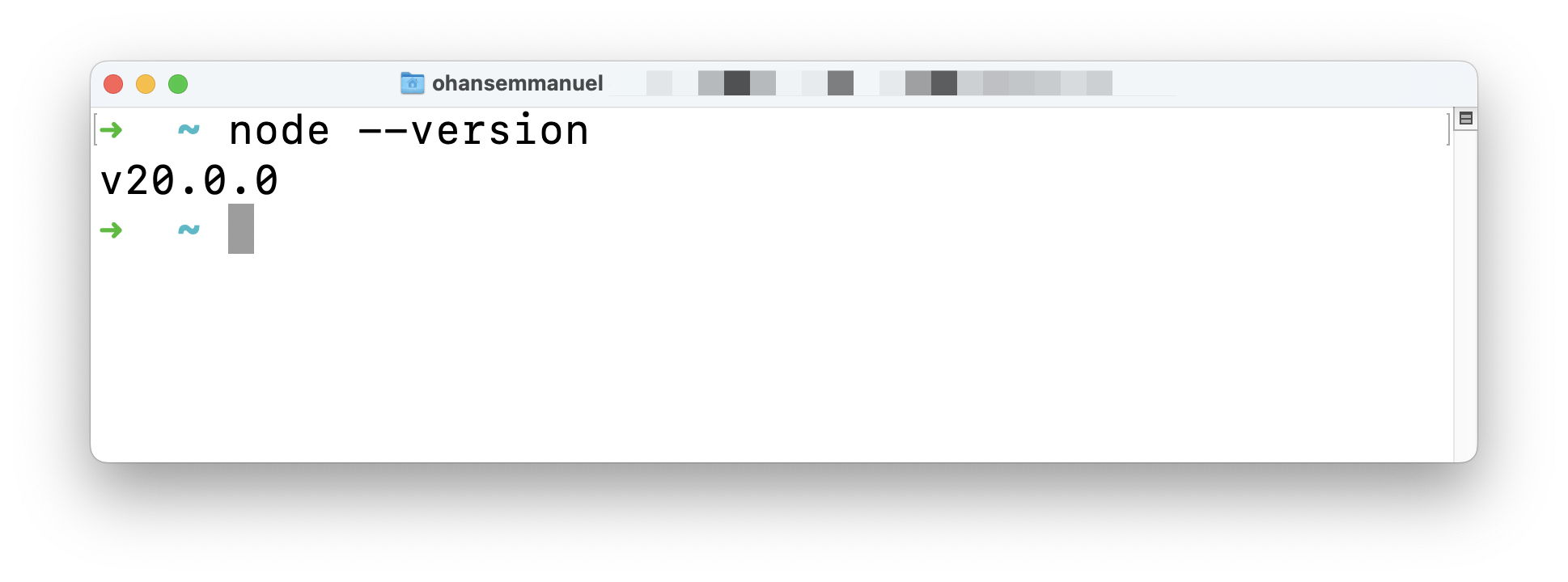
Firstly, make sure you have nodejs installed.
If unsure, run node --version in your terminal. You will get back a node version if you have nodejs installed.
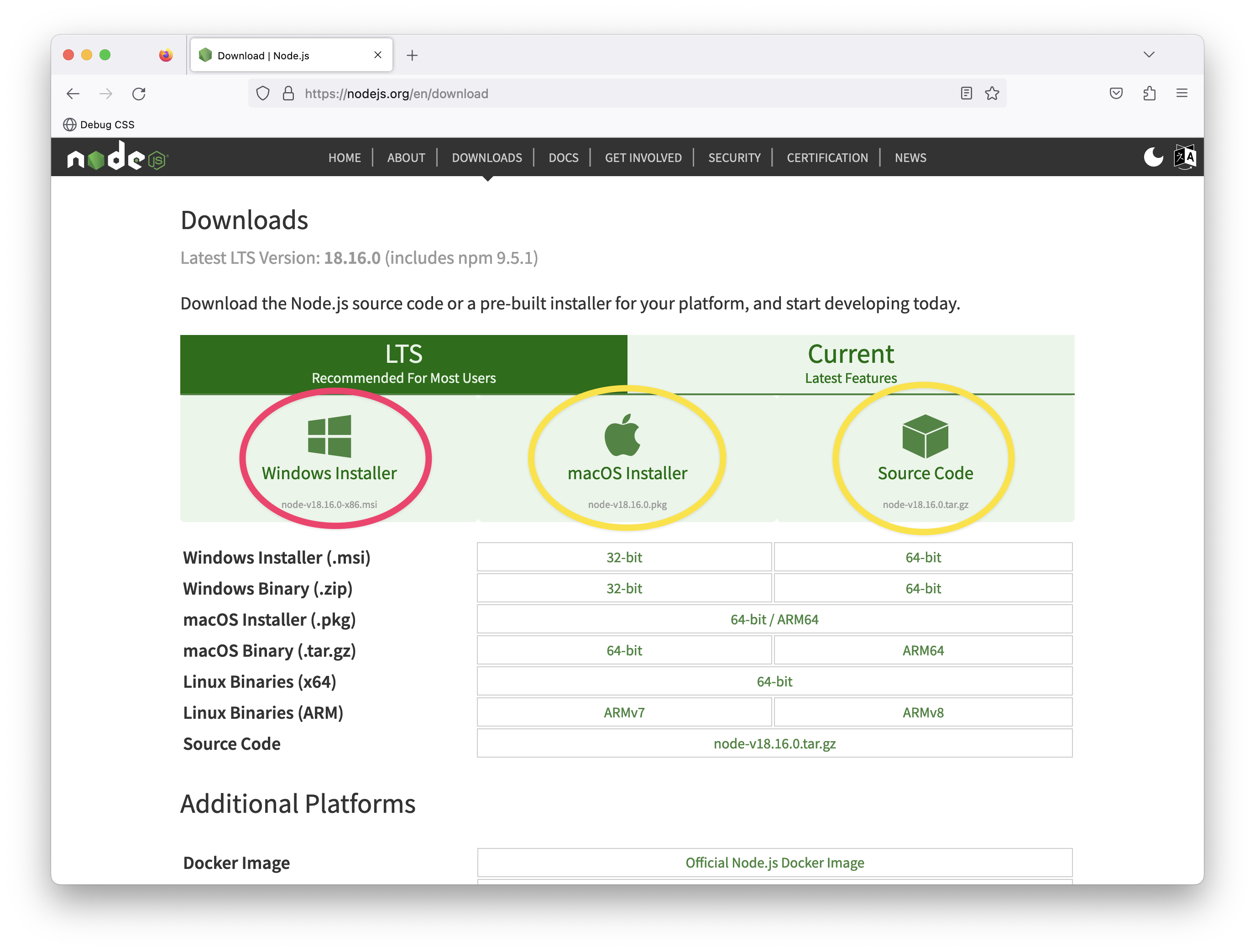
Don’t have nodejs installed? Then, visit the official download page and install the necessary package for your operating system. It’s as easy as installing any other computer program. Click, click, click!
Setting up your code editor
I’ll avoid any heated debate(s) on what code editor you should be writing software with. The truth is I do not care. Quite frankly.
However, I use Visual Studio Code (VSCode).
You can develop Astro applications with any code editor, but VSCode is also the officially recommended editor for Astro.
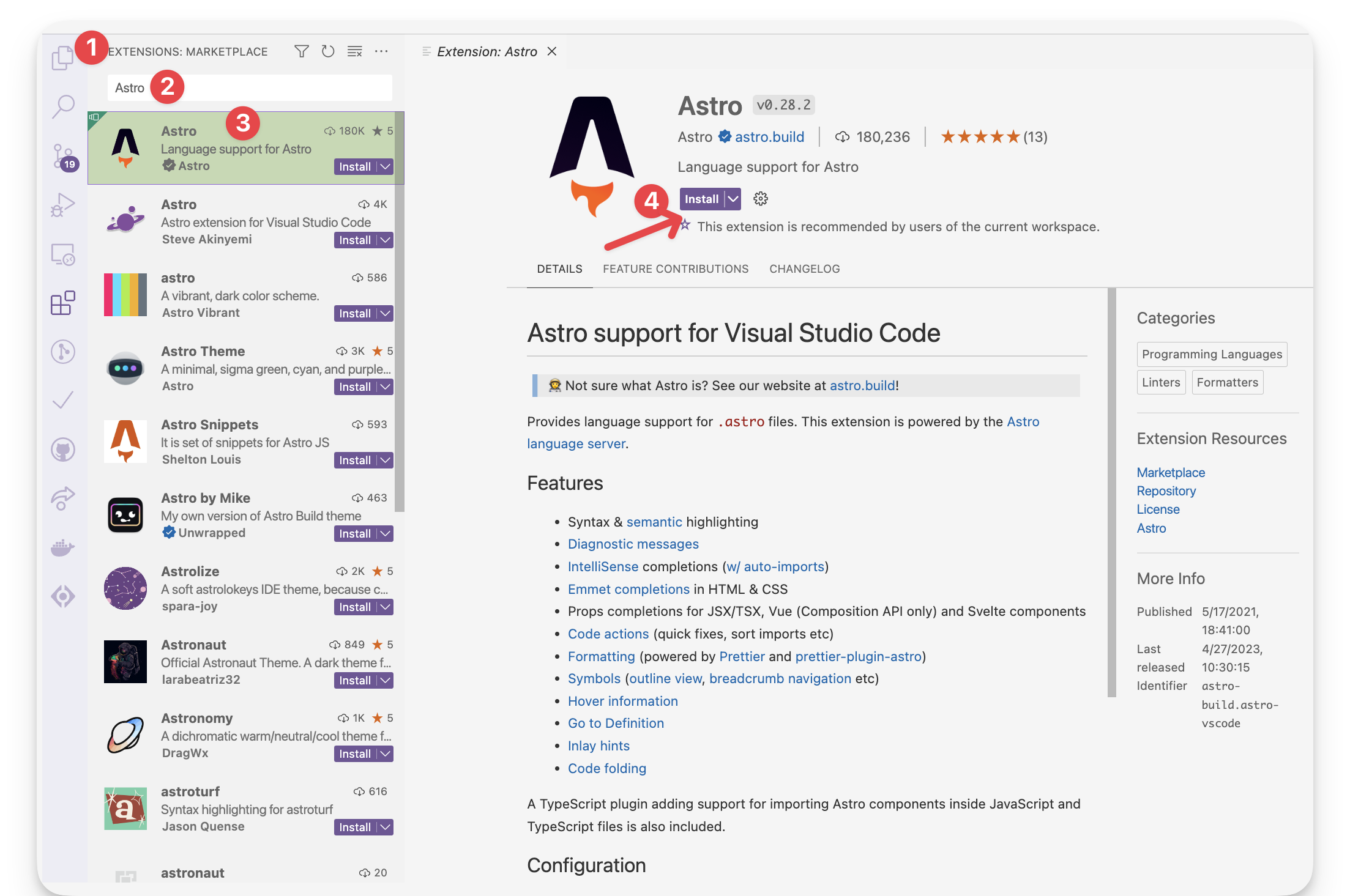
If you’re building with VSCode1, install the official Astro extension. This helps with syntax and semantic highlighting, diagnostic messages, IntelliSense, and more.
Let’s now get started setting up our first Astro project. To do this, we must install Astro, and the fastest way to do this is to use the Astro automatic CLI.
To start the install wizard, run the following command:
npm create astro@latestIf on pnpm or yarn, the command looks as follows:
# using pnpmpnpm create astro@latest

# using yarnyarn create astro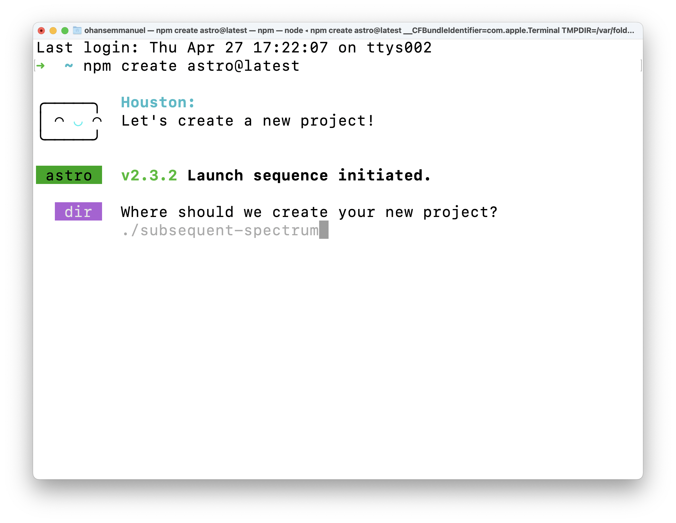
This will start the wizard, which will guide us through helpful prompts. It’s important to mention that we can run this from anywhere on our machine and later choose where exactly we want the project created.
When asked, “Where should we create your new project?” go ahead and pass a file path. In my case, this is documents/dev/books/understanding-astro/astro-beginner-project.
Alternatively, we could have run the npm create astro@latest command in our desired directory and just entered a shorter file path, e.g., ./astro-beginner-project.
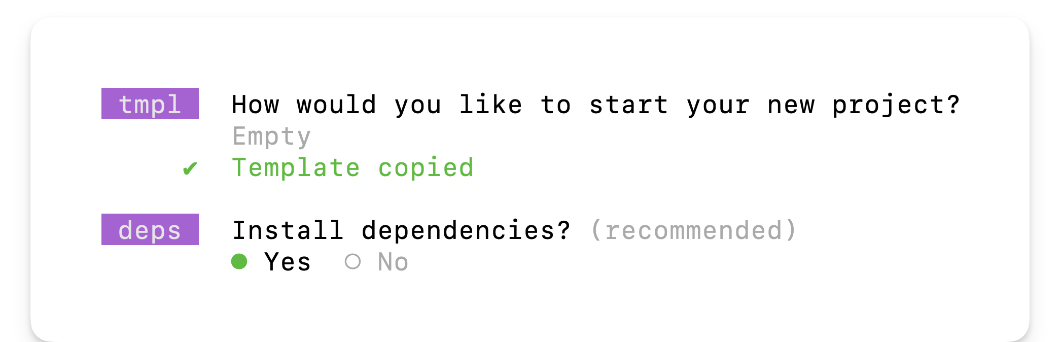
When asked, “How would you like to start your new project?” go ahead and choose “Empty”.
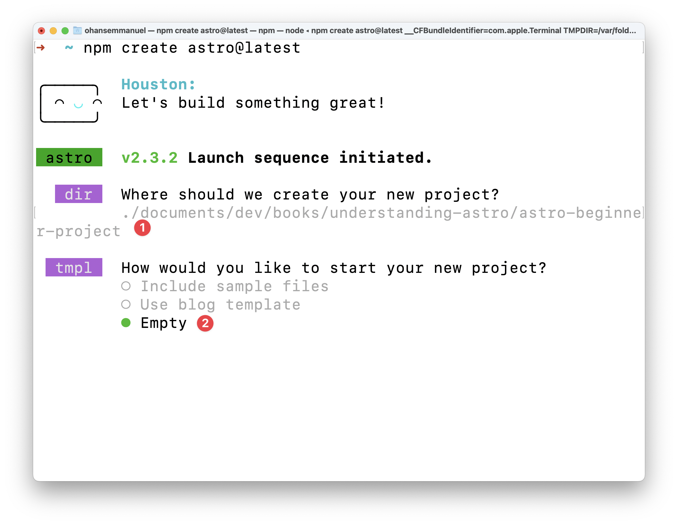
We want a fresh start to explore Astro from the ground up.
Now, we will be asked whether to install dependencies or not. Select yes and hit enter to continue the installation.
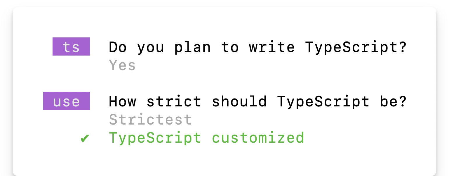
Once the dependencies are installed, answer the “Do you plan to write TypeScript?” prompt with a yes and choose the “strictest” option.
We want strong type safety.
Afterwards, answer the “Initialise a new git repository?” question with whatever works for you. I’ll go with a yes here and hit enter.
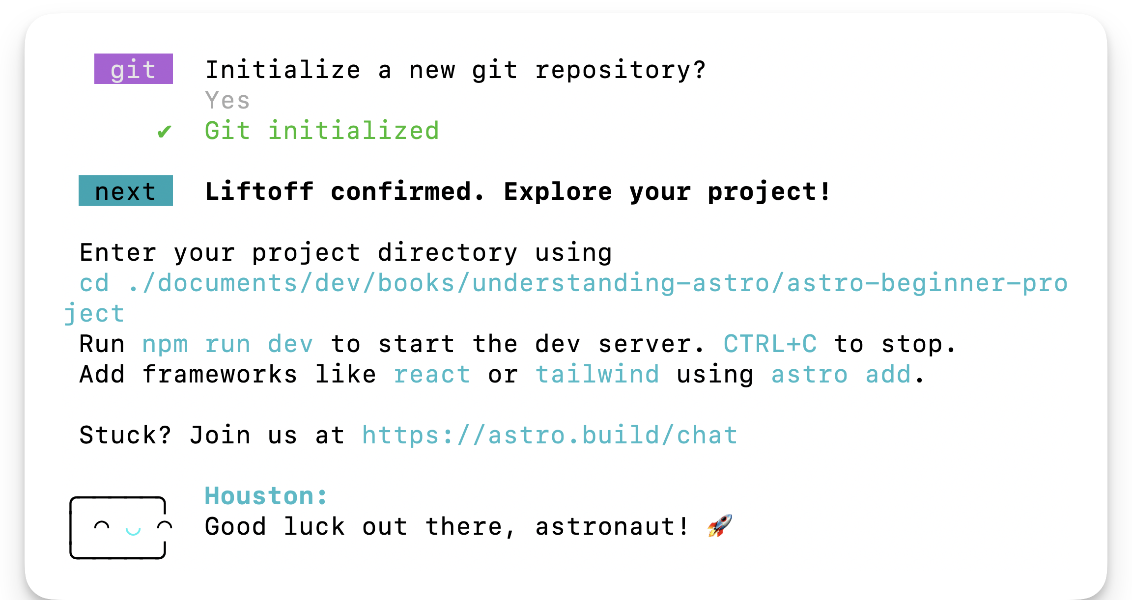
And voila! Believe it or not, our new project is created and ready to go!
Change into the directory where you set up the project. In my case, this looks like the following:
cd ./documents/dev/books/understanding-astro/astro-beginner-projectAnd then run the application via the following:
npm run startThis will start the live application on an available local port 🚀
Project structure
Open the newly created project in your code editor, and you’ll notice that the create astro CLI wizard has included some files and folders.
Astro has an opinionated folder structure. We can see some of this in our new project. By design, every Astro project will include the following in the root directory:
| File / Directory | |
|---|---|
| astro.config.mjs | The Astro configuration file. This is where we provide configuration options for our Astro project. |
| tsconfig.json | A Typescript configuration file. This specifies the root files and Typescript compiler options. |
| package.json | A JSON file that holds the project metadata. This is typically found at the root of most Node.js projects. |
| public/* | This directory holds files and assets that will be copied into the Astro build directory untouched, e.g., fonts, images and files such as robots.txt |
| src/* | The source code of our project resides here. |
Let’s now look at the files in our newly generated project.
tsconfig.json
The content of our tsconfig.json file is the following:
{ "extends": "astro/tsconfigs/strictest"}The extends property points to the base configuration file path to inherit from, i.e., inherit the typescript configuration from the file in astro/tsconfigs/strictest.
Using your editor, we may navigate to the referenced path, e.g., in vscode by clicking on the link while holding CMD. This will navigate us to node_modules/astro/tsconfigs/strictest.json, where we’ll find a well-annotated file:
{  ...  "compilerOptions": {    // Report errors for fallthrough cases in switch statements    "noFallthroughCasesInSwitch": true,
    // Force functions designed to override their parent class to be specified as `override`.    "noImplicitOverride": true,
    // Force functions to specify that they can return `undefined` if a possible code path does not return a value.    "noImplicitReturns": true,   ...  }}
This is very well annotated, so we won’t spend time on this. However, the compilerOptions for Typescript are set in this file. The point to make here is Astro keeps a list of typescript configurations (base, strict and strictest) that our project leverage when we initialise via the CLI wizard.
In this example, we’ll leave the tsconfig.json file as is. Typescript (and consequently the tsconfig.json file is optional in Astro projects. However, I strongly recommend you leverage Typescript. We’ll do so all through the book.
package.json
The package.json file is easy to reason about. It holds metadata about our project and includes scripts for managing our Astro project, e.g., npm start, npm run build, and npm preview.
package-lock.json
The package-lock.json file is an autogenerated file that holds information on the dependencies/packages for our project. We won’t be touching this file manually. Instead, it is automatically generated (and updated) by npm.
A project’s lock file may differ depending on the package manager, e.g., yarn or pnpm.
astro.config.mjs
Most frameworks define a way for us to specify our project-specific configurations. For example, Astro achieves this via the astro.config file.
import { defineConfig } from "astro/config";
export default defineConfig({});
At the moment, it defines an empty configuration. So we’ll leave it as is. However, this is the right place to specify different build and server options, for example.
src/env.d.ts
d.ts files are called type declaration files2. Yes, that’s for Typescript alone, and they exist for one purpose: to describe the shape of some existing module. The information in this file is used for type checking by Typescript.
/// <reference types="astro/client" />The content of the file points to astro/client. This is essentially a reference to another declaration file at astro/client.d.ts
src/pages/index.astro
As mentioned earlier, the src folder is where the source code for our project resides. But what’s the pages directory, and why’s there an index.astro file?
First, consider the contents of the index.astro file:
------
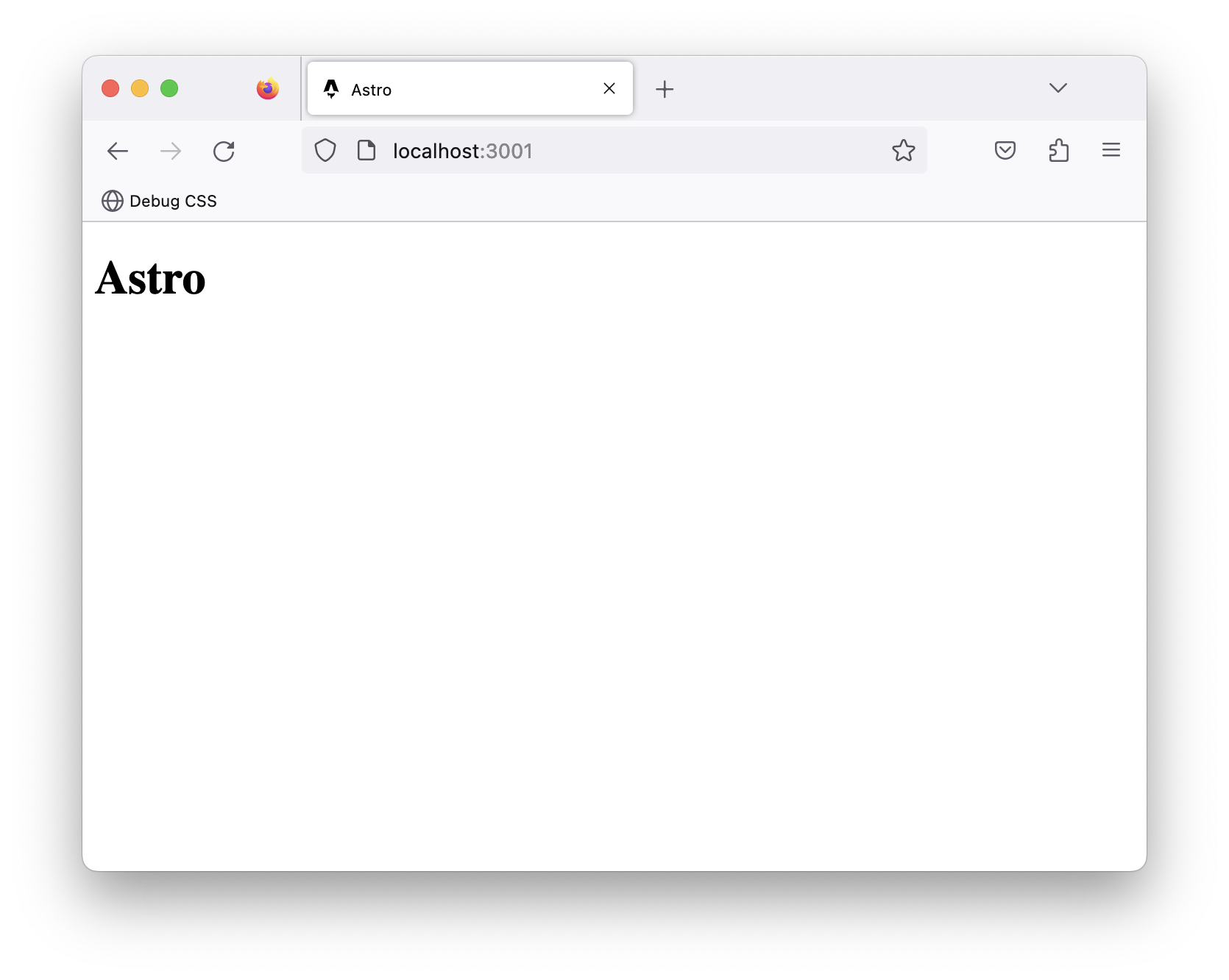
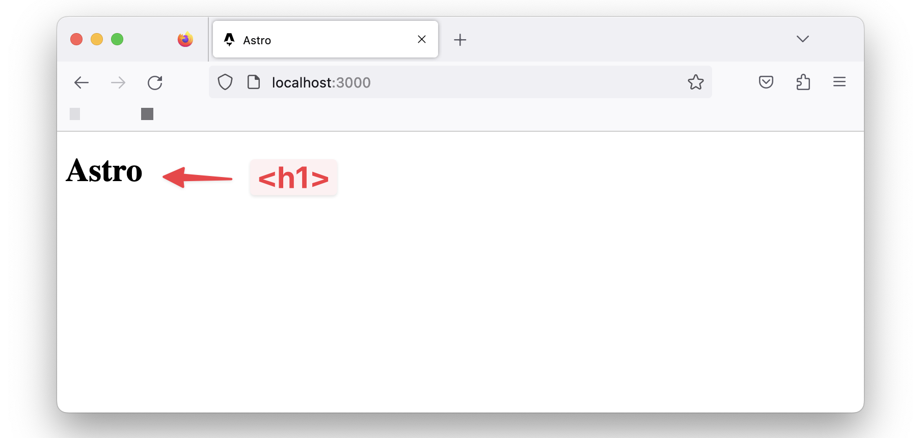
<html lang="en"> <head> <meta charset="utf-8" /> <link rel="icon" type="image/svg+xml" href="/favicon.svg" /> <meta name="viewport" content="width=device-width" /> <meta name="generator" content={Astro.generator} /> <title>Astro</title> </head> <body> <h1>Astro</h1> </body></html>You’d notice that it looks remarkably similar to standard HTML, with some exceptions.
Also, notice what’s written within the <body> tag. An <h1> element with the text Astro.
If we visit the running application in the browser, we have the <h1> rendered.
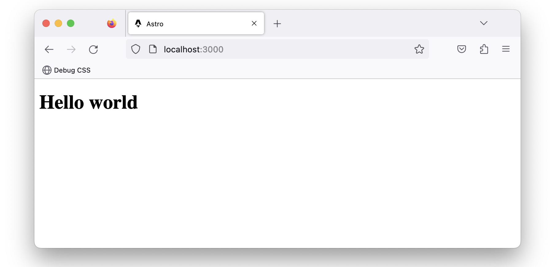
Now change the text to read <h1>Hello world</h1> and notice how the page is updated in the browser!
This leads us nicely to discuss pages in Astro — what I consider the entry point to our application.
Introduction to Astro pages
Astro leverages a file-based routing system and achieves this by using the files in the src/pages directory.
For example, the src/pages/index.astro file corresponds to the index page served in the browser.
Let’s go ahead and create an src/pages/about.astro page with similar content to index.astro as shown below:
// 📂 src/pages/about.astro------
<html lang="en"> <head> <meta charset="utf-8" /> <link rel="icon" type="image/svg+xml" href="/favicon.svg" /> <meta name="viewport" content="width=device-width" /> <meta name="generator" content={Astro.generator} /> <title>About us</title> </head> <body> <h1>About us</h1> </body></html>- Copy and paste the exact content of
index.astroinabout.astro. - Change the
<h1>to have the textAbout us.
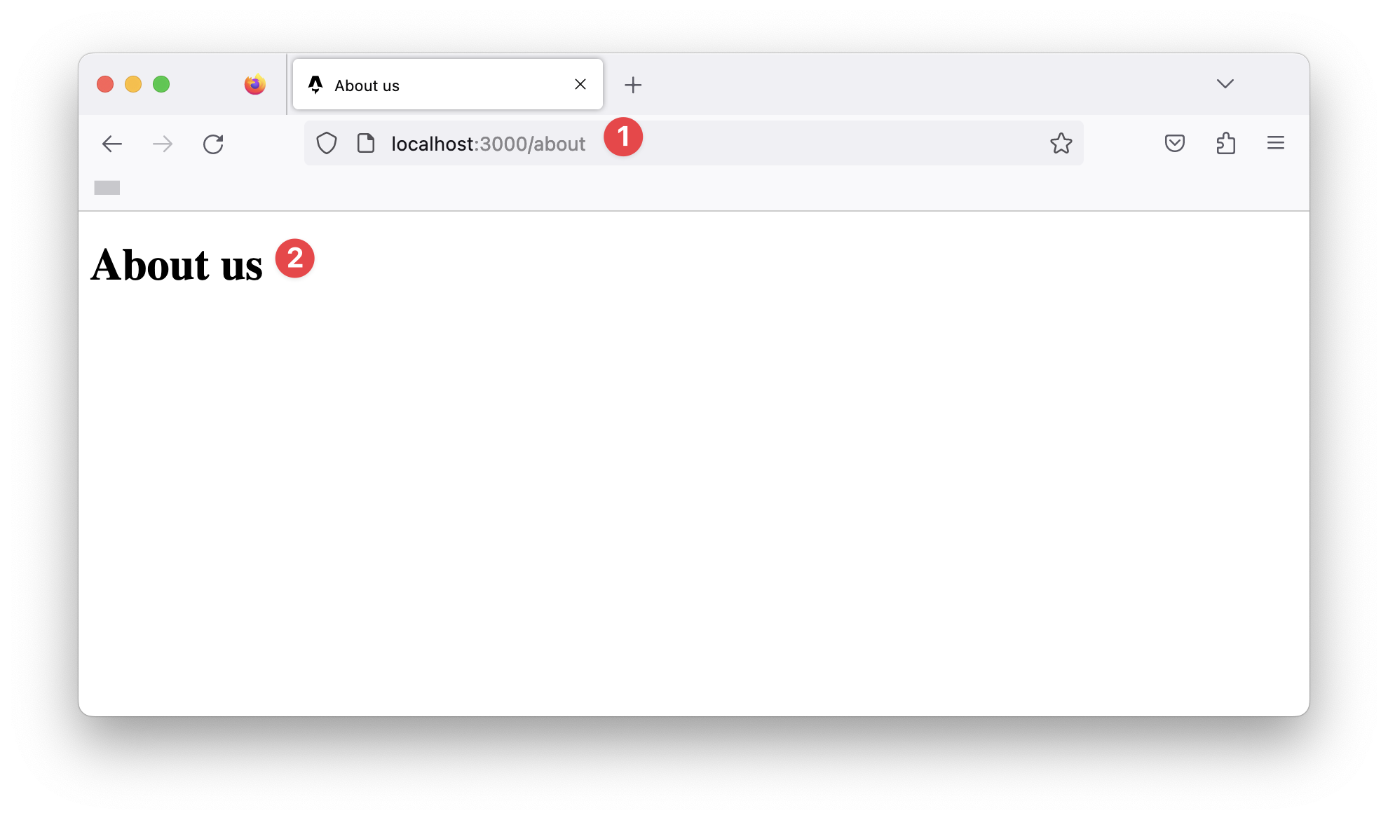
Now, if we navigate to /about in the browser, we should have the new page rendered.
What makes a valid Astro page?
We’ve defined Astro pages as files in the src/pages/directory. Unfortunately, this is only partly correct.
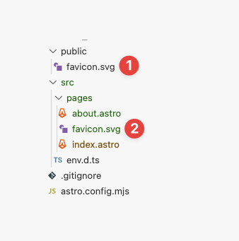
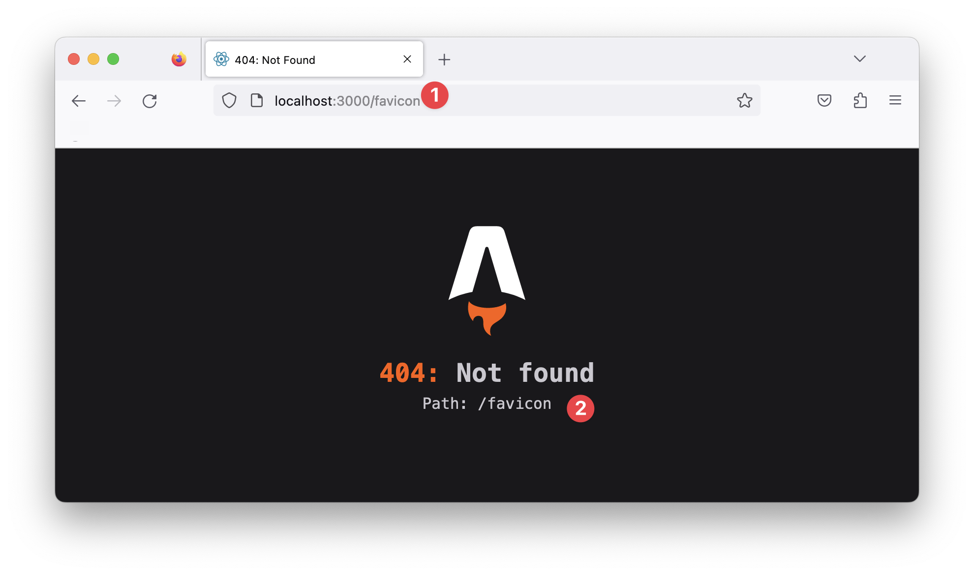
For example, if we duplicate the favicon.svg file in public/favicon.svg into the pages directory, does this represent a favicon page?
Even though index.astro and about.astro correspond to our website’s index and about pages, /favicon will return a 404: Not found error.
This is because only specific files make a valid astro page. For example, if we consider the index and about files in the pages directory, you perhaps notice something: they both have the .astro file ending!
In layperson’s terms, these are Astro files, but a more technical terminology for these is Astro components.
So, quick quiz: what is an Astro component?
That’s easy—a file with the .astro ending.
10 points to you! Well done.
Anatomy of an Astro component
We’ve established that index.astro and about.astro represent Astro components and are valid Astro pages.
Now, let’s dig into the content of these files.
Consider the contents of the index.astro page:
// 📂 src/pages/index.astro------
<html lang="en">  <!-- removed for brevity -->
</html>
Notice the distinction between the two parts of this file’s content.
The section at the bottom contains the page’s markup:
// 📂 src/pages/index.astro// ...<html lang="en"> <!-- removed for brevity --></html>This part is called the component template section.
While the top section contains a rather strange divider-looking syntax:
------This part is called the component script section, and the --- is called fence.
Together, these make up an Astro component.
Let’s take the component script section for a spin.
The section’s name hints at what this section of the component does. Within the component script code fence, we may declare variables, import packages and fully take advantage of Javascript or Typescript.
Oh yes, Typescript!
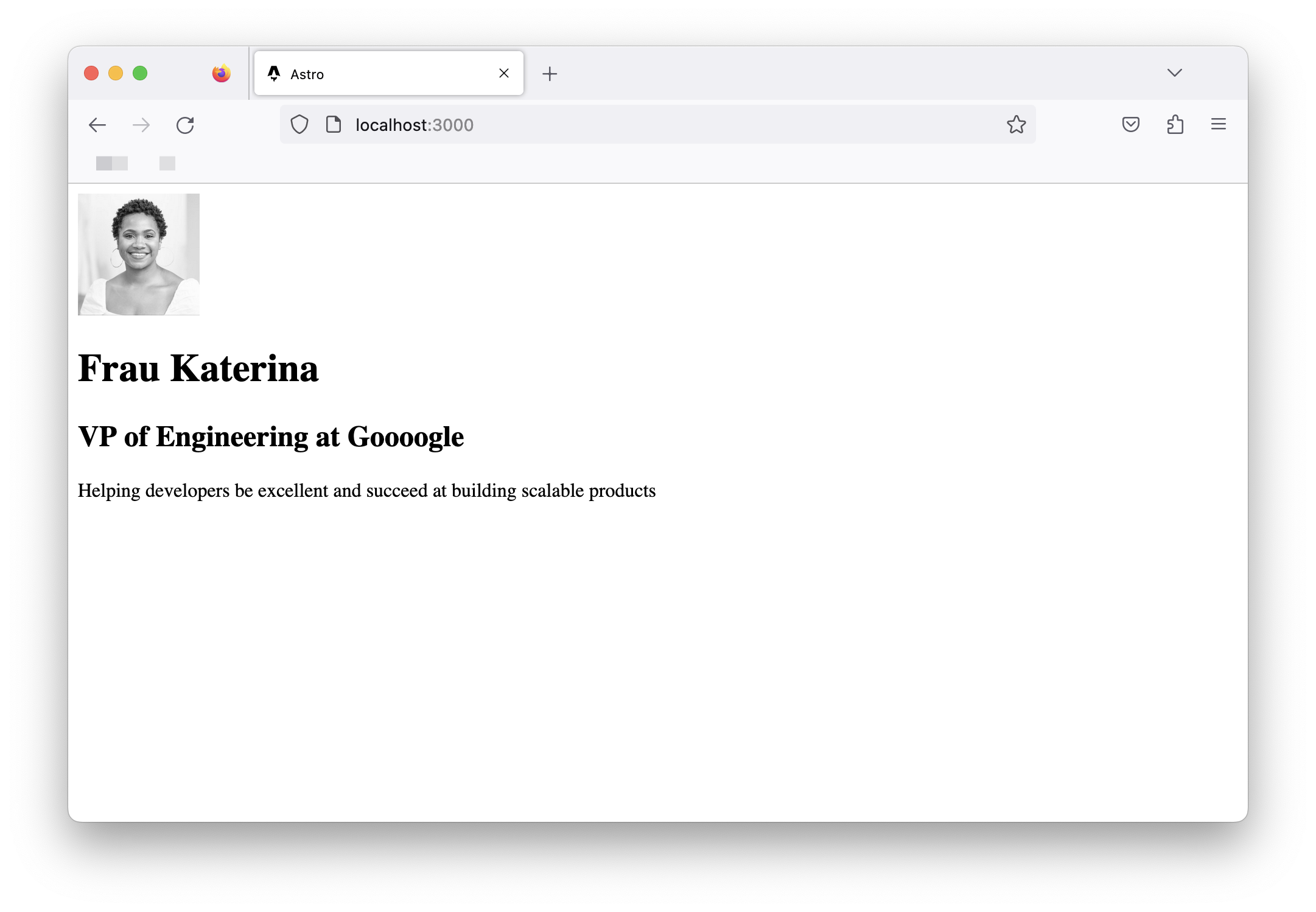
Let’s start by creating a variable to hold our user’s profile picture, as shown below:
// 📂 src/pages/index.astro---const profilePicture = "https://i.imgur.com/JPGFE75.jpg";---We may then take advantage of the component template section to reference this image as shown below:
// 📂 src/pages/index.astro---const profilePicture = "https://i.imgur.com/JPGFE75.jpg";---
<html lang="en">  <head>    <meta charset="utf-8" />    <link rel="icon" type="image/svg+xml" href="/favicon.svg" />    <meta name="viewport" content="width=device-width" />    <meta name="generator" content={Astro.generator} />    <title>Astro</title>  </head>  <body>    <!-- 👀 Look here  -->    <img      src={profilePicture}      alt="Frau Katerina's headshot."      width="100px"      height="100px"    />  </body></html>
Note that the profilePicture variable is referenced using curly braces { }. This is how to reference variables from the component script in the component markup.
Now we should have the image rendered on the home page:
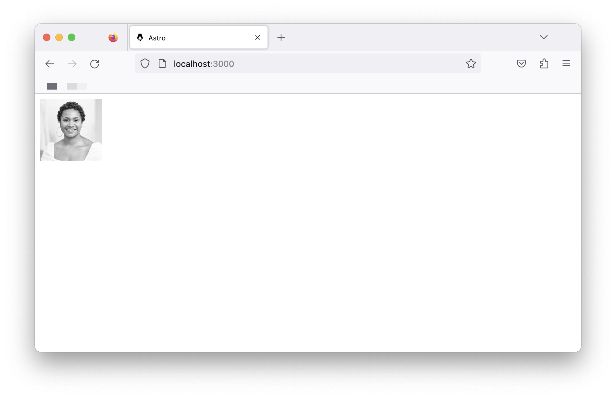
It’s not much, but it’s honest work, eh?
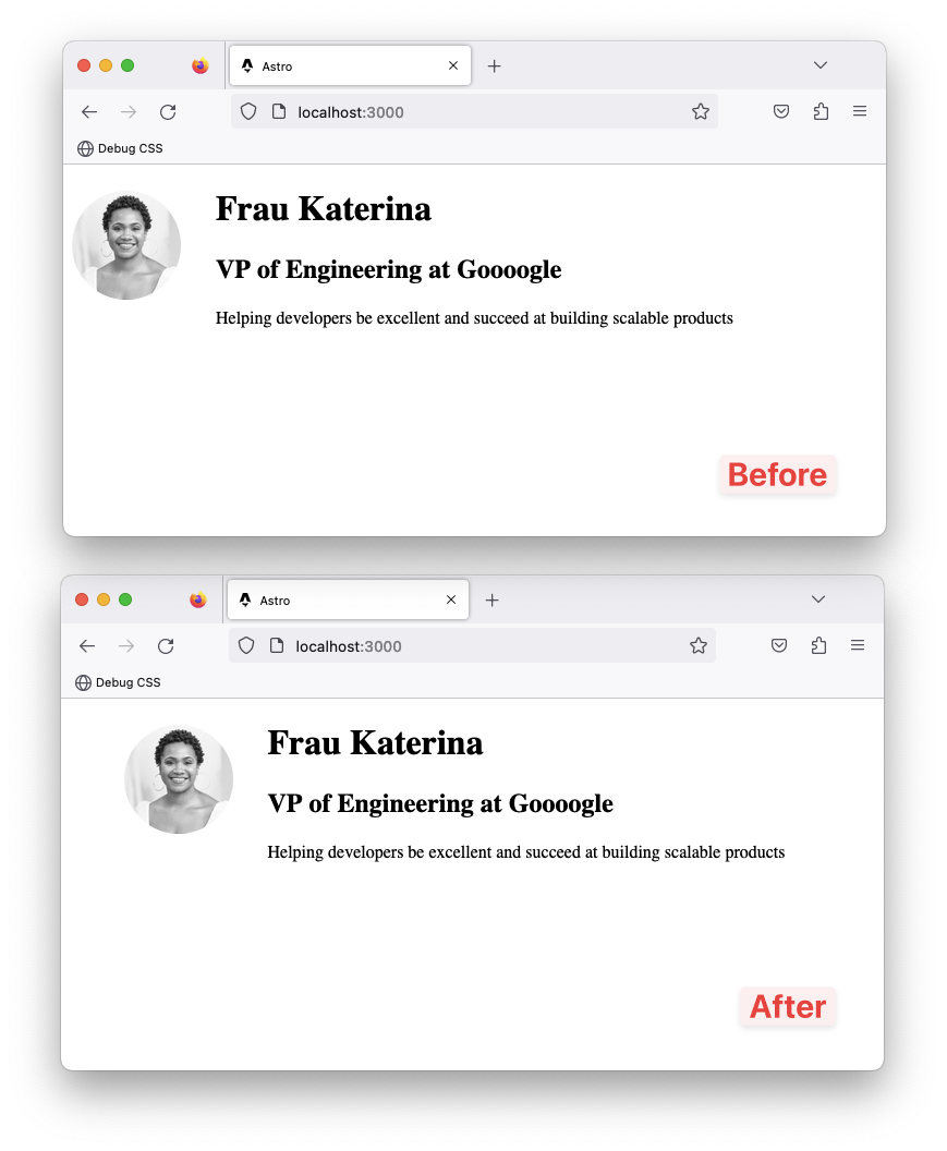
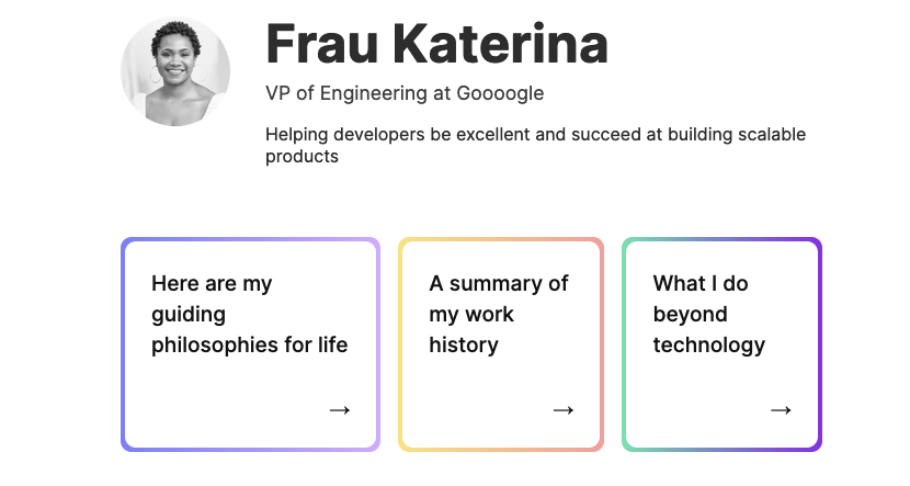
Let’s go ahead and flesh out the page to have the user’s profile markup:
// 📂 src/pages/index.astro// ... <body> <!-- Look here 👀 --> <div> <img src={profilePicture} alt="Frau Katerina's headshot." width="100px" height="100px" /> <div> <h1>Frau Katerina</h1> <h2>VP of Engineering at Goooogle</h2> <p> Helping developers be excellent and succeed at building scalable products </p> </div> </div> </body>// ...As you might have noticed, we’re writing HTML looking syntax in the component markup section!
Now we should have the user photo and their bio rendered in the browser as follows:
Component styles
Styling in Astro is relatively easy to reason about. Add a <style> tag to a component, and Astro will automatically handle its styling.
While it’s possible to select elements directly, let’s go ahead and add classes to the component markup for ease:
// 📂 src/pages/index.astro// ...<div class="profile"> <img src={profilePicture} class="profile__picture" {/** ... **/} /> <div class="profile__details"> <h1>Frau Katerina</h1> {/** ... **/} </div></div>// ...Add a <style> tag, and write CSS as usual!
// ...<style>  .profile {    display: flex;    align-items: flex-start;    flex-wrap: wrap;    padding: 1rem 0 3rem 0;  }
  .profile__details {    flex: 1 0 300px;  }
  .profile__details > h1 {    margin-top: 0;  }
  .profile__picture {    border-radius: 50%;    margin: 0 2rem 1rem 0;  }</style>
The user details should now be styled as expected.

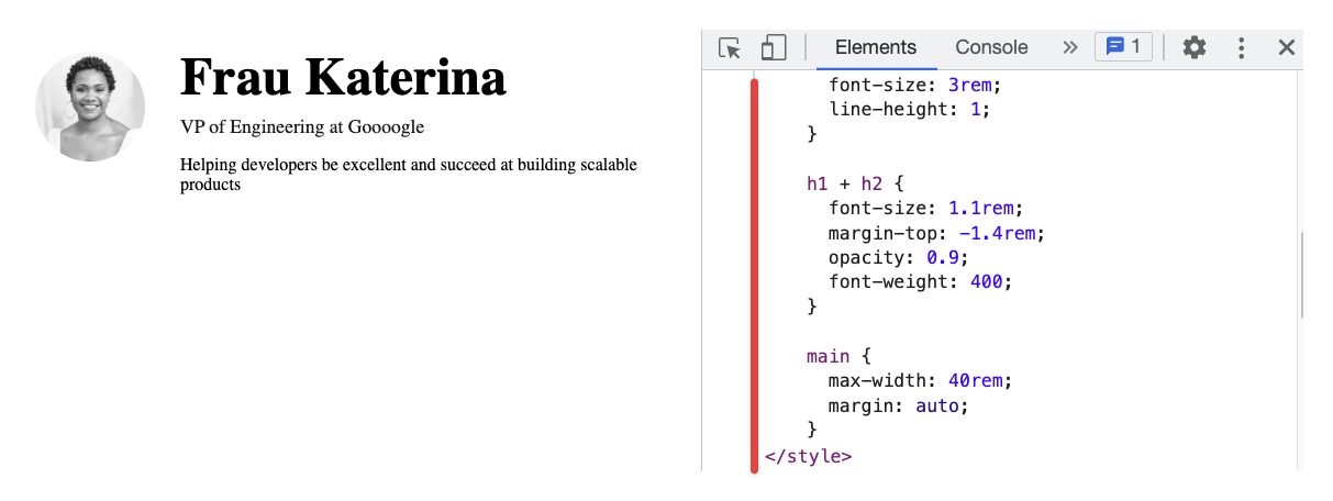
If we inspect the eventual styles applied to our UI elements via the browser developer tools, we’ll notice that the style selectors look different.
For example, to style the user name, we’ve written the following CSS:
.profile__details > h1 { margin-top: 0;}However, what’s applied in the browser looks something like this:
.profile__details:where(.astro-J7PV25F6) > h1:where(.astro-J7PV25F6) { margin-top: 0;}Why is this?
The actual style declarations for the h1 element remain unchanged. The only difference here is the selector.
The h1 element now has auto-generated class names, and the selector is now scoped via the :where CSS selector.
This is done internally by Astro. This makes sure the styles we write don’t leak beyond our component; for example, if we styled every h1 in our component as follows:
h1 { color: red;}The eventual style applied in the browser will be similar to the following:
h1:where(.astro-some-unique-id) { color: red;}This will ensure all other h1 in our project remains the same, and this style only applies to our specific component h1.
Page layouts
Please look at the pages of our completed application, and realise how they all have identical forms.
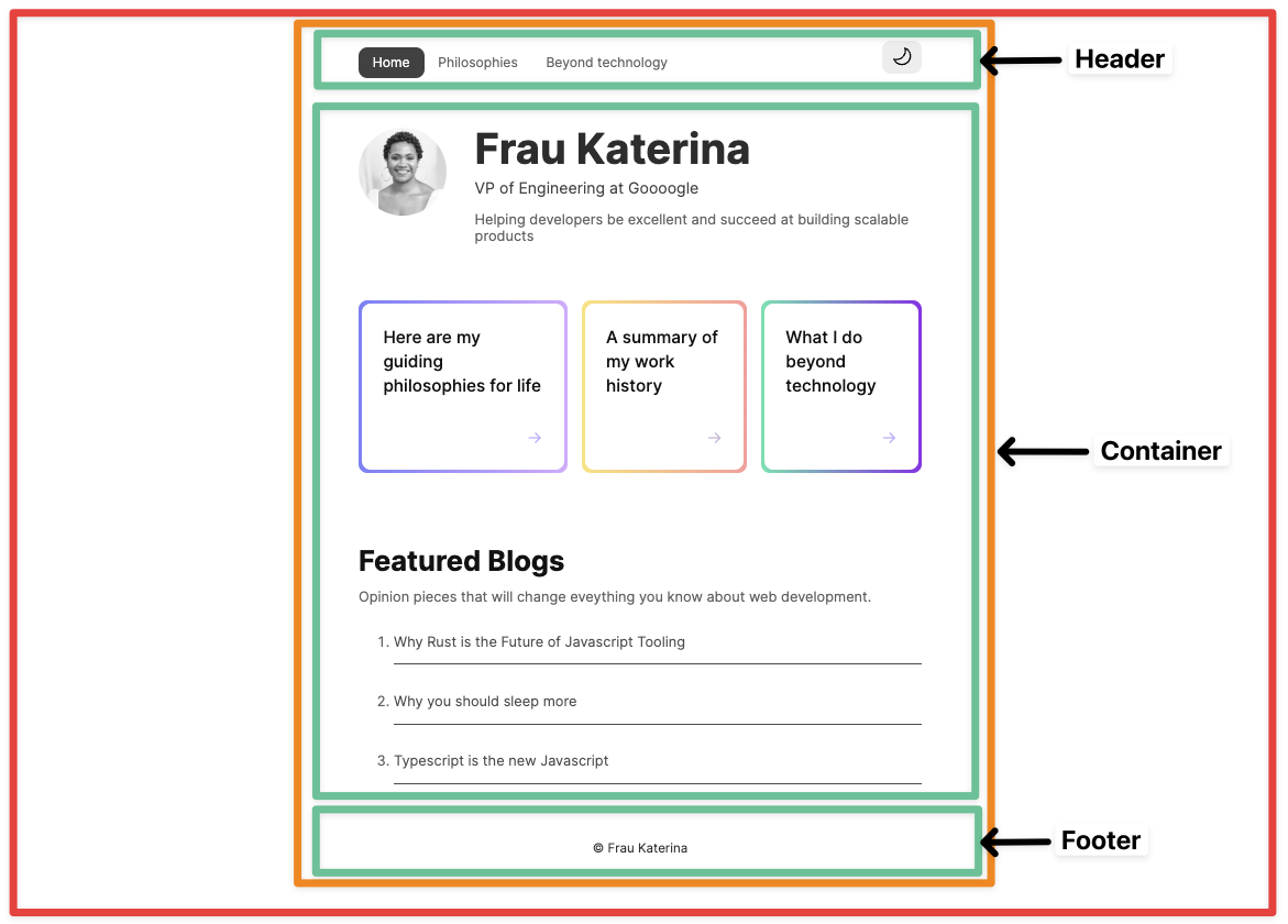
There’s a navigation bar, a footer, and some container that holds the page’s main content.
Should we repeat these similar UI structures across all pages?
Most people will answer “No”. So, is there a way to share reusable UI structures across pages?
Yes, yes, yes! This is where layouts come in.
Layouts are Astro components with a twist. They are used to provide reusable UI structures across pages, e.g., navigation bars and footers.
Conventionally, layouts are placed in the src/layouts directory. This is not compulsory but a widespread pattern.
Let’s go ahead and create our first layout in src/layouts/Main. We’ll do this by moving away all the reusable UI structures currently in index.astro as follows:
// 📂 src/layouts/Main.astro------
<html lang="en"> <head> <meta charset="utf-8" /> <link rel="icon" type="image/svg+xml" href="/favicon.svg" /> <meta name="viewport" content="width=device-width" /> <meta name="generator" content={Astro.generator} /> {/* Add a new meta description tag */} <meta name="description" content="Frau Katarina's website" /> {/* Title is hardcoded as Astro, for now. */} <title>Astro</title> </head> <body> <main> {/* We want the content of each page to go here */} </main> </body></html>- We’ve moved the
<html>,<head>and<body>elements to theMain.astrolayout. - We’ve also introduced a new
<meta name=description />tag for SEO. - We’ve equally introduced a
<main>element where we want the rest of our page to go in. - Note that the file name of the layout is capitalised, i.e.,
Main.astro, notmain.astro.
On the one hand, layouts are unique because they mostly do one thing - provide reusable structures. But, on the other hand, they aren’t unique. They are like other Astro components and can do everything a component can!
Rendering components and slots
Rendering an Astro component is similar to how you’d attempt to render an HTML element, e.g., we’d render a div by writing the following:
<div>render something within the div</div>The same goes for Astro components.
To render the Main.astro component, we’d do similar:
<Main>render something within the Main component</Main>Let’s put this into practice. We may now use the Main layout in the index.astro page. To do this, we will do the following:
- Import the
Mainlayout from"../layouts/Main.astro" - Substitute the
<html>,<head>and<body>elements for the<Main>layout inindex.astro.
---import Main from "../layouts/Main.astro";
const profilePicture = "https://i.imgur.com/JPGFE75.jpg";---
<Main>  <div class="profile">    <img      src={profilePicture}      class="profile__picture"      alt="Frau Katerina's headshot."      width="100px"      height="100px"    />    <div class="profile__details">      <h1>Frau Katerina</h1>      <h2>VP of Engineering at Goooogle</h2>      <p>        Helping developers be excellent and succeed at building scalable        products      </p>    </div>  </div></Main>
If we checked our app, we’d have a blank index page.
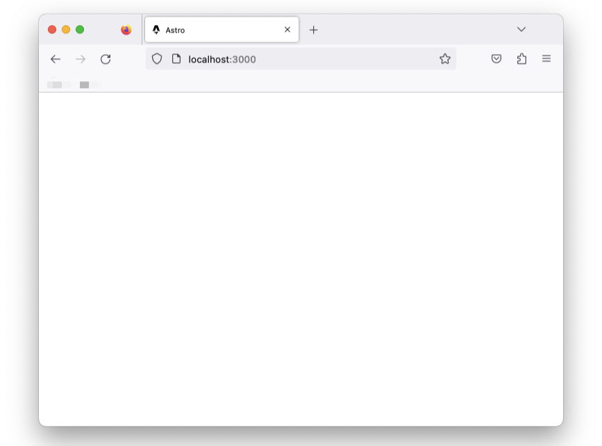
Why’s that?
Unlike HTML elements, the child elements in the <Main> tag aren’t automatically rendered.
{/** Child div will not be automatically rendered */}<Main> <div>Hello from child</div><Main>The <Main> layout component is rendered, and nothing else. The child components aren’t. Hence, the empty page.
To render the child elements of an Astro component, we must specify where to render these using a <slot /> element.
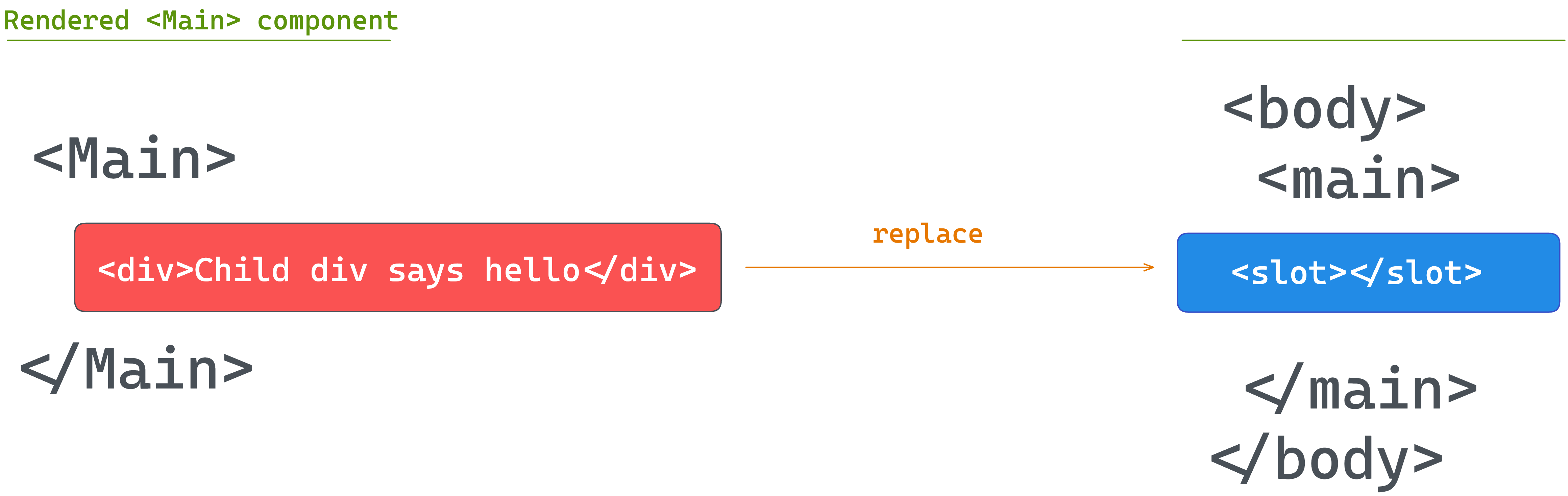
Let’s add a <slot> within Main.astro :
//...<body> <main> {/* We want the content of each page to go here */} <slot /> </main></body>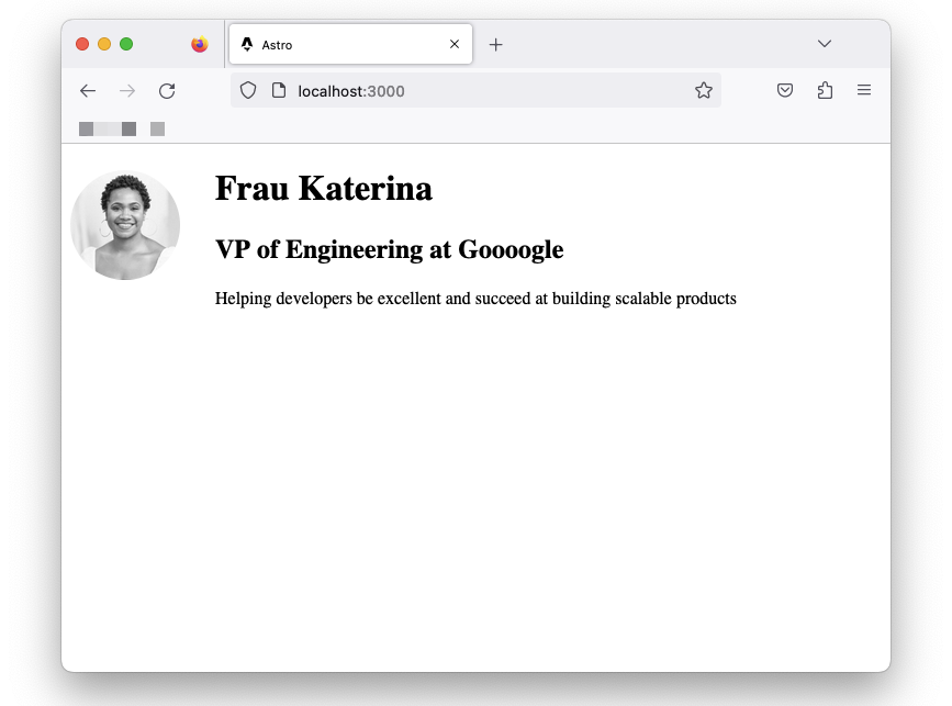
We should now have our page rendered with the reusable layout in place.
Capitalising component names
We’ve capitalised the file name of the Main.astro layout component but is this important?
Theoretically, the answer to that is no.
We could create a file with a lower cased name, e.g., mainLayout.astro and import the component as follows:
import Main from "../layouts/mainLayout.astro";This is perfectly correct.
However, where we encounter issues is if we name the imported component with a lowercase:
// main NOT Mainimport main from "../layouts/mainLayout.astro";In this case, we’ll encounter issues when we attempt to render the component as the name collides with the standard HTML main element.
For this reason, it’s common practice to capitalise both component file names and the imported variable name.
The global style directive
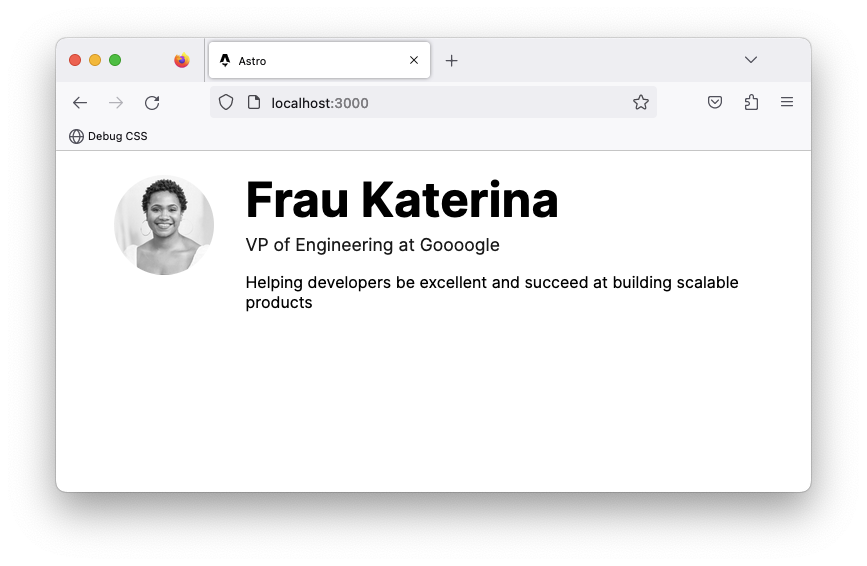
The Main layout is in place but doesn’t add much to our page. Let’s start by adding some styles for the headers and also centre the page’s content:
<!-- 📂 src/layouts/Main.astro --><style>  h1 {    font-size: 3rem;    line-height: 1;  }
  h1 + h2 {    font-size: 1.1rem;    margin-top: -1.4rem;    opacity: 0.9;    font-weight: 400;  }
  main {    max-width: 40rem;    margin: auto;  }</style>
With this, we’ll have the main element centred, but the headers, h1 and h2 remain unstyled.
This is because styles applied via the <style> tag are locally scoped by default.
Can you tell me why?
The main element resides in the Main layout. However, the header h1 and h2 exist in a different index.astro component!
For our use case, we need global styles.
We need to break out of the default locally scoped styles the Astro component provides, but how do we do this?
Global styles can be a nightmare — except when truly needed. For such cases, Astro provides several solutions. The first is using what’s known as a global style template directive.
I know that sounds like a mouthful! However, in simple terms, template directives in Astro are different kinds of HTML attributes that can be used in Astro component templates3.
For example, to break out of the default locally scoped <style> behaviour, we can add a is:global attribute as shown below:
<style is:global> ...;</style>This will remove the local CSS scoping and make the styles available globally.
Custom fonts and global CSS
Base layout components like Main.astro are a great place to have global properties such as global styles and custom fonts.
We’ve added global styles via the is:global template directive, but alternatively, we could have all global styles imported into Main.astro from a global.css file.
In cases where a project requires importing some existing global css file, this is the more straightforward approach.
For example, let’s refactor our project to use global.css. To do so, move the entire CSS content within the <style is:global> element into src/styles/global.css. Then import the styles in the Main.astro component frontmatter:
// 📂 src/layouts/Main.astro---import "../styles/global.css";---This will load and inject style onto the page.
Now, let’s turn our attention to global fonts.
We will use the Google Inter font for the project, but how do we do this?
Technically speaking, to add Inter to our project, we must add the <link>s to Inter on every page required.
However, instead of repeating ourselves on every page, we can leverage the shared Main.astro layout component.
Go ahead and add the <link>s to the Inter font as shown below:
// 📂 src/layouts/Main.astro<html lang="en"> <head> {/** 👀 Look here ... */} <link rel="preconnect" href="https://fonts.googleapis.com" /> <link rel="preconnect" href="https://fonts.gstatic.com" crossorigin /> <link href="https://fonts.googleapis.com/css2?family=Inter:wght@400;500;700&display=swap" rel="stylesheet" /> </head> {/** ... */}</html>We may now update the global.css file to use the new font family:
body { font-family: "Inter", sans-serif; padding: 0 0.5rem; /* Additional body style */}And boom! We have sorted global fonts.
Independent Astro components
We’ve discussed two special types of Astro components: layouts and pages.
However, a working site is made up of more than just layouts and pages. For example, different blocks of user interfaces are typically embedded within a page. These independent and reusable blocks of user interfaces can also be represented using Astro components.
Let’s put this to practice by creating NavigationBar and Footer components to be used in the Main.astro layout.
When creating components, a standard convention is to have them in the src/components directory. Let’s go ahead and create one.
// 📂 src/components/Footer.astro<footer>© Frau Katerina</footer>
<style> footer { /* Applies top and bottom paddings */ padding: 3rem 0; /* Centers the text content */ text-align: center; /* Makes the font smaller */ font-size: 0.9rem; }</style>Let’s also create a NavigationBar component:
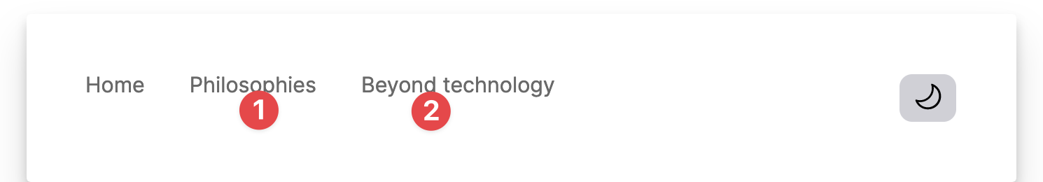
// 📂 src/components/NavigationBar.astro------
<nav>  <ul>    <li>      <a href="/">Home</a>    </li>
    <li>      {/** Link points nowhere for now*/}      <a href="#">Philosophies</a>    </li>
    <li>      {/** Link points nowhere for now*/}      <a href="#">Beyond technology</a>    </li>  </ul></nav>
<style>  nav {    display: flex;    align-items: flex-start;    padding: 2rem 0;  }
  ul {    display: flex;    flex-wrap: wrap;    padding: 0;    margin: 0 auto 0 0;  }
  nav li {    opacity: 0.8;    list-style: none;    font-size: 0.95rem;  }
  a {    padding: 0.5rem 1rem;    border-radius: 10px;    text-decoration: none;  }</style>
Now render the NavigationBar and Footer as shown below:
// 📂 src/layouts/Main.astro---//...import Footer from "../components/Footer.astro";import NavigationBar from "../components/NavigationBar.astro";---
{/** ... **/}<main>  <NavigationBar />
  <slot />
  <Footer /></main>
Adding interactive scripts
An integral part of Astro’s philosophy is shipping zero Javascript by default to the browser.
This means our pages get compiled into HTML pages with all Javascript stripped away by default.
You might ask, what about all the Javascript written in the component script section of an Astro component?
The component script and markup will be used to generate the eventual HTML page(s) sent to the browser.
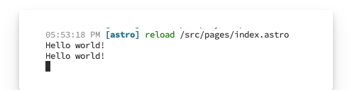
For example, go ahead and add a simple console.log to the frontmatter of the index.astro page:
// 📂 src/pages/index.astro---console.log("Hello world!");---Inspect the browser console and notice how the log never makes it to the browser!
So, where’s the log?
Astro runs on the server. In our case, this represents our local development server. So, the console.log will appear in the terminal where Astro serves our local application.
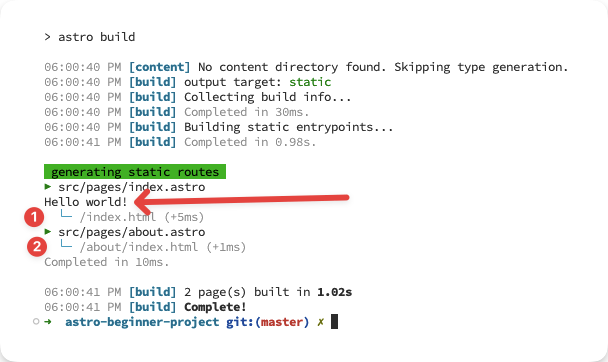
When we eventually build our application for production with npm run build, Astro will output HTML files corresponding to our pages in src/pages.
In this example, the Hello world! message will be logged but not get into the compiled HTML pages.
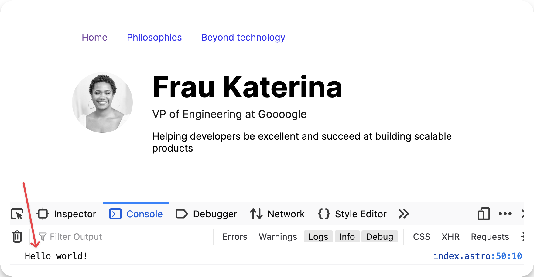
To add interactive scripts, i.e., scripts that make it into the final HTML page build output, add a <script> element in the component markup section.
For example, let’s move the console.log from the frontmatter to the markup via a <script> element:
// 📂 src/pages/index.astro------// ...
<script>  console.log("Hello world!");</script>
We should have Hello world! logged in the browser console!
Interactive theme toggle
Let’s put our newly found knowledge of client-side scripts to good use.
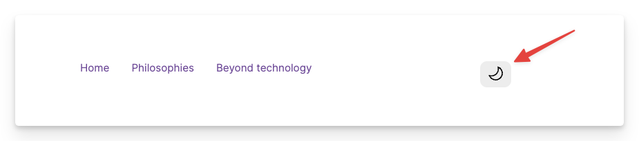
Create a new ThemeToggler.astro component in the src/components directory.
Add the following markup:
// 📂 src/components/ThemeToggler.astro<button aria-label="Theme toggler"> <svg width="25px" xmlns="http://www.w3.org/2000/svg" viewBox="0 0 24 24"> <path class="sun" fill-rule="evenodd" d="M12 17.5a5.5 5.5 0 1 0 0-11 5.5 5.5 0 0 0 0 11zm0 1.5a7 7 0 1 0 0-14 7 7 0 0 0 0 14zm12-7a.8.8 0 0 1-.8.8h-2.4a.8.8 0 0 1 0-1.6h2.4a.8.8 0 0 1 .8.8zM4 12a.8.8 0 0 1-.8.8H.8a.8.8 0 0 1 0-1.6h2.5a.8.8 0 0 1 .8.8zm16.5-8.5a.8.8 0 0 1 0 1l-1.8 1.8a.8.8 0 0 1-1-1l1.7-1.8a.8.8 0 0 1 1 0zM6.3 17.7a.8.8 0 0 1 0 1l-1.7 1.8a.8.8 0 1 1-1-1l1.7-1.8a.8.8 0 0 1 1 0zM12 0a.8.8 0 0 1 .8.8v2.5a.8.8 0 0 1-1.6 0V.8A.8.8 0 0 1 12 0zm0 20a.8.8 0 0 1 .8.8v2.4a.8.8 0 0 1-1.6 0v-2.4a.8.8 0 0 1 .8-.8zM3.5 3.5a.8.8 0 0 1 1 0l1.8 1.8a.8.8 0 1 1-1 1L3.5 4.6a.8.8 0 0 1 0-1zm14.2 14.2a.8.8 0 0 1 1 0l1.8 1.7a.8.8 0 0 1-1 1l-1.8-1.7a.8.8 0 0 1 0-1z" ></path> <path class="moon" fill-rule="evenodd" d="M16.5 6A10.5 10.5 0 0 1 4.7 16.4 8.5 8.5 0 1 0 16.4 4.7l.1 1.3zm-1.7-2a9 9 0 0 1 .2 2 9 9 0 0 1-11 8.8 9.4 9.4 0 0 1-.8-.3c-.4 0-.8.3-.7.7a10 10 0 0 0 .3.8 10 10 0 0 0 9.2 6 10 10 0 0 0 4-19.2 9.7 9.7 0 0 0-.9-.3c-.3-.1-.7.3-.6.7a9 9 0 0 1 .3.8z" ></path> </svg></button>- For accessibility, the button has an
aria-labelofTheme toggler]. - The
SVGhas a fixed width of25px, rendering two<path>elements. - The first
<path>visually represents a sun icon. The second is a moon icon. - By default, both icons (sun and moon) are rendered. Our goal is to toggle the displayed icon based on the active theme.
Then import the component and render it in the NavigationBar:
// 📂 src/components/NavigationBar---import ThemeToggler from "./ThemeToggler.astro";---
<nav>  <ul>    {/** ... **/}  </ul>  {/** 👀 Look here **/}  <ThemeToggler /></nav>
Let’s add some <style> to ThemeToggler:
// 📂 src/components/ThemeToggler.astro// ...<style>  button {    cursor: pointer;    border-radius: 10px;    border: 0;    padding: 5px 10px;    transition: all 0.2s ease-in-out;  }
  button:hover {    /* Make the button smaller (scale down) when hovered */    transform: scale(0.9);  }
  button:active {    /** Return the button to its standard size when active */    transform: scale(1);  }
  .sun {    /* Hide the sun icon by default. This assumes a light theme by default */    fill: transparent;  }</style>
Now, we should have a decent-looking theme toggler.
The :global() selector
Let’s take a moment to consider the strategy we’ll use for toggling the theme.
We’ll toggle a CSS class on the root element whenever a user clicks the toggle.
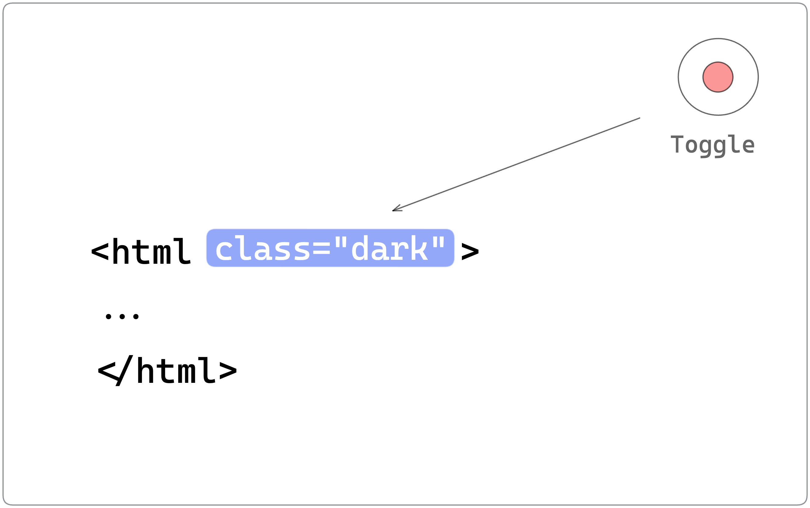
For example, if the user was viewing the site in light mode and clicked to toggle, we’ll add a .dark class to the root element and, based on that, apply dark-themed styles.
If the user is in dark mode, clicking the toggle will remove the .dark class. We’ll refer to this as a class strategy for toggling dark mode.
Based on this strategy, we must update our local ThemeToggler style to display the relevant icon depending on the global .dark class.
To do this, we will leverage the :global selector.
Here’s how we’d achieve this:
<!-- 📂 src/components/ThemeToggler.astro --><style> /**...**/
/** If a parent element has a .dark class, target the .sun icon and make the path black (shows the icon) */ :global(.dark) .sun { fill: black; }
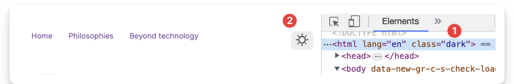
/** If a parent element has a .dark class, target the .moon icon and make the path transparent (hides the icon) */ :global(.dark) .moon { fill: transparent; }</style>To see this at work, inspect the page via the developer tools, and add a dark class to the root element. The toggle icon will be appropriately changed.
In practice, limit :global only to appropriate use cases because mixing global and locally scoped component styles will become challenging to debug. However, this is permissible, given our use case.
Event Handling
We’ve handled the styles for our toggle, assuming a .dark root class. Now, Let’s go ahead and handle the toggle click event with a <script> element.
<!-- 📂 src/components/ThemeToggler.astro --><script>  /** Represent the toggle theme class with a variable */  const DARK_THEME_CLASS = "dark";
  /** Grab the toggle */  const toggle = document.querySelector("button");  /** Grab the document root element. In this case <html>  */  const rootEl = document.documentElement;
  if (toggle) {    toggle.addEventListener("click", () => {      /** toggle the "dark" class on the root element */      rootEl.classList.toggle(DARK_THEME_CLASS);    });  }</script>
Notice that this is standard Javascript. Nothing fancy going on here.
- The toggle is selected via
document.querySelector("button"). - To set up an event listener, we use the
.addEventListenermethod on the button. - On clicking the button, we toggle the class list on the root element: adding or removing the “dark” class.
With this in place, the toggle icon changes when clicked to either that of the sun or moon.
Excellent!
Theming via CSS variables
CSS variables4 are outstanding, and we’ll leverage them for theming our application.
Firstly, let’s go ahead and define the colour variables we’ll use in the project.
// 📂 styles/global.csshtml {  --background: white;  --grey-200: #222222;  --grey-400: #444444;  --grey-600: #333333;  --grey-900: #111111;}
html.dark { --background: black; --grey-200: #eaeaea; --grey-400: #acacac; --grey-600: #ffffff; --grey-900: #fafafa;}- Set the variables on the root
HTMLelement to be globally scoped. - A CSS variable is a property that begins with two dashes,
--e.g.,--background. - For simplicity, we’ll stick to the minimal grey palette above.
The first visual change we’ll make is to add the following color and background style declarations to the body element:
// 📂 styles/global.cssbody { color: var(--grey-600); background: var(--background);}With this seemingly simple change, we should now have the text and background colour of the body react to clicking the toggle.

Finally, update the navigation links in NavigationBar to reflect theme preferences:
/* 📂 src/components/NavigationBar.astro */<style>  /* ... */  a {    color: var(--grey-400);    padding: 0.5rem 1rem;    border-radius: 10px;    text-decoration: none;  }
  a:hover {    color: var(--grey-900);  }</style>
Accessing global client objects
Question! 🙋🏼
Where should we access global objects such as window.localStorage? Within an Astro component frontmatter or an interactive <script>?
At this point, I hope the answer to the question is clear from previous examples.
Since Astro runs on the server, attempting to access a window property within the frontmatter of a component will result in an error.
---{/** ❌ this will fail with the error: window is undefined **/} const value = window.localStorage.getItem("value")---To access window properties, we need the script to run on the client, I.e., in the browser. So, we must leverage one or more client-side scripts.
A good use case for this is remembering the user’s theme choice.
If users toggle their theme from light to dark and refresh the browser, they lose the selected theme state.
How about we save this state to the browser’s local storage and restore the selected theme upon refresh?
Well, let’s do that!
Here are the first steps we’ll take:
- Grab the current state of the theme, i.e., dark or light, when the theme toggle is clicked.
- Save the theme value to the browser’s local storage in the form:
{COLOUR_MODE: "LIGHT" | "DARK";}
Here’s that translated in code:
<!-- 📂 src/components/ThemeToggler.astro --><script>  const DARK_THEME_CLASS = "dark";  /** Represent the local storage key by a variable */  const COLOUR_MODE = "COLOUR_MODE";  /** Represent the local storage values by variables */  const LIGHT_THEME = "LIGHT";  const DARK_THEME = "DARK";  /** ... **/  toggle.addEventListener("click", () => {    /** ... */    /**Get the current theme mode, i.e., light or dark */    const colourMode = rootEl.classList.contains(DARK_THEME_CLASS)      ? DARK_THEME      : LIGHT_THEME;
    /** Save the current theme to local storage   */    window.localStorage.setItem(COLOUR_MODE, colourMode);  });</script>
We have saved the theme to local storage but must now set the active theme as soon as the page is loaded and the script is executed.
Here’s the annotated code required to achieve this:
<!-- 📂 src/components/ThemeToggler.astro --><script> { /**... **/ } const getInitialColourMode = () => { /** Get colour mode from local storage **/ const previouslySavedColourMode = window.localStorage.getItem(COLOUR_MODE); if (previouslySavedColourMode) { return previouslySavedColourMode; } /** Does the user prefer dark mode, e.g., through an operating system or user agent setting? */ if (window.matchMedia("(prefers-color-scheme: dark)").matches) { return DARK_THEME; } /** Default to the light theme */ return LIGHT_THEME; }; /**Get initial colour mode */ const initialColourMode = getInitialColourMode(); const setInitialColourMode = (mode: string) => { if (mode === LIGHT_THEME) { rootEl.classList.remove(DARK_THEME_CLASS); } else { rootEl.classList.add(DARK_THEME_CLASS); } }; /** Set the initial colour mode as soon as the script is executed */ setInitialColourMode(initialColourMode); { /**... **/ }</script>Now, give this a try. First, toggle the theme and refresh to see the theme choice preserved!
The magic of scripts
Client-side scripts added via a <script> may seem like your typical Javascript vanilla JS, but they’re more capable in specific ways.
The most crucial point is that Astro processes these. This means within a <script>, we can import other scripts or import npm packages, and Astro will resolve and package the script for use in the browser.
<script>  /** ✅ valid package import **/  import { titleCase } from "title-case";
  const title = titleCase("string");
  alert(title);</script>
/** ✅ valid script reference **/<script src="path-to-script.js" />Another critical point is the <script> fully supports Typescript. For example, in our solution, we typed the parameter for the setInitialColourMode function:
// mode is of type stringconst setInitialColourMode = (mode: string) => { ...};We don’t have to sacrifice type safety within the client <script> elements and can go on to write standard Typescript code. Astro will strip out the types at build time and only serve the processed Javascript to the browser.
Here’s a summary of what Astro does:
NPMpackages and local files can be imported and will be bundled.- Typescript is fully supported within the
<script>. - If a single
Astrocomponent with a<script>is used multiple times on a page, the<script>is processed and only included once. - Astro will process and insert the script in the
<head>of the page with atype=moduleattribute. - ❗️The implication of
type=moduleis that the browser will defer the script, i.e., load in parallel and execute it only after the page’s parsed.
Leveraging inline scripts
By default, Astro processes <script>s. However, to opt out of Astro’s default script processing, we may pass a is:inline directive as shown below:
<script is:inline> // Imports will not be processed // Typescript not supported by default // Script will be added as is, e.g., multiple times if the component is used more than once on a page.</script>In the real world, we quickly realise that the defaults don’t always satisfy every project requirement.
For example, consider the unstyled flash of content when we refresh our home page. For a user who chose the dark theme previously, refreshing the page shows light-themed rendered content before changing to dark after the script is parsed.

This occurs because we restore the user-chosen theme only after the page’s HTML has been parsed, i.e, the default behaviour of processed Astro scripts.
To prevent this, we will use the is:inline directive, which will make the script blocking, i.e., executed immediately and stops parsing until completed.
Since scripts with the is:inline attribute aren’t processed, they’ll be added multiple times if used in reusable components that appear more than once on the page.
So, let’s go ahead and move the theme restoration code bit into Main.astro — because the Main layout is only included once per page.
We’ll also make sure to add this within the <head> of the layout, as shown below:
<!-- 📂 src/layouts/Main.astro --><head> <!-- ... --> <!-- 👀 add is:inline --> <script is:inline> const DARK_THEME_CLASS = "dark"; const COLOUR_MODE = "COLOUR_MODE"; const LIGHT_THEME = "LIGHT"; const DARK_THEME = "DARK"; const rootEl = document.documentElement; const getInitialColourMode = () => { /** ... */ }; const initialColourMode = getInitialColourMode(); // 👀 remove string type on mode const setInitialColourMode = (mode) => { /** ... */ }; /** Set the initial colour mode as soon as the script is executed */ setInitialColourMode(initialColourMode); </script></head>We’re explicitly adding this to the <head> because Astro will not process the is:inline script. As such, it won’t be moved to the head by Astro.
Be careful with is:inline as it removes the default non-blocking nature of scripts. But it’s ideal for this use case.
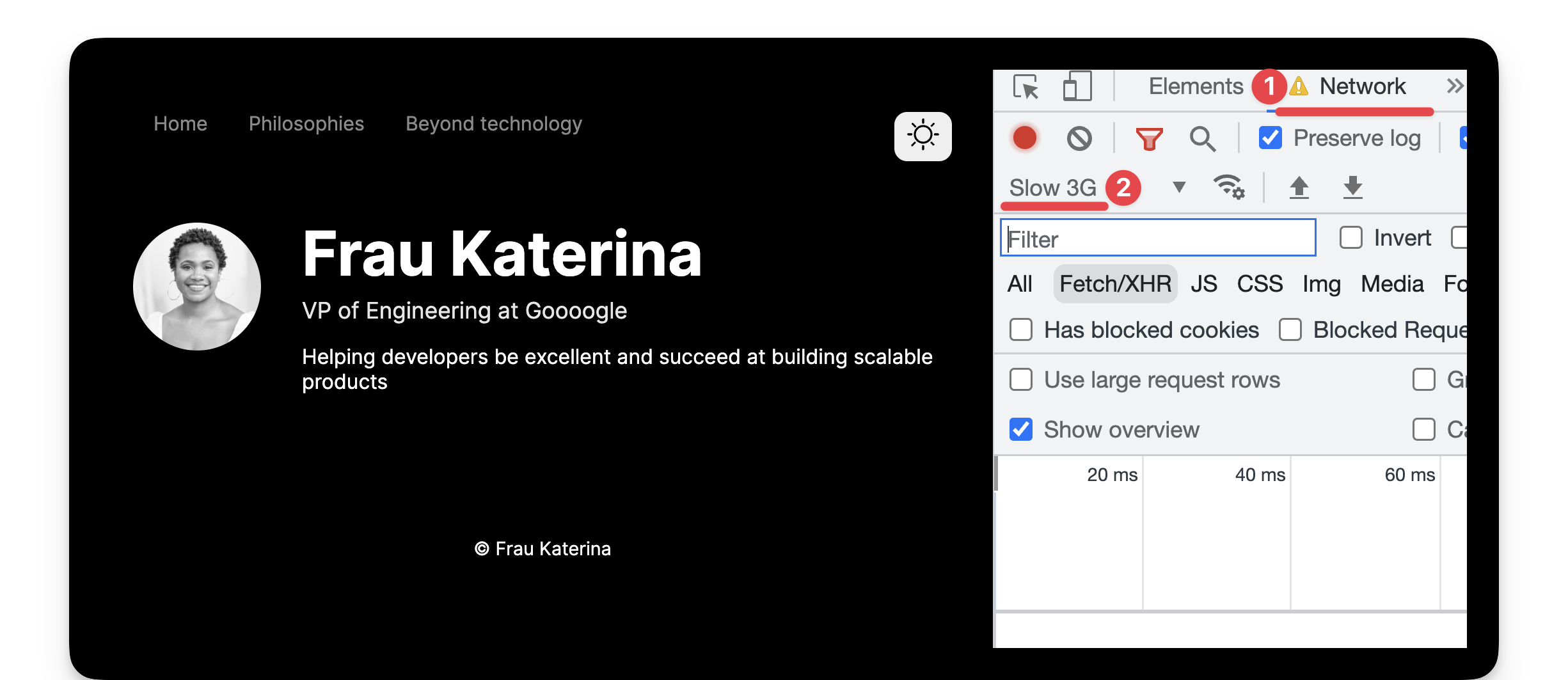
Open your developer tools and throttle the network. Then go ahead and refresh after toggling dark mode. We should have eradicated the flash of unstyled content!
Global selectors in scripts
Understanding how Astro processes the <script> in our components helps us make informed decisions.
We know the <script> will eventually be bundled and injected into our page’s <head>.
However, consider our selector for registering the theme toggle clicks:
// 📂 src/components/ThemeToggler.astroconst toggle = document.querySelector("button");The problem with this seemingly harmless code is that document.querySelector will return the first element that matches the selector — a button element.
This will be selected if we add a random button somewhere on the page before our theme toggle button.
// 📂 src/layouts/Main.astro<button> Donate to charity </button><Nav />
//...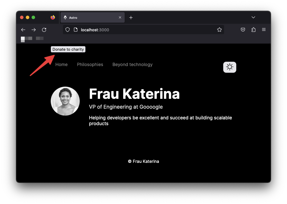
This button, which has nothing to do with theme toggling, will now be responsible for toggling the user’s theme.
Clicking “donate to charity” now toggles the theme. This is unacceptable.
The lesson here is to be mindful of your DOM selectors and be specific where possible, e.g., via ids or classes:
document.querySelector("#some-unique-id");Let’s refactor our solution to use a data attribute.
<!-- 📂 src/components/ThemeToggler.astro --><button aria-label="Theme toggler" data-theme-toggle>  <!-- ... --></button>
<script>  /** 👀 Look here */  const toggle = document.querySelector("[data-theme-toggle]");  // ...</script>
With the more specific selector, only an element with the data attribute theme-toggle will be selected, leaving <button> Donate to charity </button> out of our theme toggle business.
Markdown pages
We’ve established that not all file types are valid pages in Astro. We’ve seen Astro components as pages, but allow me to introduce markdown pages!
Markdown5 is a popular, easy-to-use markup language for creating formatted text. I’m sure my nan does not know markdown, so it’s safer to say it’s a famous text format among developers.
It’s no surprise Astro supports creating pages via markdown. So, let’s put this to the test.
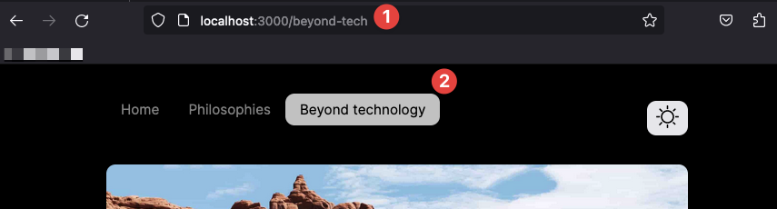
We’ll create two new pages to replace our dead Philosophies and Beyond technology navigation links.
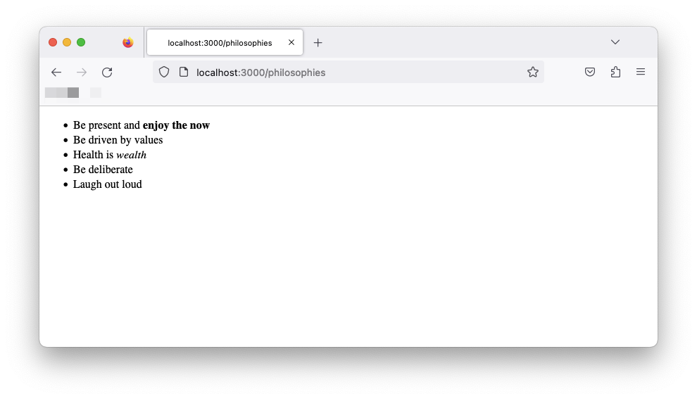
Create the first page in src/pages/philosophies.md with the following content:
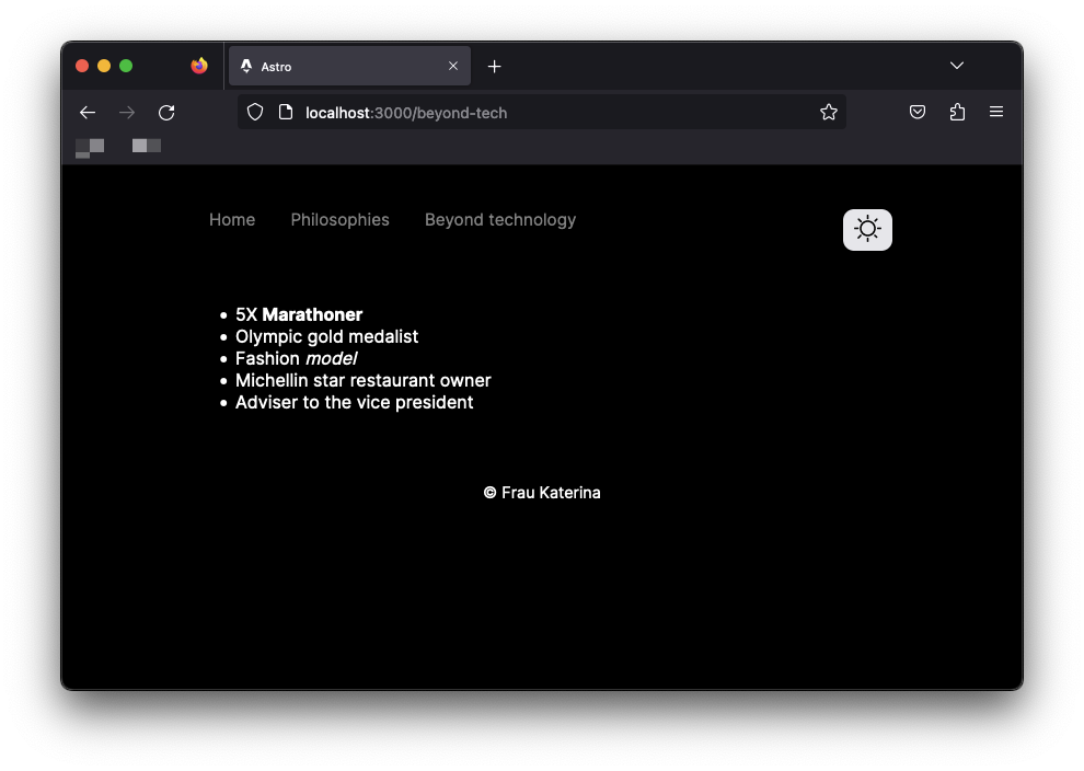
- 5X **Marathoner**- Olympic gold medalist- Fashion _model_- Michelin-star restaurant owner- Adviser to the vice presidentCreate the second page in src/pages/beyond-tech.md with the following content:
- Be present and **enjoy the now**- Be driven by values- Health is _wealth_- Be deliberate- Laugh out loudThese files are written in markdown syntax6.
As with Astro component pages, markdown pages eventually get compiled to standard HTML pages rendered in the browser. The same file-based routing is also used. For example, to access the philosophies and beyond-tech pages, visit the /philosophies and /beyond-tech routes, respectively.
Navigating between pages
Navigating between pages in Astro requires no magic wand. Surprise!
Astro uses the standard <a> element to navigate between pages. This makes sense as each page is a separate HTML page.
Let’s update the navigation links to point to the new markdown pages as shown below:
<!-- 📂 NavigationBar.astro -->
<li>  <a href="/">Home</a></li>
<li>  <a href="/philosophies">Philosophies</a></li>
<li>  <a href="/beyond-tech">Beyond technology</a></li>
Clicking any of these links should now lead us to their appropriate pages.
Markdown layouts
Let’s face it; we won’t be winning any design awards for our current markdown pages. This is because they seem off and don’t share the same layout as our existing page. Can we fix this?
You’ve probably realised I ask questions and then provide answers. All right, you’ve got me. So that’s my trick to make you think about a problem — hoverer brief — before explaining the solution.
Believe it or not, Astro component frontmatter was inspired by markdown! The original markdown syntax supports frontmatter for providing metadata about the document. For example, we could add a title metadata as shown below:
---title: Understanding Astro---This is excellent news because Astro leverages this to provide layouts for markdown pages!
Instead of the so dull I can’t take it page, we can utilise a layout to bring some reusable structure to all our markdown pages.
Let’s get started.
With Astro markdown pages, we can provide layouts for a markdown page by providing a layout frontmatter metadata as shown below:
---layout: path-to-layout---First, let’s reuse the same Main layout by adding the following to both markdown pages:
// add at the top of the Markdown pages.---layout: ../layouts/Main.astro---The markdown pages should now reuse our existing layout with the theming, navigation and footer all set in place!
Since Main.astro includes our global.css files, let’s go ahead and provide some default global styles for paragraphs and lists:
 {  /** 📂 src/styles/global.css **/}p,li {  font-size: 1rem;  color: var(--gray-400);  opacity: 0.8;}
li {  margin: 1rem 0;}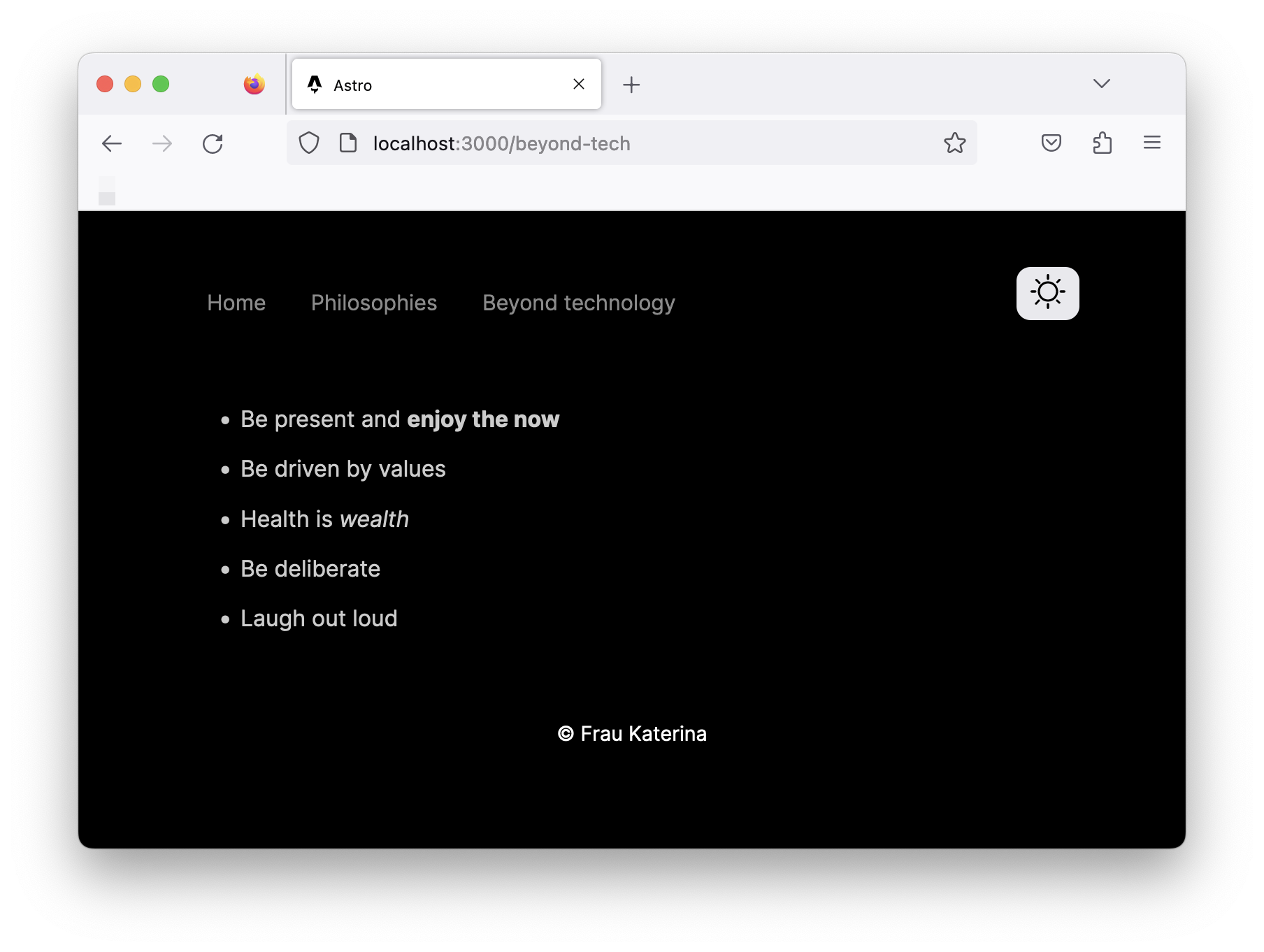
We should now have these styles take effect on our markdown pages! Isn’t life better with shared layout components? 😉
Composing layouts
Layouts are Astro components, meaning we can compose them, i.e., render a layout in another.
For example, let’s create a separate Blog.astro layout that composes our base Main.astro layout.
// 📂 src/layouts/Blog.astro---import Main from "./Main.astro";---
<Main>  <slot /></Main>
Composing the layouts in this way means we can reuse all the good stuff in Main.astro while extending Blog.astro to include only blog-specific elements.
The separation of concern significantly improves legibility and forces each layout to have a single responsibility.
Now, at this point, the markdown pages have the same layout markup and styles from Main.astro. We’ve made no customisations.
Component props
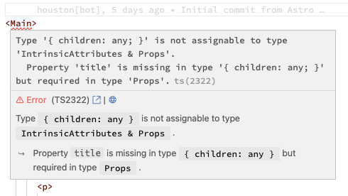
As we build reusable components, we often find situations where we must customise certain values within a component. For example, consider the <title> in our Main.astro layout component:
// 📂 src/layouts/Main.astro<title>Astro</title>A hardcoded title on every page where the Main layout is used is ridiculous.
To foster reusability, components can accept properties. These are commonly known as props.
Props are passed to components as attributes.
<Main title="Some title" />The prop values are then accessed via Astro.props. This is better explained with an example.
Go ahead and update Main to accept a title prop as shown below:
// 📂 src/layouts/Main.astro---// ...const { title } = Astro.props;---
<html lang="en">  <head>    {/** ... **/}    {/** 👀 look here **/}    <title>{title}</title>  </head>     {/** ... **/}</html>
To enforce Typescript checks, define the Props type alias or interface.
// Either of these is validtype Props = {  title: string,};
interface Props {  title: string;}
For simplicity, I’ll stick to a type alias for the Main layout:
// 📂 src/layouts/Main.astro---type Props = {  title: string}
const { title } = Astro.props;---// ...
With the type declared, we’ll have Typescript error(s) in files where we’ve used <Main> without the required title prop.
Update the index.astro and Blog.astro pages to pass a title prop to Main:
// 📂 src/layouts/index.astro<Main title="Frau Katarina">{/* ... */}// 📂 src/layouts/Blog.astro<Main title="Frau Katarina | Blog">{/* ... */}Leveraging markdown frontmatter properties
All markdown pages in our application will have a title, subtitle and poster. Luckily, a great way to represent these is via frontmatter properties.
Update the markdown pages to now include these properties, as shown below.
📂 src/pages/beyond-tech.md:
---layout: ../layouts/Blog.astroposter: "/images/road-trip.jpg"title: "Beyond Technology"subtitle: "Humans are multi-faceted. Beyond tech, I indulge in the following:"---
...
📂 src/pages/philosophies.md:
---layout: ../layouts/Blog.astroposter: "/images/philosophies.jpg"title: "My Guiding Philosophies"subtitle: "These are the philosophies that guide every decision and action I make."---
...
Note that poster points to image paths. These paths reference the public directory. So /images/philosophies.jpg points to an image in public/images/philosophies.jpg.
If you’re coding along, feel free to download any image from Unsplash and move them to the public directory.
Adding metadata to our markdown pages doesn’t do us any good if we can use them.
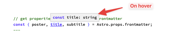
Luckily, markdown layouts have a unique superpower — they can access markdown frontmatter via Astro.props.frontmatter.
Let’s go ahead and globally handle this in our Blog.astro layout component. Below’s the component script section:
// 📂 src/layouts/Blog.astro---// import the type utility for the markdown layout propsimport type { MarkdownLayoutProps } from "astro";// import the base layout: Main.astroimport Main from "./Main.astro";
// defined the Props typetype Props = MarkdownLayoutProps<{  // Define the expected frontmatter props here  title: string;  poster: string;  subtitle: string;}>;
// get properties from the markdown frontmatterconst { poster, title, subtitle } = Astro.props.frontmatter;---- The
MarkdownLayoutPropsutility type accepts a generic and returns the type for all the properties available to a markdown layout. So feel free to inspect the entire shape7. MarkdownLayoutPropsaccepts our frontmatter property type definition as a generic, i.e.,title,posterandsubtitle. These are properties we’ve added in the frontmatter of our Markdown pages.type Props = ...orinterface Props {}is how we provide types for an Astro component.- The final line deconstructs the properties from
Astro.props.frontmatterwith full Typescript support.
Equally update the layout markup to render the image, title and subtitle:
<!-- 📂 src/layouts/Blog.astro --><main>  <figure class="figure">    <img      src={poster}      alt=""      width="100%"      height="480px"      class="figure__image"    />    <figcaption class="figure__caption">      Poster image for {title.toLowerCase()}    </figcaption>  </figure>
  <h1>{title}</h1>  <h2>{subtitle}</h2>
  <slot /></main>
<style>  h1 + h2 {    margin-bottom: 3rem;  }
  .figure {    margin: 0;  }
  .figure__image {    max-width: 100%;    border-radius: 10px;  }
  .figure__caption {    font-size: 0.9rem;  }</style>
Most of the markup is arguably standard. However, note the title.toLowerCase() call for the poster image caption. This is possible because any valid JavaScript expression can be evaluated within curly braces { } in the component markup.
Our markdown pages will now have styled titles, subtitles and poster images! With all this handled in one place — the markdown layout.

Interactive navigation state
Now that we’re pros at handling interactive scripts in Astro let’s go ahead and make sure that we style our active navigation links differently.
As with all things programming, there are different ways to achieve this, but we will go ahead and script this.
<!-- 📂 src/components/NavigationBar.astro --><script>  const { pathname } = window.location;  const activeNavigationElement = document.querySelector(    `nav a[href="${pathname}"]`  );
if (activeNavigationElement) { activeNavigationElement.classList.add("active"); }</script>- Get the
pathnamefrom thelocationobject. This will be in the form"/beyond-tech","/philosophiesor"/". - Since the
pathnamecorresponds to thehrefon the anchor tag element, we may select the active anchor tag via:document.querySelector(`nav a[href="${pathname}"]`). - Finally, we add the
activeclass to the active anchor tag.
Finally, add the relevant style for the active tag:
/* 📂 src/components/NavigationBar.astro */<style> /* ... */ a.active { background: var(--grey-900); color: var(--background); }</style>Viola! We should now have the active anchor tag styled differently.
Component composition
Our first look at component composition was with the Main and Blog layouts. Let’s take this further.
Our goal is to create a set of different yet identical cards. Each card acts as a link to a blog and will have a title and some background gradient.
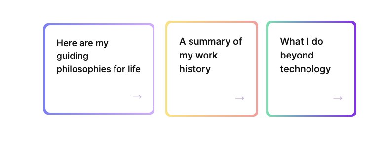
To achieve this, we’ll have a Cards.astro component that renders multiple Card.astro components.
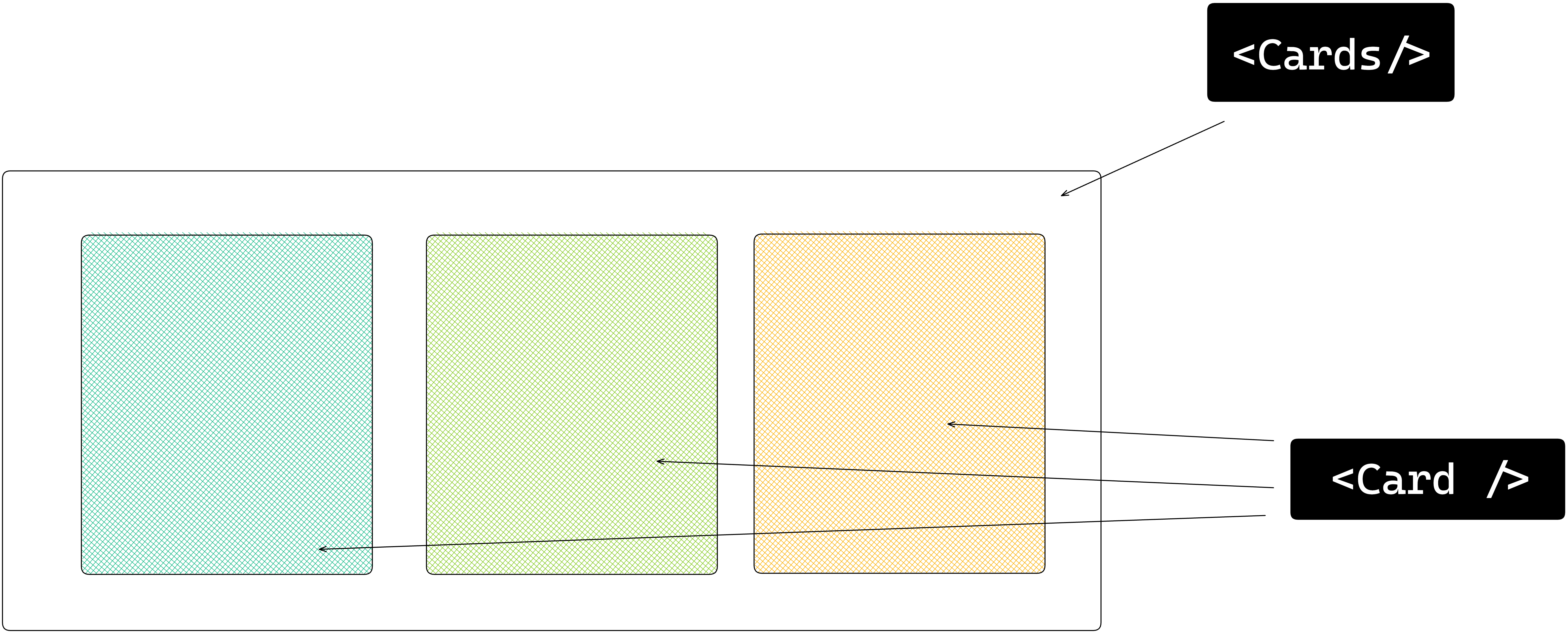
Let’s start by creating Card.astro.
Define the relevant component props and relevant markup as shown below:
// 📂 src/components/Card.astro---{/** Export the Props type alias **/}export type Props = {  to: string;  title: string;  gradientFrom: string;  gradientTo: string;};
// Get component props from Astro.propsconst { title, to } = Astro.props;---<a href={to} class="card"> <div class="card__inner"> <div class="card__title">{title}</div> <!-- Render the arrow via HTML entity name: → = →--> <div class="card__footer">→</div> </div></a>
<style> .card { /** local CSS variable reused below */ --radius: 10px;
padding: 4px; border-radius: var(--radius); text-decoration: none; transition: all 0.2s ease-in-out; }
.card:hover { transform: scale(0.95); }
.card__inner { background: var(--background); padding: 1.5rem; border-radius: var(--radius); display: flex; flex-direction: column; }
.card__title { font-size: 1.2rem; color: var(--grey-900); font-weight: 500; line-height: 1.75rem; }
.card__footer { padding-top: 2rem; font-size: 1.2rem; color: var(--grey-900); margin: auto 0 0 auto; }</style>Now, go ahead and create the Cards.astro component as follows:
// 📂 src/components/Cards.astro---// Import the Card componentimport Card from "./Card.astro";// Import the Card Props typeimport type { Props as CardProp } from "./Card.astro";
// Define the Props for this componenttype Props = {  cards: CardProp[]; // accepts an array of CardProps};
// Retrieve the cards propconst { cards } = Astro.props;---<div class="cards"> <!-- Dynamically render multiple Card components and spread the required card props --> {cards.map((card) => <Card {...card} />)}</div>
<style> .cards { display: flex; flex-direction: column; gap: 1rem; }
/* Since this is standard CSS, we can have media queries here */ @media screen and (min-width: 768px) { .cards { flex-direction: row; } }</style>To see the fruits of our labour, we must now import and render Cards in the index.astro page component.
// 📂 src/pages/index.astro---// ...import Cards from "../components/Cards.astro";---<Main> <div class="profile"> {/** ... **/} </div> {/** 👀 look here **/} <Cards cards={[ { title: "Here are my guiding philosophies for life", gradientFrom: "#818cf8", gradientTo: "#d8b4fe", to: "/philosophies", }, { title: "A summary of my work history", gradientFrom: "#fde68a", gradientTo: "#fca5a5", to: "/work-summary", }, { title: "What I do beyond technology", gradientFrom: "#6ee7b7", gradientTo: "#9333ea", to: "/beyond-tech", }, ]} /></Main>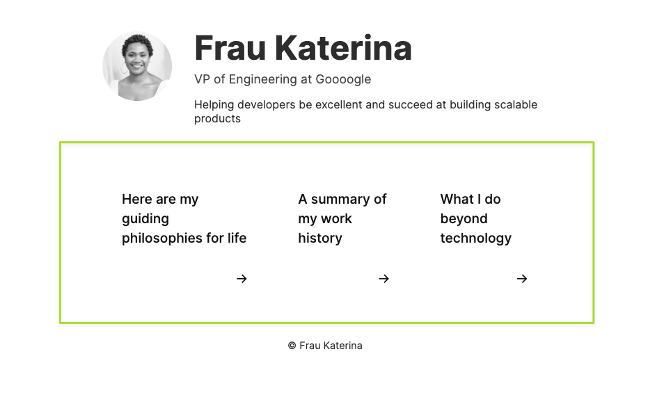
Clicking any of the links will point to the respective blog page.
Let’s not forget to add the new work-summary.md page:
// 📂 src/pages/work-summary.md---layout: ../layouts/Blog.astroposter: "/images/work-summary.jpg"title: "Work summary"subtitle: "A summary of my work:"---
- VP Engineering at Google- VP Engineering at Facebook- VP Engineering at Tesla- VP Engineering at Amazon- VP Engineering at Netflix
There we go!
The template flow of data
As we’ve discussed, the data in the frontmatter runs on the server and is not available in the browser.
As we’ve built our application, we’ve frequently leveraged data in the frontmatter in the template section, as shown below:
--- const data = "Understanding Astro"---
//Use data in the template<h1>{data}</h1>
This is easy to reason about for our static website. We know this will eventually be compiled into HTML.
However, consider a more robust markup that includes <style> and <script> elements. How do we reference data from the frontmatter in these markup sections?
--- const data = "Understanding Astro"---
// ✅ Use data in the template<h1>{data}</h1>
// styles<style> {/** ❌referencing data here will fail */}</style>
// scripts<script>{/** ❌referencing data here will fail */} console.log(data)</script>
One answer is via the define:vars template directive.
define:vars will pass our variables from the frontmatter into the client <script> or <style>. It’s important to note that only JSON serialisable values work here.
Let’s give this a shot.
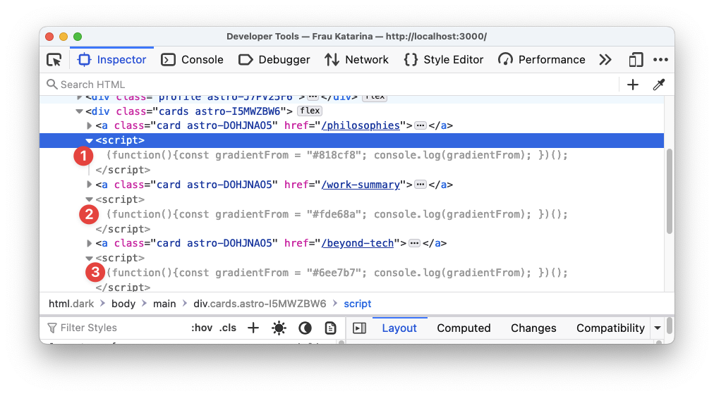
We must reference the gradientFrom and gradientTo variables passed as props in our <style>.
First, to make the variables available within <style>, we’ll go ahead and use define:vars as follows:
// 📂 src/components/Card.astro---const { title, to, gradientFrom, gradientTo } = Astro.props;// ...---
<style define:vars={{gradientFrom, gradientTo }}>  {/** ... **/}</style>
define:vars accepts an object of variables we want available within <style>.
The variables are defined but not used yet!
Now, we can reference the variables via custom properties (aka css variables) as shown below:
/** 📂 src/components/Card.astro **/<style define:vars={{gradientFrom, gradientTo }}> /** 👀 look here **/ .card { background-image: linear-gradient( to right, var(--gradientFrom), var(--gradientTo) ); } /** ... **/</style>And voila!
Our cards are now more beautiful than ever.
The dark side of define:vars
We’ve seen define:vars come in handy for using variables from the frontmatter of an Astro component. However, be careful when using define:vars with scripts.
Using define:vars with a <script> is similar to using the is:inline directive.
Astro will not bundle the script and will be added multiple times if the same component is rendered more than once on a page.
Here’s an example to make this clear.
In Card.astro go ahead and add a <script> with the define:vars directive as follows:
/** 📂 src/components/Card.astro **/<script define:vars={{ gradientFrom }}>console.log(gradientFrom);</script>Inspect the elements via the developer tools. You’ll notice that the <script> is inlined and unprocessed, i.e., just as we’ve written it, apart from being wrapped in an immediately invoked function execution (IIFE).
The script is also added three times — with a different value of gradientFrom for each rendered card.
With scripts, a better solution (except the inline behaviour is ideal for your use case) is to pass the data from the component frontmatter to the rendered element via data- attributes and then access these via Javascript.
For example, we may rewrite the previous solution as shown below:
------
<a href={to} class="card" data-gradientfrom={gradientFrom}> ... </a>...<script>  const card = document.querySelector(".card");
  // narrow the type of card to HTMLElement to access ".dataset"  if (card instanceof HTMLElement) {    // access data in dataset.gradientfrom    console.log(card.dataset.gradientfrom);  }</script>
Note that this is a contrived example and only retrieves the first card element with its associated gradientfrom data. Still, this demonstrates how to prevent unwanted behaviours with define:vars in <script>s.
Loading multiple local files
Let’s go ahead and create a new blog directory to hold some more markdown pages. The pages and their content are shown below:
📂 pages/blogs/rust-javascript-tooling.md :
---layout: "../../layouts/Blog.astro"poster: "/images/adventure.jpg"title: "Why Rust is the Future of Javascript Tooling"subtitle: "How to create fast, speedy developer experiences."---
- Rust is fast- Yes, it is fast- Touted as the new C++- Did I mention it's pretty fast?
📂 pages/blogs/sleep-more.md :
---layout: "../../layouts/Blog.astro"poster: "/images/sleeping-cat.jpg"title: "Why you should sleep more"subtitle: "Sleep is great for you. Here's why:"---
- Sleep- Sleep more- Sleep a little more
📂 pages/blogs/typescript-new-javascript.md :
---layout: "../../layouts/Blog.astro"poster: "/images/coding.jpg"title: "Typescript is the new Javascript"subtitle: "Typescript is becoming a standard for web development these days:"---
- Type safety- Type safety!- Even more type safety!
We aim to list these blog titles on our home page. One way to do this would be to render all link elements in index.astro manually:
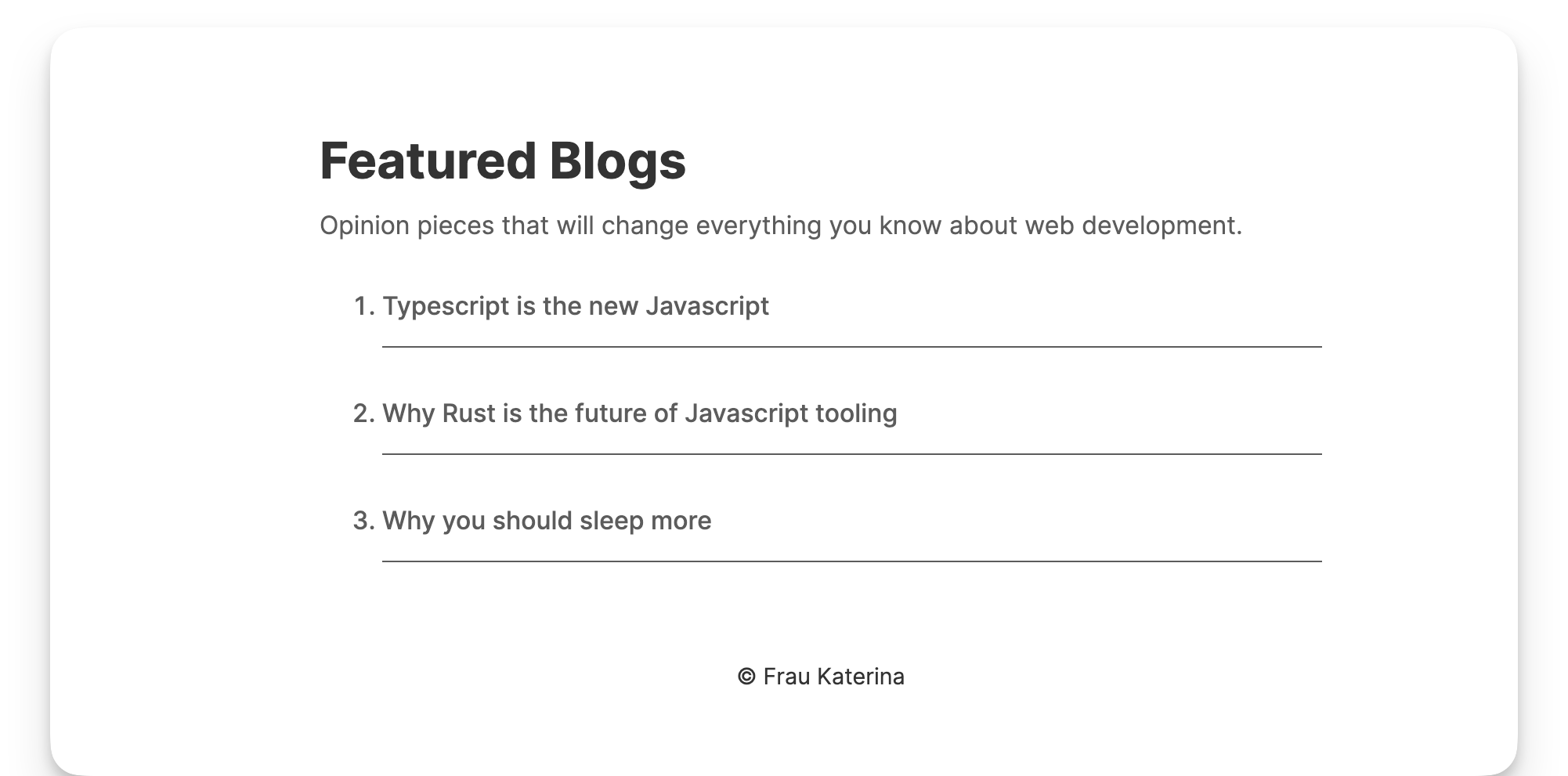
<!-- 📂 src/pages/index.astro -->...<main>  ...  <div class="featured-blogs">    <h3 class="featured-blogs__title">Featured Blogs</h3>    <p class="featured-blogs__description">      Opinion pieces that will change everything you know about web development.    </p>  </div>
  <ol class="blogs">    <li class="blogs__list">      <a href="blogs/typescript-new-javascript" class="blog__link"        >Typescript is the new Javascript</a      >    </li>
    <li class="blogs__list">      <a href="/blogs/rust-javascript-tooling" class="blog__link"        >Why Rust is the future of Javascript tooling</a      >    </li>
    <li class="blogs__list">      <a href="/blogs/sleep-more" class="blog__link"        >Why you should sleep more</a      >    </li>  </ol></main>
Then update our component styles:
<!-- 📂 src/pages/index.astro -->...<style>  ... .featured-blogs {    margin: 0;    padding: 3rem 0 0 0;  }  .featured-blogs__title {    font-size: 2rem;    color: var(--gray-900);  }
  .featured-blogs__description {    margin-top: -1.2rem;  }
  .blogs {    font-size: 1rem;    font-weight: 500;  }
  .blogs__list {    border-bottom: 1px solid;    border-color: var(--gray-200);  }
  .blog__link {    opacity: 1;    height: 100%;    display: block;    padding: 1rem 0;    color: var(--gray-200);    text-decoration: none;    transition: opacity 0.2s ease-in-out;  }
  .blog__link:hover {    opacity: 0.7;  }</style>
This isn’t necessarily a wrong approach to getting this done. We will now have a list of the blogs, as expected.
A better solution is to use Astro.glob() to load multiple files.
Astro.glob() accepts a single URL glob parameter of the files we’d like to import. glob() will then return an array of the exports from the matching file.
Talk is cheap, so let’s put this into action.
Instead of manually writing out the list of blog articles, we will use Astro.glob() to fetch all the blog posts:
// 📂 src/pages/index.astro---const blogs = await Astro.glob<{ poster: string; title: string; subtitle: string;}>("../pages/blogs/*.md");...---...- Note the argument passed to
.glob, i.e.,../pages/blogs/*.md. This relative glob path represents all markdown files in the/blogsdirectory. - Also note the typing provided.
.globimplements a generic, which, in this case, represents the markdown frontmatter object type.{poster: string;title: string;subtitle: string;}
Now, we may replace the manual list with a dynamically rendered list, as shown below:
// 📂 src/pages/index.astro... <ol> { blogs.map((blog) => ( <li class="blogs__list"> <a href={blog.url} class="blog__link"> {blog.frontmatter.title} </a> </li> )) } </ol>- Dynamically render the blog list using the
.maparray function. Astro.glob()returns markdown properties including frontmatter andurlwhereblog.urlrefers to the browser url path for the markdown file.
And voila! Same result with a much neater implementation.
Deploying a static Astro site
We’ve come a long way! Now, let’s deploy this baby to the wild.
Deploying a static website is relatively the same regardless of the technology used to create the site.
At the end of your deployment build, we’ll have static assets to deploy to any service we choose.
Once this is done, we must wire up a static web server to serve this content when your users visit the deployed site.
NB: a static web server is a web server that serves static content. It essentially serves any files (e.g., HTML, CSS, JS) the client requests.
This breaks down the process of deploying a static website into two:
(1) Create the static production assets (2) Serve the static assets via a static web server
Let’s do these.
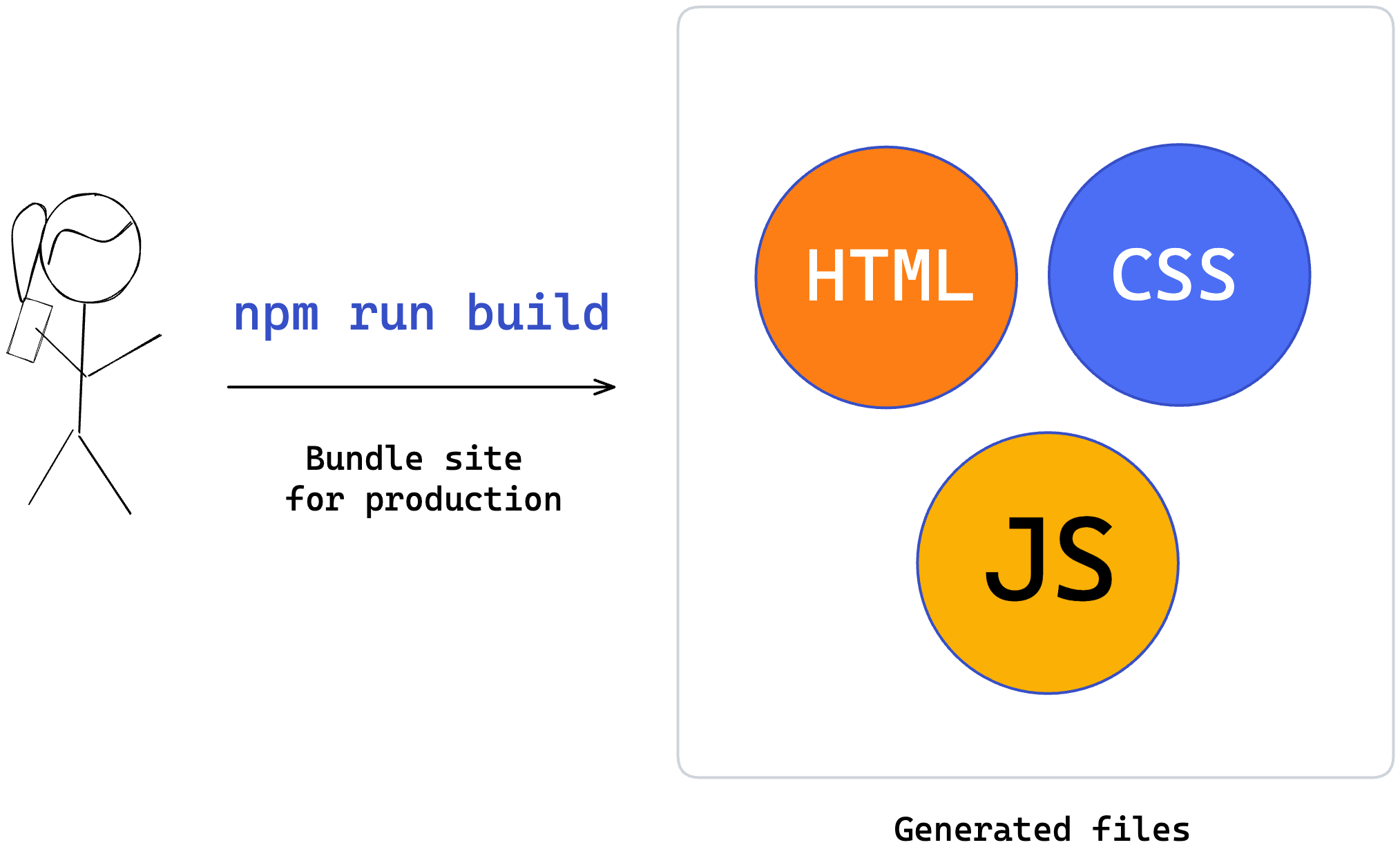
1. Create static production assets
To build our application for production, run the command:
npm run buildThis will internally run the astro build command and build our application production static assets.
By default, these assets will exist in the dist folder.
2. Serve the static assets via a static web server
Choosing a web server will come down to your choice. I’ll go ahead and explain how to use Netlify. However, the steps you must take with your web server provider will look similar.
Go over to Netlify and create an account.
Once you create an account and sign in, you’ll find a manual section to deploy a site.
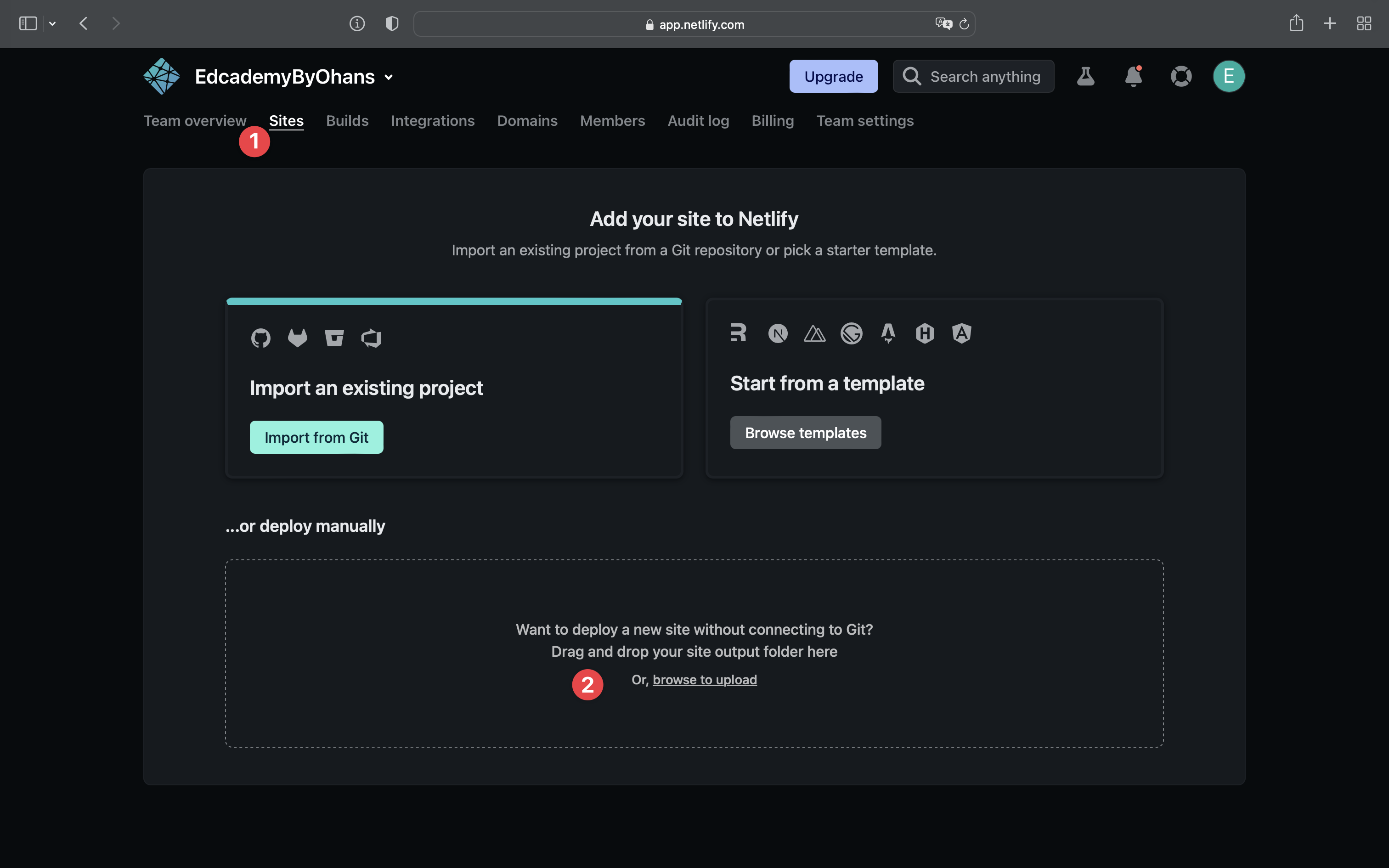
Now, click browse to upload and upload the dist folder containing our static production assets.
Once the upload is completed, you’ll have your site deployed with a random public URL, as shown below:
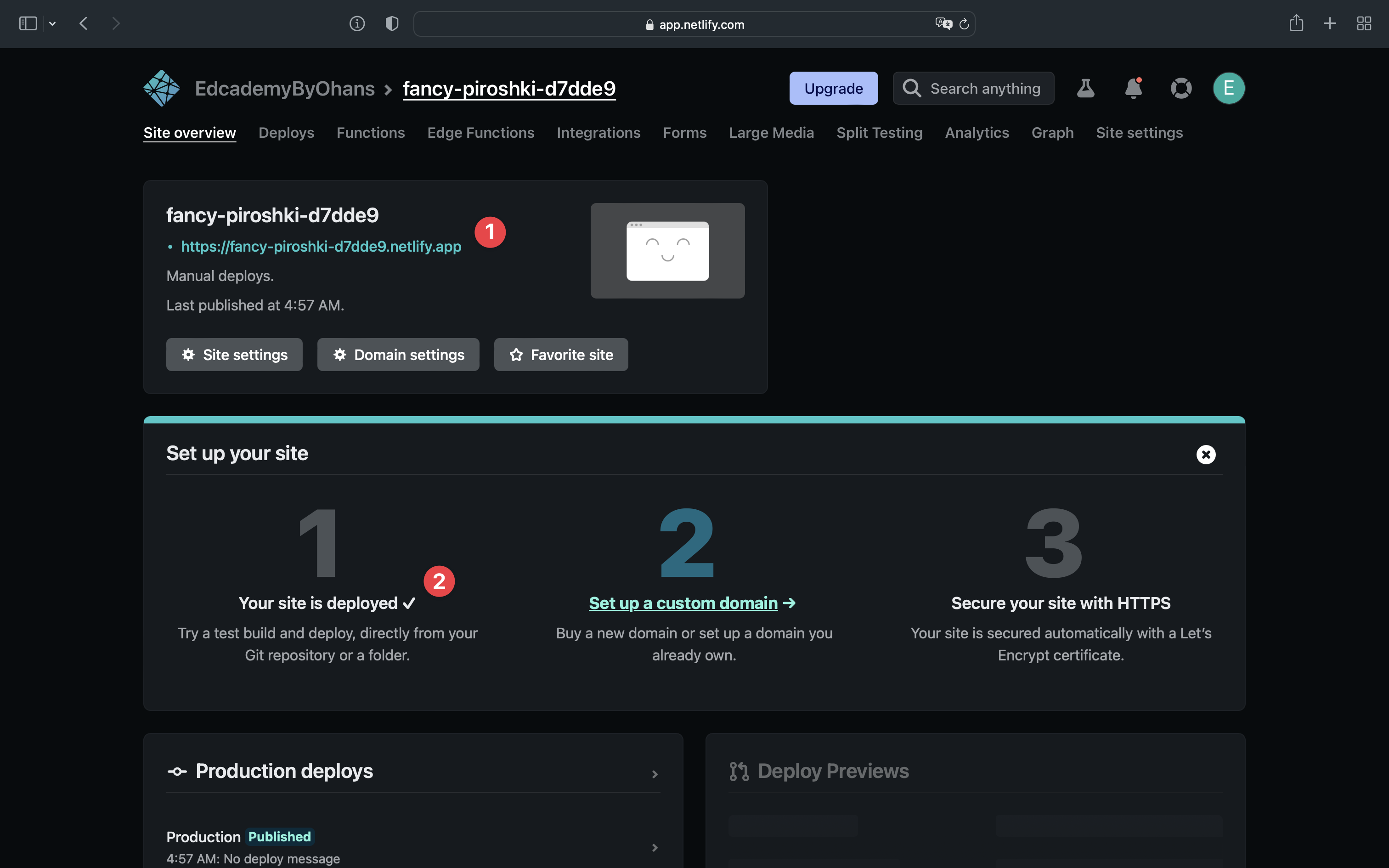
Visit the URL to view your newly deployed website!
The problem with manual deployments
Manual deployments are great for conceptually breaking down the process of deploying a static website.
However, in the real world, you may find this less optimal.
The main challenge here is that every change made to your website requires you to build the application and re-upload it to your server manually.
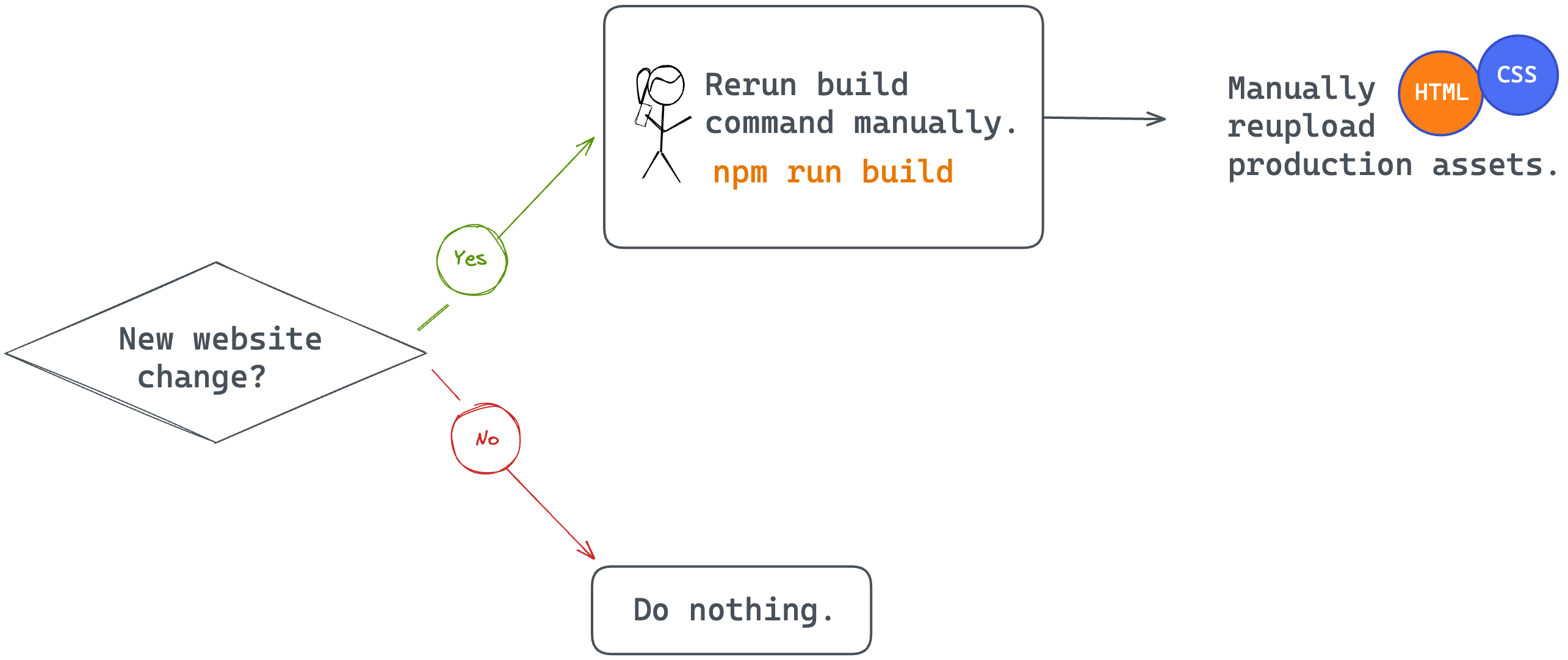
This is a well-known problem with a standardised solution. The solution involves automating the entire process of deploying static websites by connecting your website to a git provider.
Automating the deployment of a static website
Automating the deployment of a static website looks something like this:
Step 1: Write and push your code to a Git provider like GitHub.
Step 2: Connect the GitHub project to your static web server provider, e.g., Netlify.
Step 3: You provide your website’s build command and the location of the built assets to your web server provider, e.g., Netlify.
Step 4: Your web server provider automatically runs the build command and serves your static assets.
Step 5: Anytime you make changes to the GitHub project, your web server provider picks up the changes and reruns step 4, i.e., automatically deploying your website changes.
To see this process in practice with Netlify, go over to your dashboard and connect a Git provider (step 1).
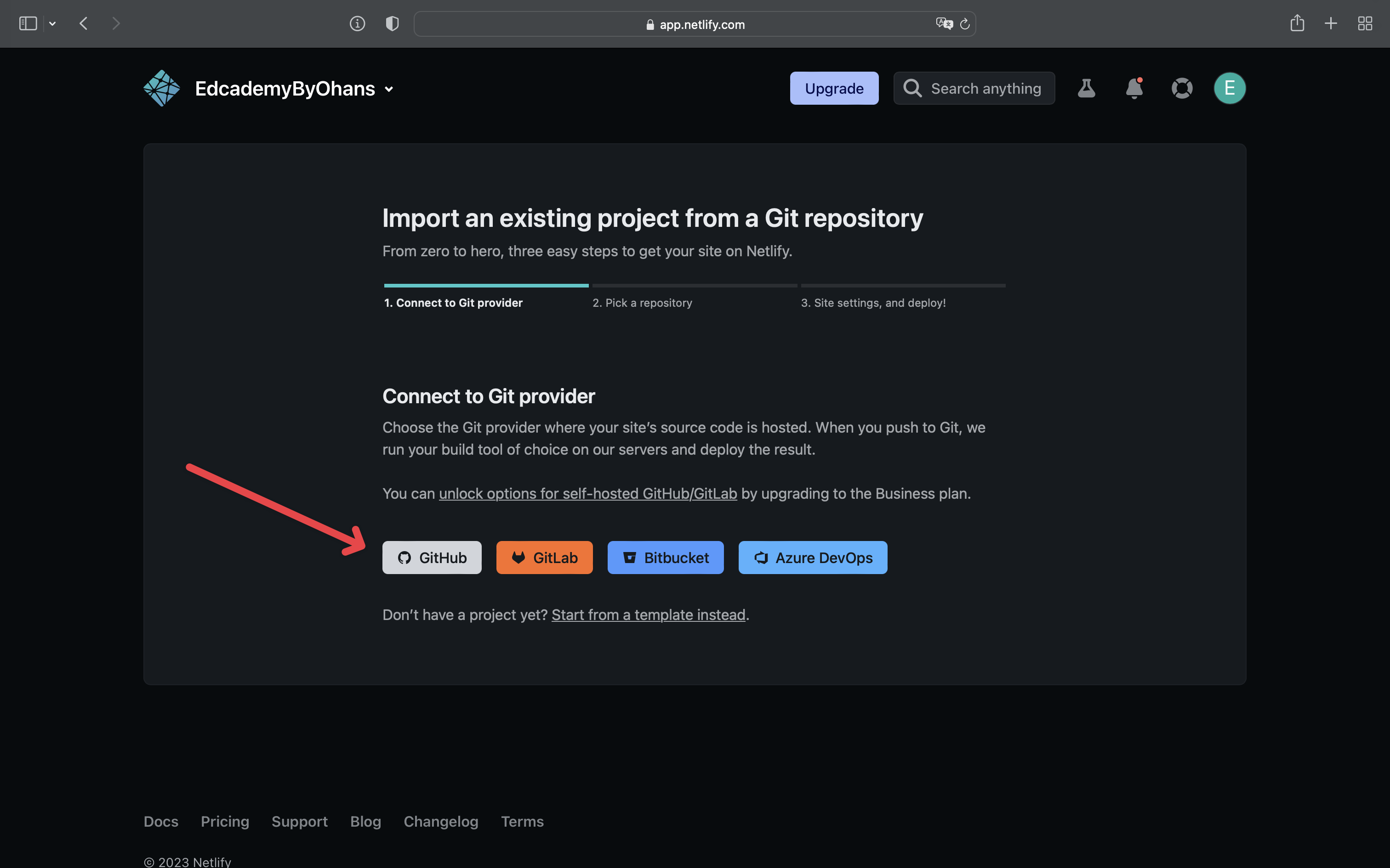
I’ll go ahead to select Github, authorise Netlify and select the GitHub project (step 2).
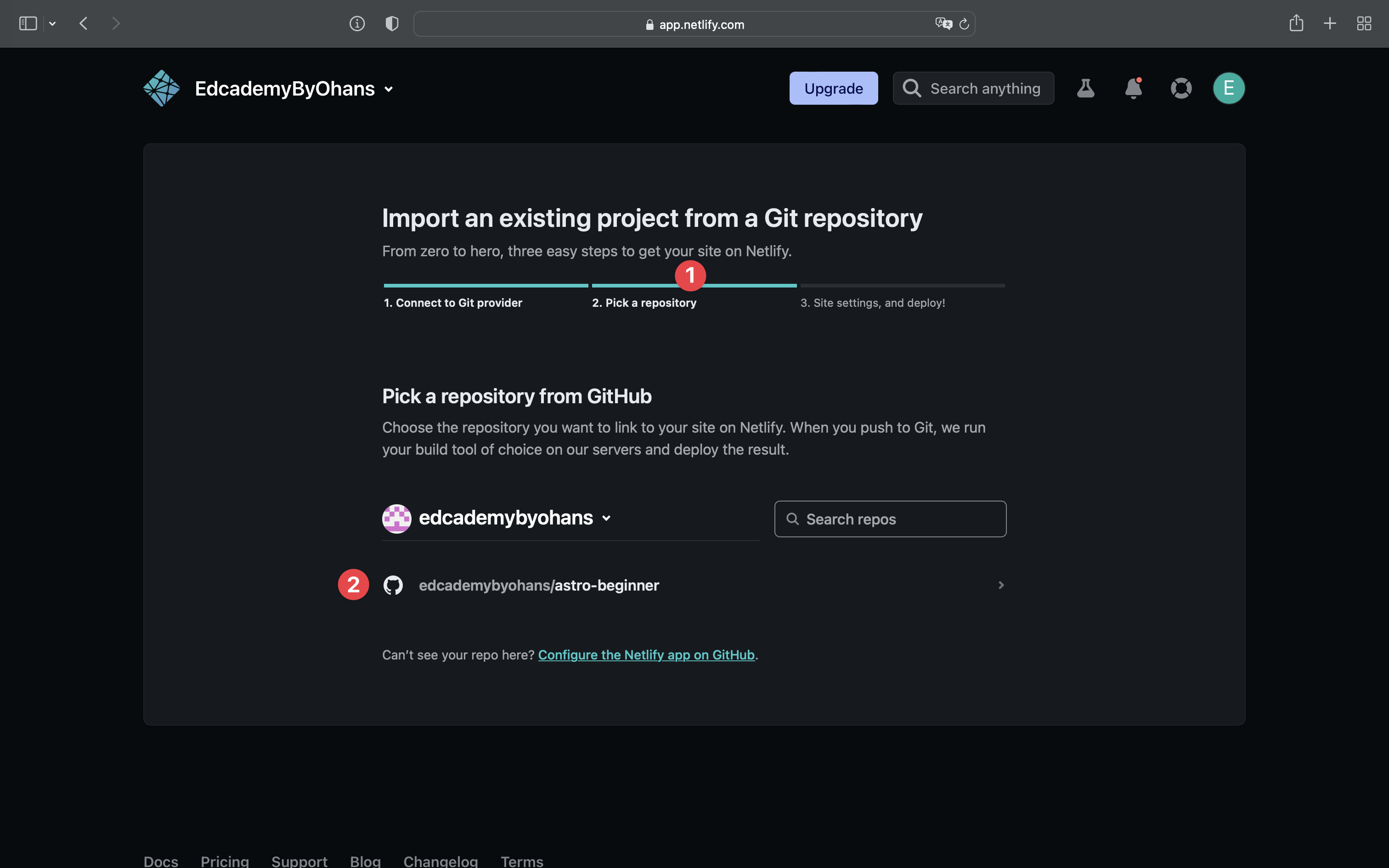
Once that’s selected, provide the settings for your application deployment (Step 3). By default, Netlify will suggest the build and publish directory. Check these to make sure there are no errors.
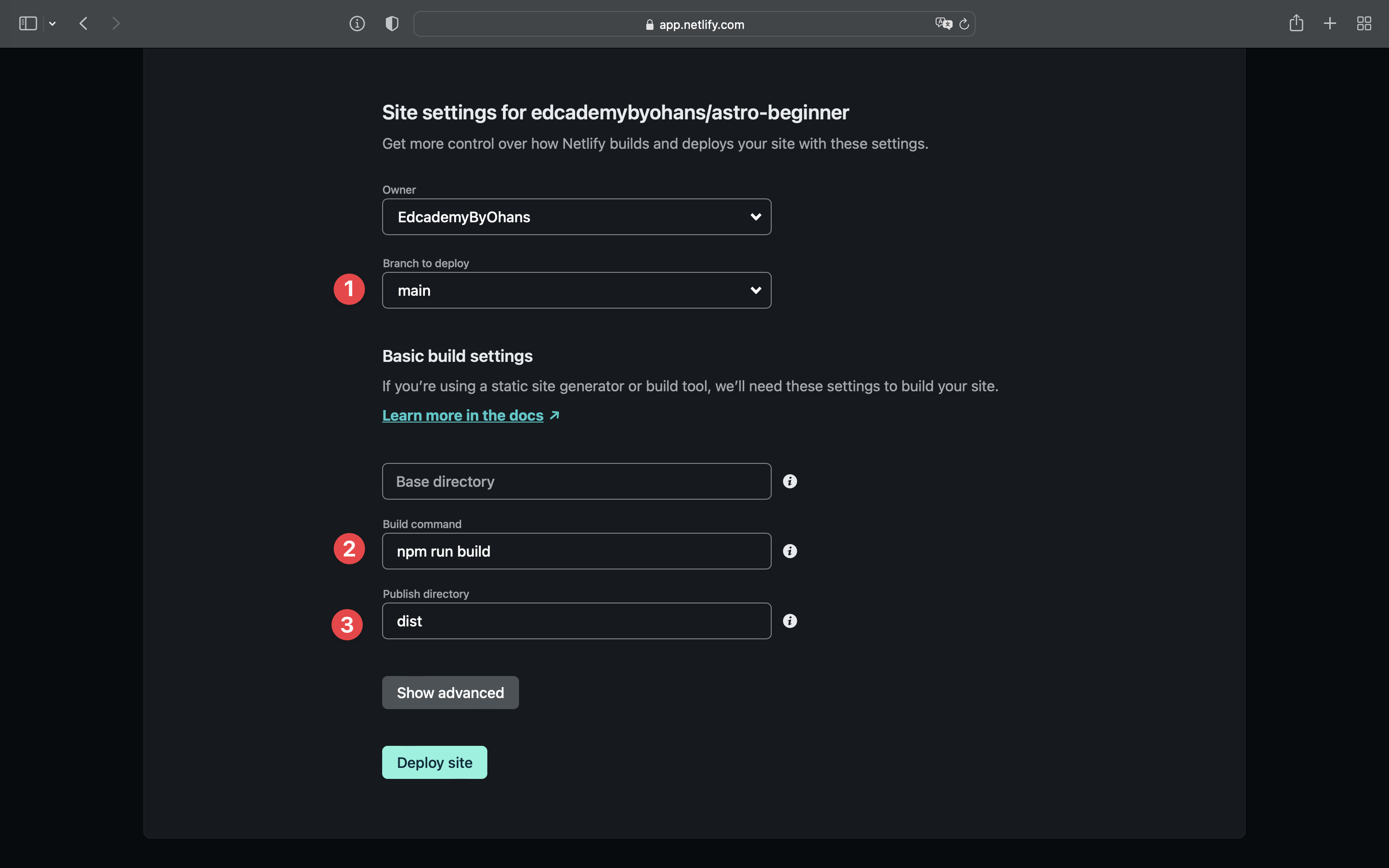
Hit deploy, and your site will be live in seconds (step 4).
To see the redeployment after a new change, push a new change to the connected git repository.
How fast is our Astro website?
Astro boasts of insanely fast websites compared to frameworks like React or Vue.
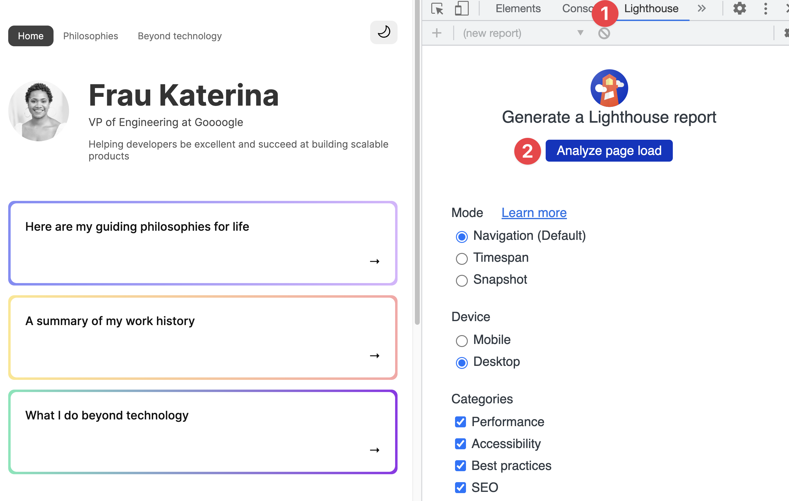
Let’s put this to the test by following the steps below:
- Visit the newly deployed website on Chrome.
- Open the Chrome developer tools.
- Go to the Lighthouse tab.
- Analyse the page load.
Here’s my result running the test:
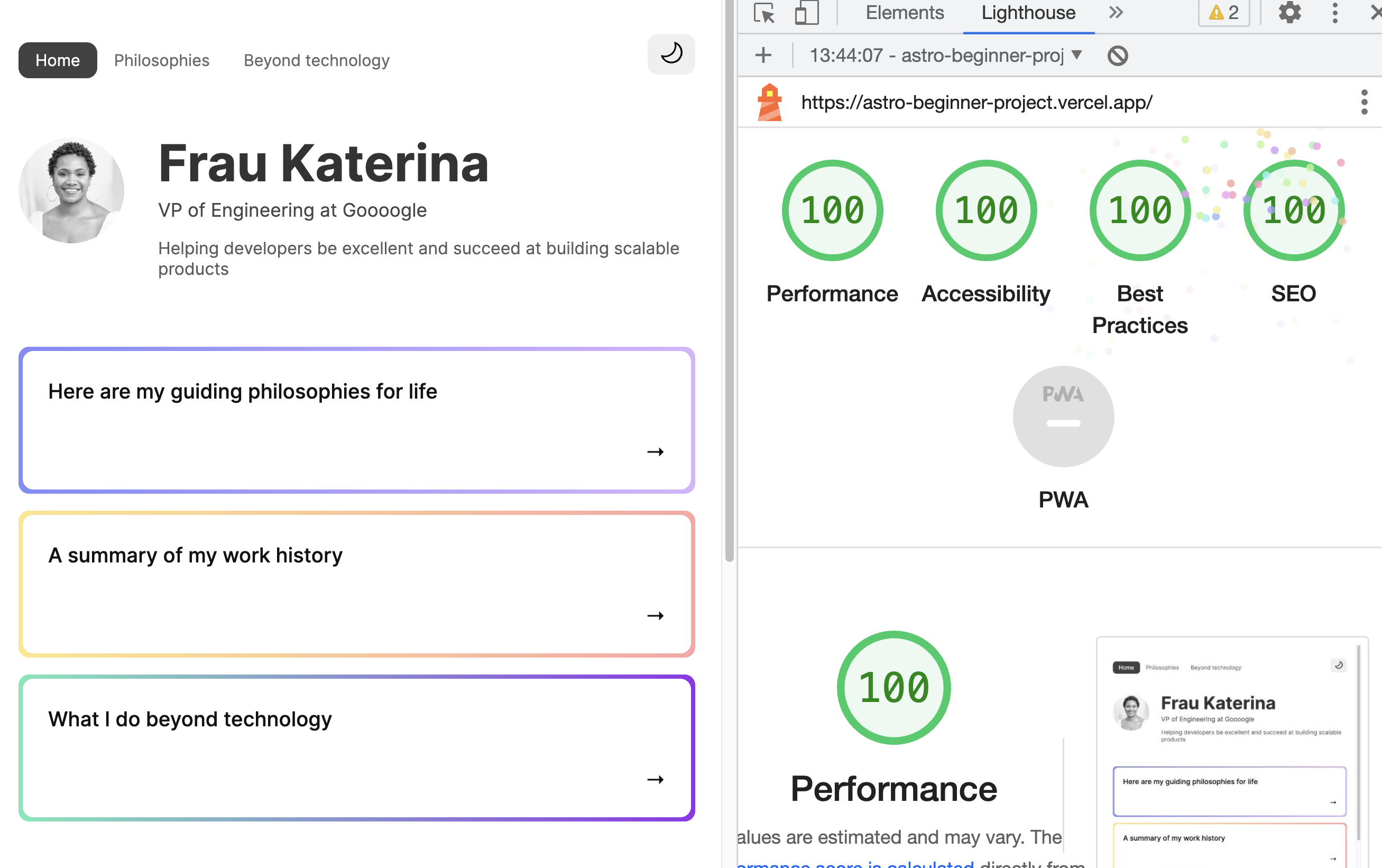
If this were a school examination, we would have just scored A+ on performance without trying!
This is a fast website!
Feel free to run the test on other pages!
Conclusion
This has been a lengthy discourse on Astro! We’ve delved into building a project and learned a handful of Astro’s capabilities, from installation to project structure to the nuances of inline scripts and, eventually, project deployment.
Why stop here? We’ve only just scratched the surface.
Footnotes
-
For other editors, please see the official Astro site https://docs.astro.build/en/editor-setup/ ↩
-
What is a “.d.ts” file in Typescript? https://medium.com/@ohansemmanuel/what-is-a-d-ts-file-in-typescript-2e2d90d58eca ↩
-
As we’ll see later, they can also be used in .mdx files. ↩
-
Don’t know CSS variables? Read my guide https://medium.com/free-code-camp/everything-you-need-to-know-about-css-variables-c74d922ea855 ↩
-
What is Markdown? https://en.wikipedia.org/wiki/Markdown ↩
-
The markdown syntax cheatsheet https://www.markdownguide.org/cheat-sheet/ ↩
-
Markdown layout properties: https://docs.astro.build/en/core-concepts/layouts/#markdown-layout-props ↩