36 min read
Edit pageChapter 5: Oh my React!
Everything you need to know to develop rich content websites with real-world best practices. This is a practical section best served with you coding along.


What you’ll learn
- Styling Astro projects with Tailwind.
- Several syntax highlighting solutions for Astro.
- Leveraging content collections for scalable and type-safe development.
- Understand dynamic routing in Astro.
Set up the starter project
We’ve spent ample time learning the ins and outs of building static websites with Astro. So, in this chapter, we will not start from scratch.
Instead, we’ll begin with a basic static project we’ll build upon throughout the chapter.
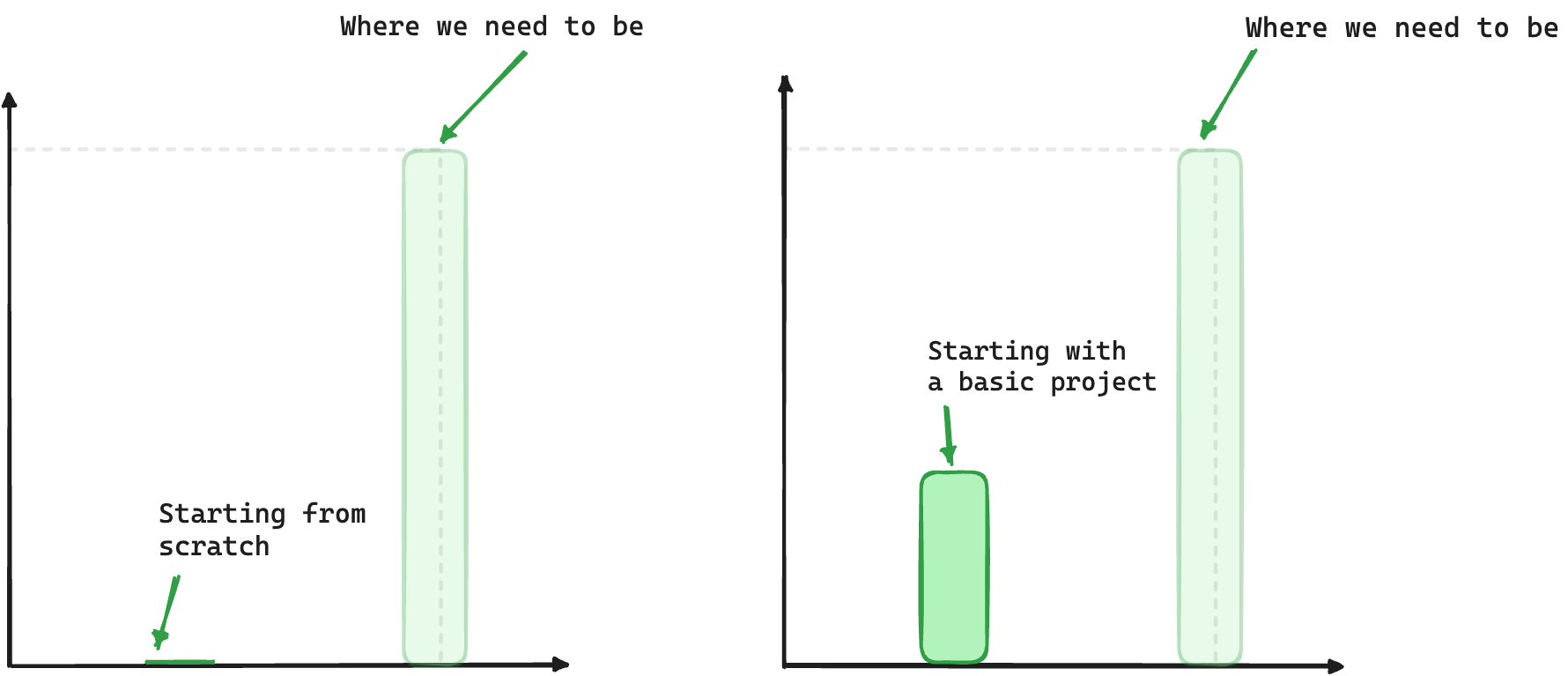
In this chapter, we will adopt a solution-oriented approach similar to that of detectives. We aim to solve various TODOs scattered throughout the starter project.
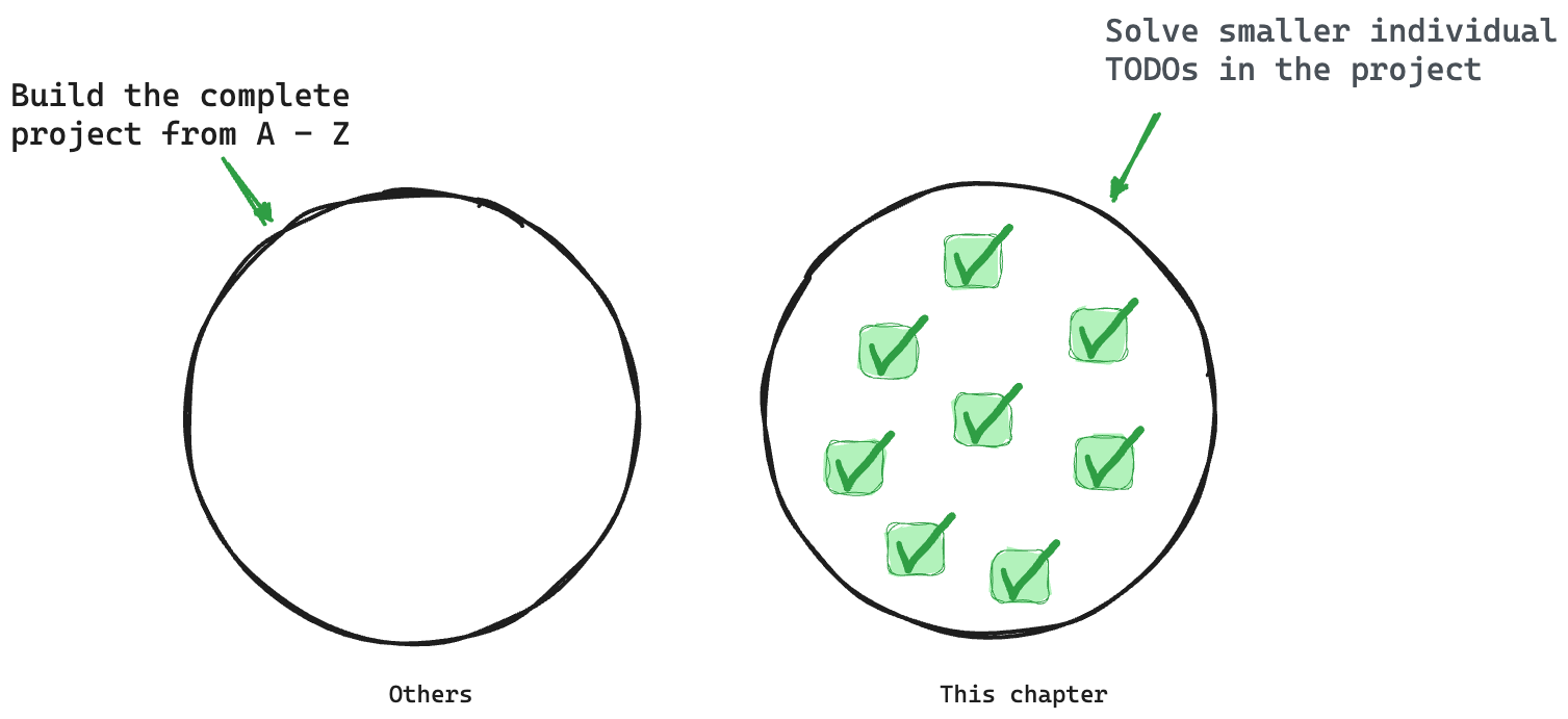
The reason for this is to ignore already learned concepts and focus on learning new concepts or consolidating older concepts via practice — solving isolated problems.
To get started, go ahead and clone the project:
git clone https://github.com/understanding-astro/react.dev-astro.gitThen change directories:
cd react.dev-astroFinally, checkout to the clean-slate branch I’ve prepared so we can systematically build upon the base application.
git checkout clean-slateInstalling dependencies
Go ahead and install the project’s dependencies via the following:
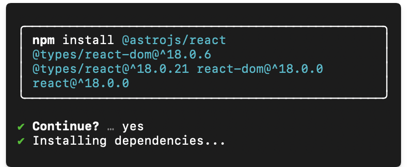
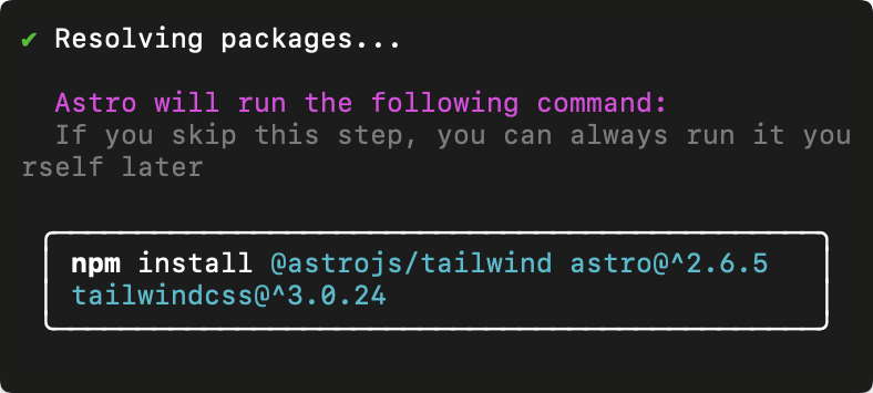
npm installThen install the Astro react integration:
npx astro add reactWhen prompted, type “y” to accept each prompt. “y” means “yes”!
The complete installation will add all relevant react dependencies and updates the astro.config.mjs project configuration file.
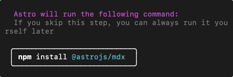
Finally, go ahead and install the mdx integration. I’ll describe the what and why later in the chapter. For now, go ahead and install the integration by running the following:
npx astro add mdxThis will install the @astrojs/mdx integration and also update the astro.config.mjs project configuration file.
Now run the application:
npm startThis will run the application in an available local port e.g., the default localhost:3000.
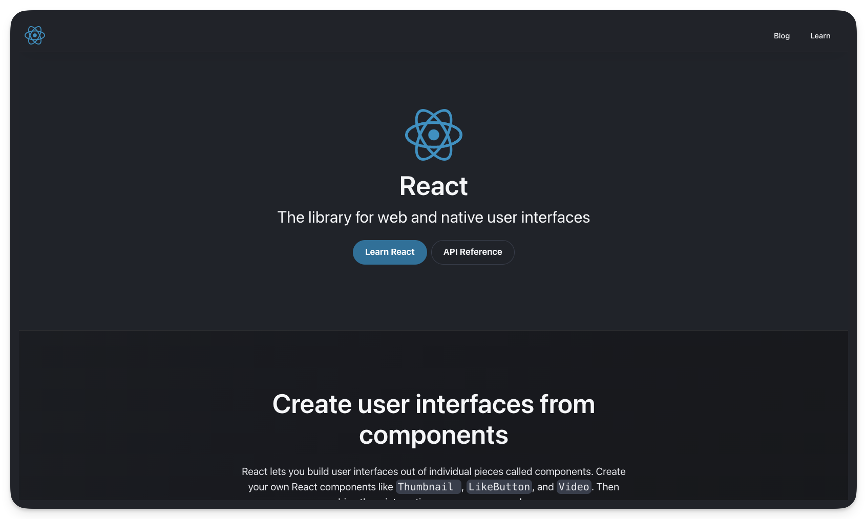
Visit the local server and you’ll find the base unstyled application running in the browser as shown below:
I’ve got to say that’s one ugly-looking page.
We’ll fix that next.
Styling Astro projects with Tailwind
Love or hate it, CSS is how we make beautiful web applications.
In Chapter One, we wrote the styles for the personal website by hand i.e., by writing out every CSS declaration, however, in this chapter, we will use a CSS framework called Tailwind.
So, what’s Tailwind?
An overly simple definition would be, Tailwind is the modern bootstrap. Never used Bootstrap? Then think of Tailwind as a utility-first CSS framework that provides class names like flex, text-lg, items-center and many more that you can apply to your markup for styles.
Tailwind will enable us to build modern-looking websites — fast.
Installing Tailwind
Keep the project running in your terminal and open another terminal tab. Run the following install command:
npx astro add tailwindThis will install the Astro tailwind integration in the project and update the project configuration.
Once the installation is complete, the existing application styles will now take effect. Visit the application on your local port to see the styled application.
What a difference styling makes!
Take your time and browse the different pages of the styled application.
How does Tailwind work?
Using Tailwind in Astro is straightforward. Install the Tailwind integration and provide a class attribute with Tailwind utility classes in your component markup.
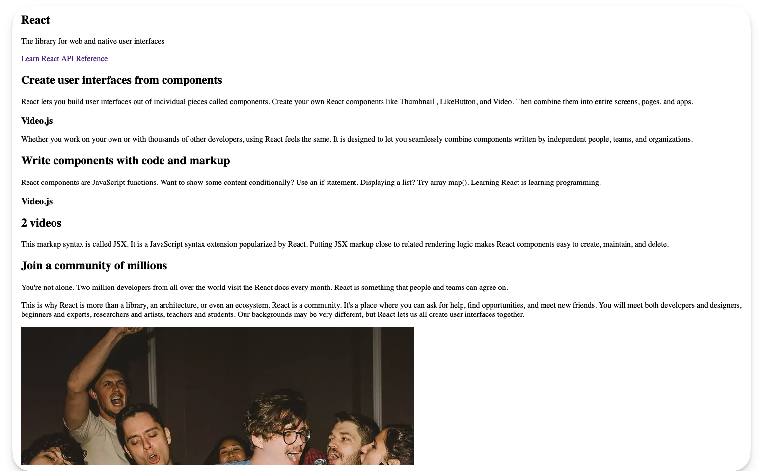
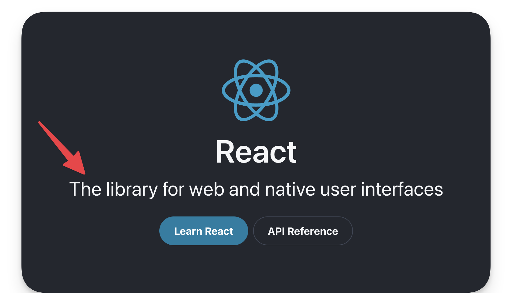
For example, consider the styled text “The library for web and native user interfaces” on the project homepage:
Now, consider the code responsible for the styles:
// ...<p class="max-w-lg py-1 text-center font-display text-4xl leading-snug text-secondary dark:text-primary-dark md:max-w-full"> The library for web and native user interfaces</p>In the example above, the classes applied are as shown below:
"max-w-lg py-1 text-center font-display text-4xl leading-snug text-secondarydark:text-primary-dark md:max-w-full"While this is not a Tailwind book, it’s only fair to give a general explanation of what’s going on here.
Firstly, most Tailwind utility classes are well-named and you can infer what they do. Others might not.
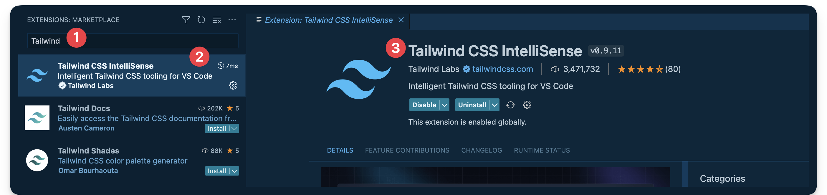
If you’re coding along in VSCode, I recommend installing the official Tailwind integration:
If you’re not using VSCode, consider finding your editor setup in the official Tailwind docs.
Installing the integration brings a lot of benefits. The important benefit I’d love to highlight here is you can hover over any of the Tailwind utility classes to see the exact CSS property value the class corresponds to.
For example, hovering over the max-w-lg displays the css property value for the utility class as shown below:
.max-w-lg { max-width: 32rem /* 512px */;}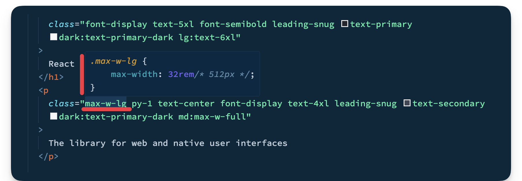
This is very helpful because you can now inspect whatever classes are added to any markup in the project!
Tailwind configuration
Upon installing Tailwind, it ships with its default theme.
It’s not a bad theme, however, when you build projects, you likely want control over the project theme.
In our example, we want a theme that models the official React documentation theme.
To customise Tailwind, we can provide a tailwind.config.js file where we can define our project’s fonts, colour palette, type scale, border radius values, breakpoints and much more.
Look at the tailwind.config.cjs file in the project’s root. This is where the project’s tailwind configuration magic happens.
For more details on customising Tailwind, please consult the official documentation.
Typescript import alias
Let’s be honest, no one likes those ugly relative imports, eh?
import MyComponent from '../../components/MyComponent.astroUgh!!
C’mon, we can do better.
This is where import aliases come in. The easiest way to get this set up in an Astro project is to define the aliases in the tsconfig.json file.
For example, we may do the following:
// 📂 tsconfig.json
{  "compilerOptions": {    "baseUrl": ".",    "paths": {      "@components/*": ["src/components/*"],    }  }}
We’re essentially mapping any directories in the src/components import path to @components.
Now, wait for it.
The result of this is we can take our previous ugly import path and turn it into a work of art as shown below:
// Beforeimport MyComponent from '../../components/MyComponent.astro
// Afterimport MyComponent from '@components/MyComponent.astro'
Beautiful and clean, isn’t it?
The reason I mention this is the starter project has been set up to use import aliases. So, don’t get confused.
Go ahead and look in the tsconfig.json file where you’ll find the following import aliases:
"paths": { "@components/*": ["src/components/*"], "@layouts/*": ["src/layouts/*"], "@utils/*": ["src/utils/*"]}You’re welcome 😉
Islands & colocating page components
We’ve learned that appropriate file types in the src/pages directory get transformed into HTML pages.
However, what if we need to have some files collocated in the src/pages directory without being transformed into accompanying HTML pages?
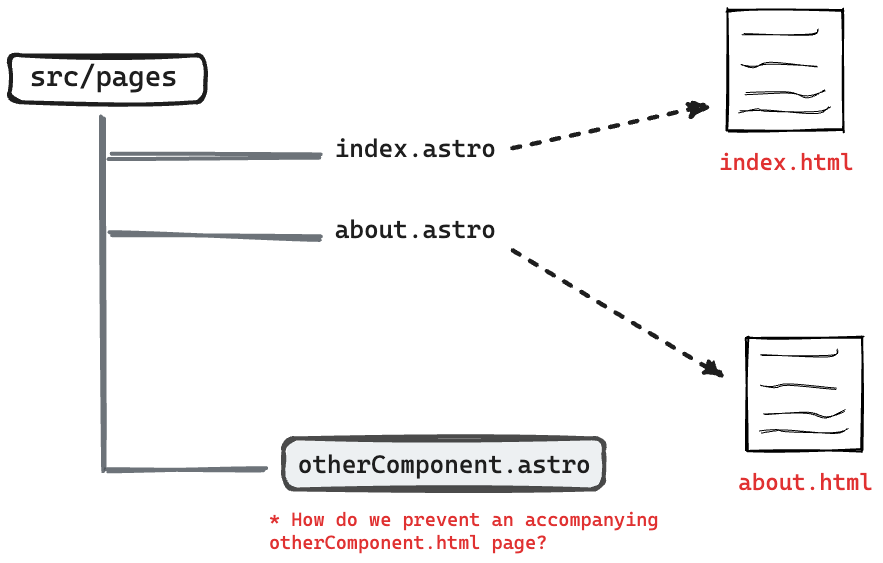
This can be helpful for collocating tests, utilities and components along the associating pages.
Well, there’s a solution for that.
To exclude a valid page file type in the src/pages directory from being compiled into an associating HTML page, prefix the file name with an underscore _.
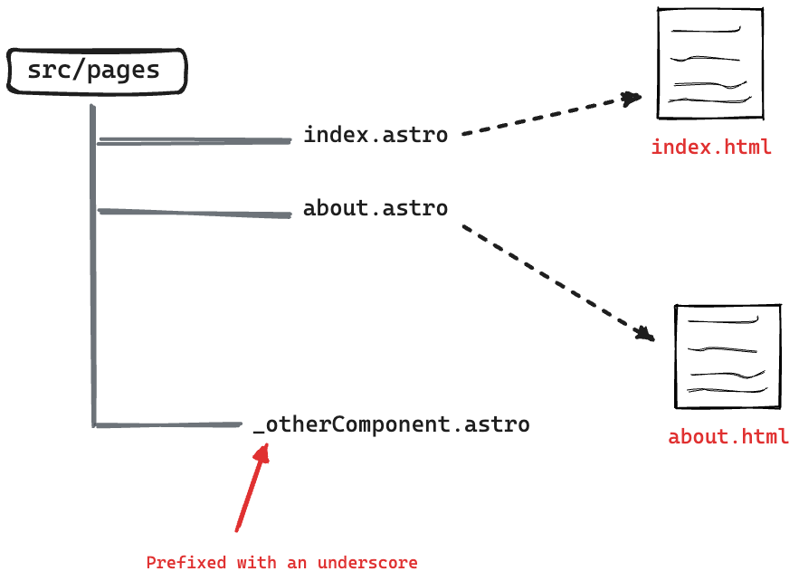
For example, take a look at the pages/_components/Home directory in the project.
This directory contains a handful of components that aren’t meant to be reusable across the project. They only exist to be used on the project’s homepage.
To exclude these from being separate browser pages, note how the _components directory is named.
As an example, if you visited /_components/Home/Code in the browser, this will return a 404. Even though the Code components exist, it is not a page.
Now, let’s bring our knowledge of collocated components and Astro islands together to solve our first TODO in the project.
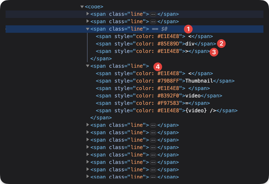
Take a look at the index.astro and consider the TODO to render the Video React component as shown below:
// 📂 src/pages/index.astro❗️ <Code class="text-white">TODO:</Code> (Astro Island): Render the ...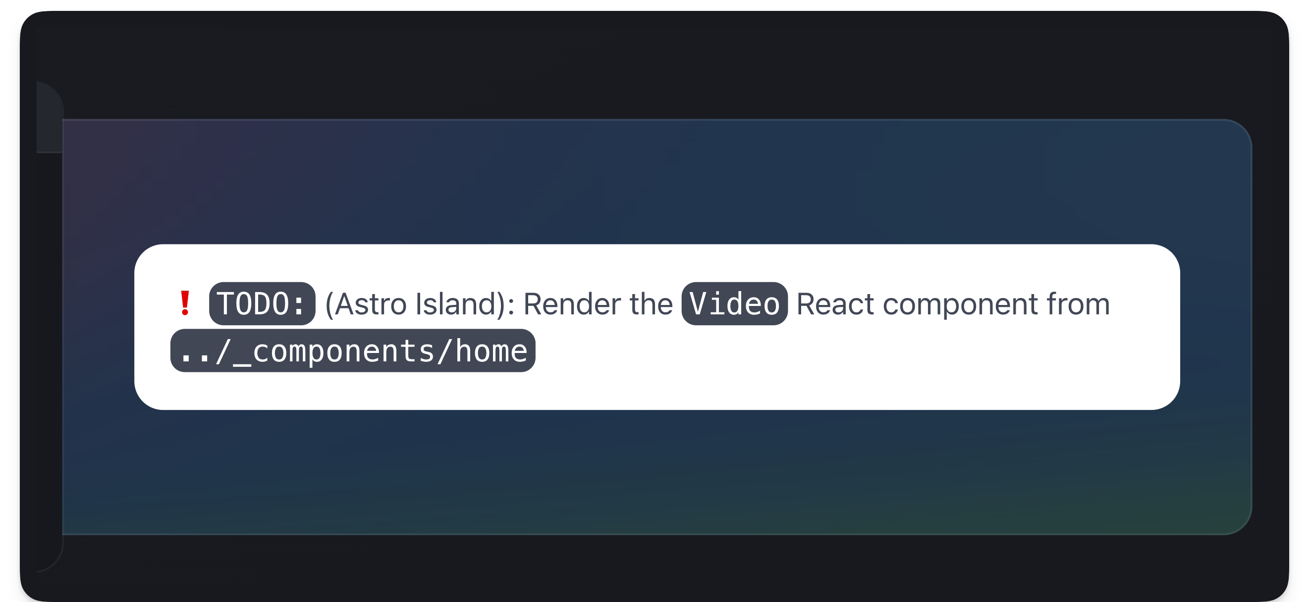
Now consider the annotated solution below:
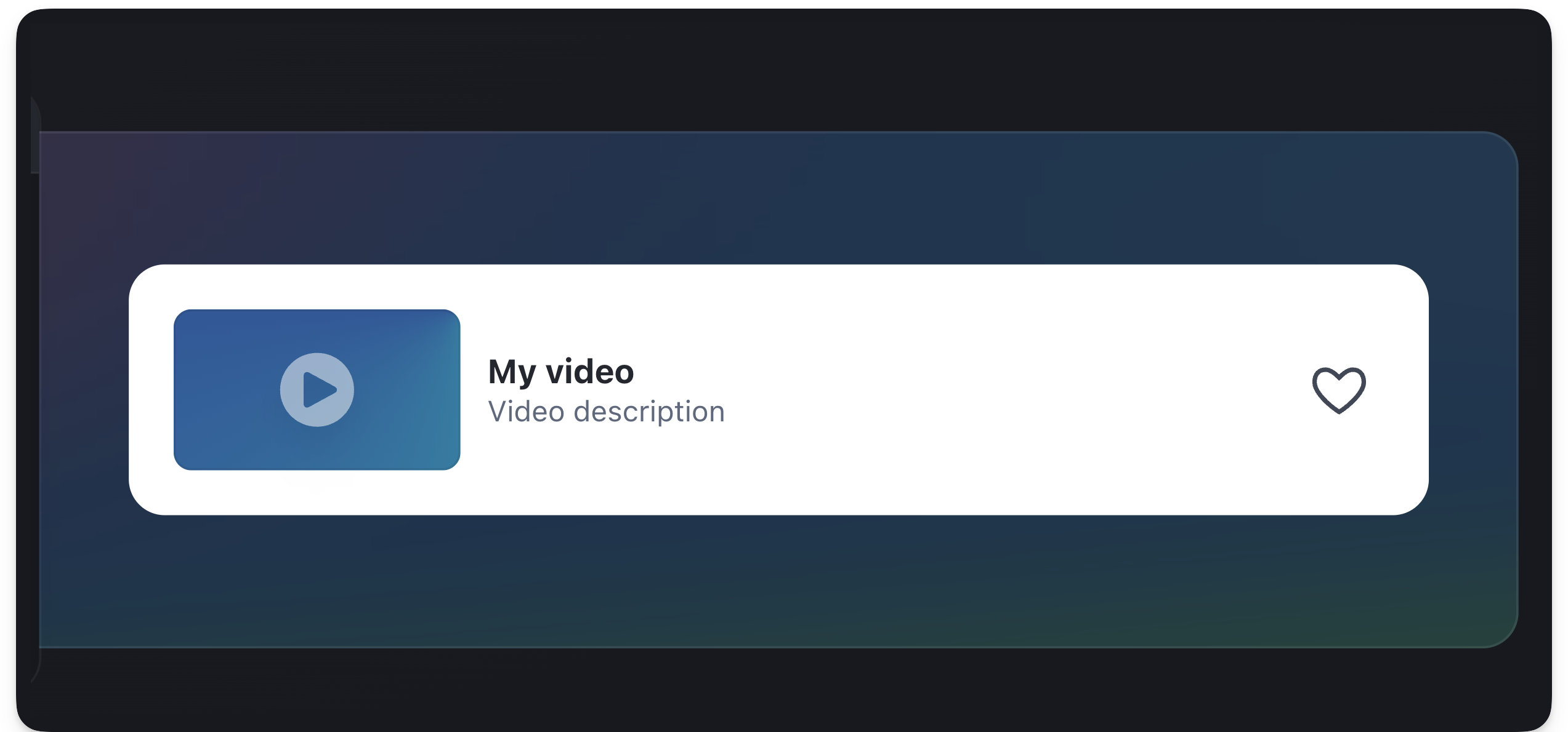
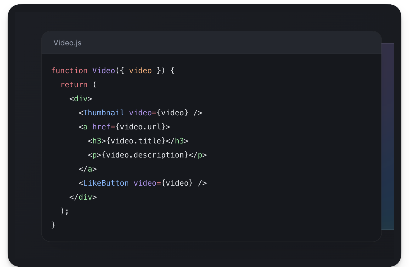
// 📂 src/pages/index.astro===// Import the Video component from "_components ..."import { Video } from "./_components/home/Video";// ...---<ExampleResultPanel slot="right-content"> {/** Render the Video component. NB: this is a React component **/} <Video client:visible {/** 👈 Add the client directive **/} video={{ title: "My video", description: "Video description" }} /></ExampleResultPanel>- Render the
VideoReact component - Pass a
client:visibleattribute to hydrate the island as soon as the component is visible - Finally pass the required
videoobject props to theVideocomponent:{title: "my video", description: "Video description"}.
Similarly, let’s resolve the second TODO. This time around we’ll render multiple Video components.
// 📂 src/pages/index.astro❗️ <Code class="text-white">TODO:</Code> (Astro Island): Render two ...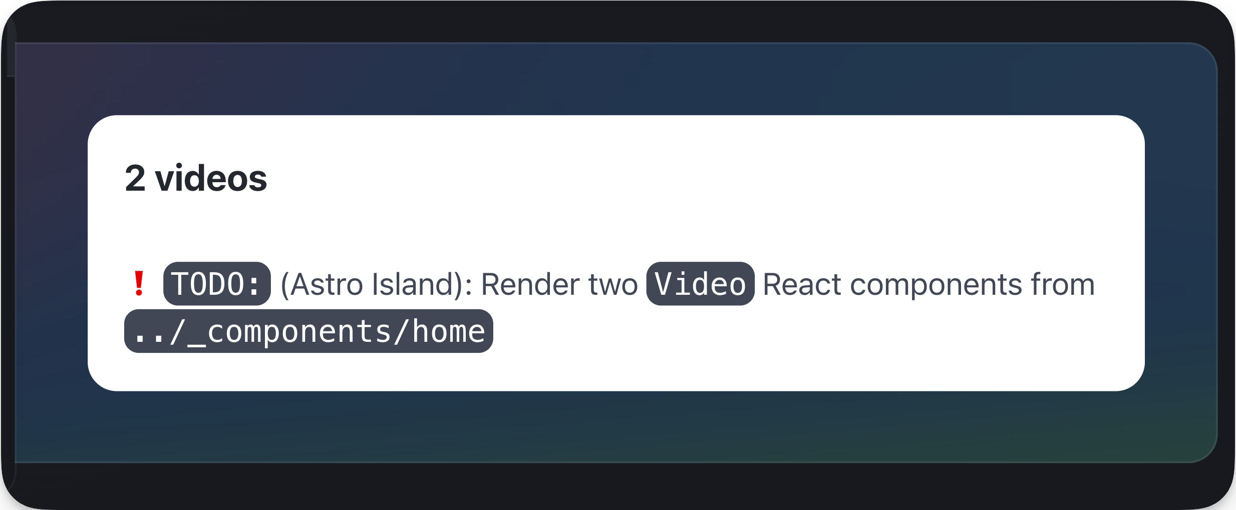
Consider the solution below:
<ExampleResultPanel slot="right-content"> <div class="flex w-full flex-col gap-4"> {/** ... **/} {/** Render both islands **/} <Video client:visible video={{ title: "My video", description: "Video description" }} /> <Video client:visible video={{ title: "My video", description: "Video description" }} /> </div></ExampleResultPanel>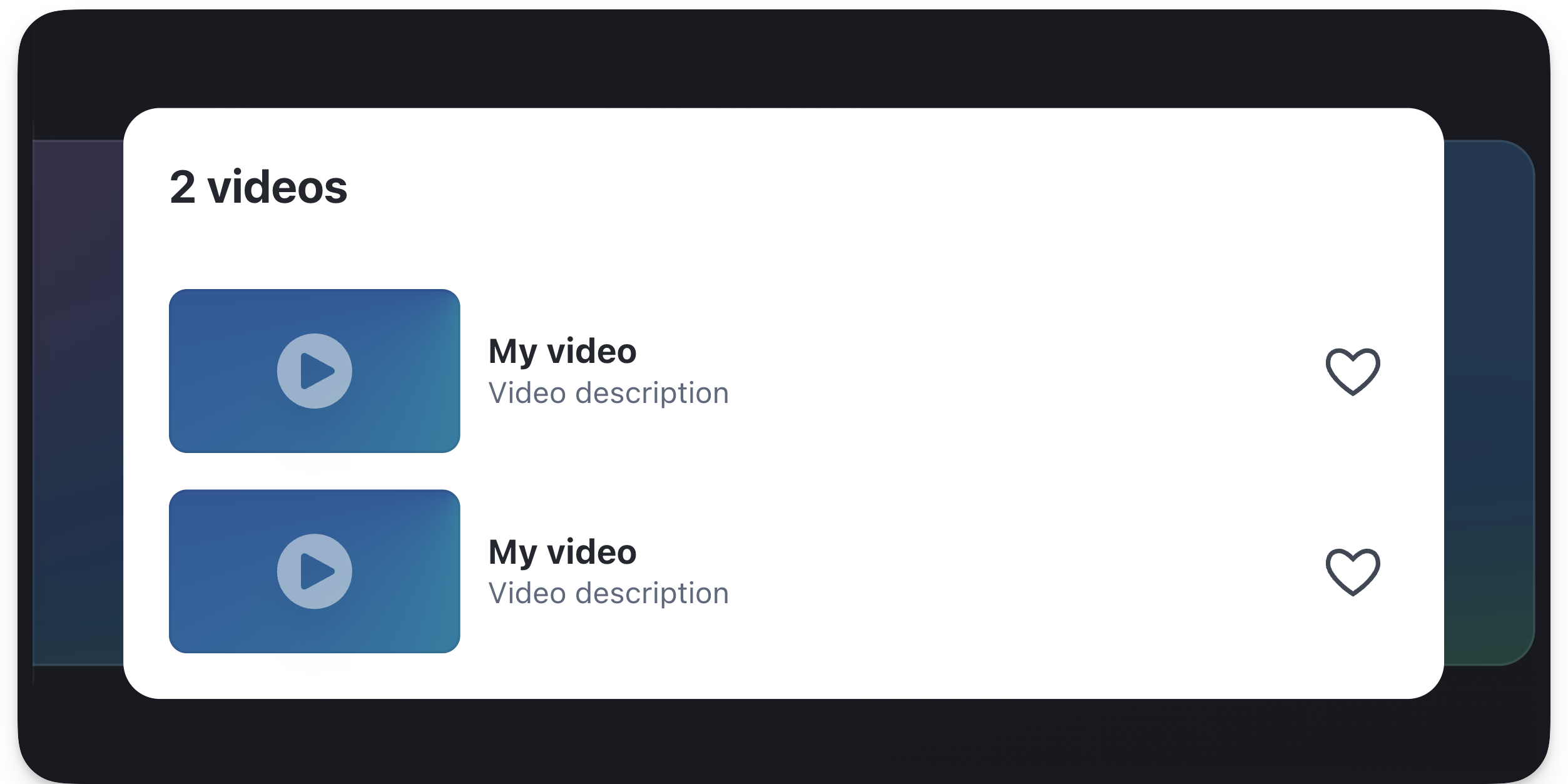
Syntax highlighting
I never understood the intricacies of syntax highlighting until I started researching this section of the book. It’s a bliss how much’s abstracted in libraries.
Anyway, I’ll skip the nuances and provide what I believe to be the most important bits.
So, how do we tackle syntax highlighting in an Astro application?
By default, Astro uses Shiki - a syntax highlighting library under the hood, and broadly speaking, there are two ways to go about syntax highlighting your code blocks in an Astro component1.
Let’s have a look at these.
The default Code component
Astro ships with a <Code /> component that provides syntax highlights at build time.
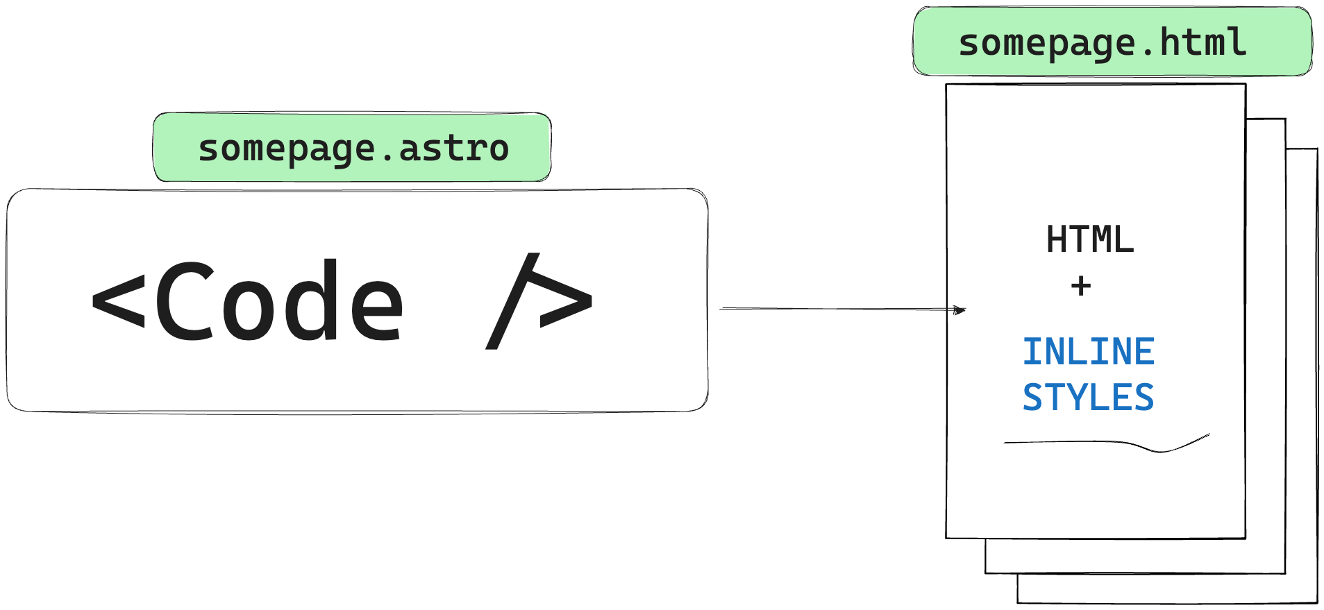
By implication, there’s no runtime overhead to this method of syntax highlighting as no computations are done at runtime and the eventual result is a bunch of elements with inline styles.
This is powered by Shiki.
Let’s go back to our starter project and resolve another TODO.
📂 src/pages/index.astro
// ...❗️ <Code class="text-white">TODO:</Code> Replace with Syntax highlighted code
The goal here is to provide syntax-highlighted code within the component markup.
To solve this, we’ll leverage the Code component from Astro as shown in the annotated code block below:
// 📂 src/pages/index.astro---// import Code from "astro/components"import { Code as AstroCode } from "astro/components";//... other imports---
// ...Render the component and pass the code and lang string props<div slot="left-content">  <AstroCode            code={`function Video({ video }) {  return (    <div>      <Thumbnail video={video} />      <a href={video.url}>        <h3>{video.title}</h3>        <p>{video.description}</p>      </a>      <LikeButton video={video} />    </div>  );}`}    lang="jsx" {/** 👈 code language for syntax highlighting **/}   /></div>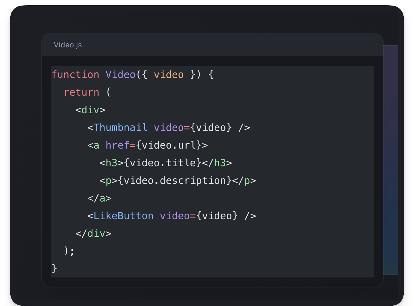
Since the code snippets are just good old HTML DOM nodes, we can apply some styles on the parent div to style them further as shown below:
// 📂 src/pages/index.astro<div slot="left-content" class="[&_pre]:!bg-transparent [&_pre]:!text-sm [&_pre]:!leading-6"> <AstroCode ... /></div>This will reduce the size of the font, reduce the type leading and make the code background transparent. Note that the square braces are how we write arbitrary custom styles in Tailwind.
See the results below:
Much better, eh?
We can go ahead and do the same for the other TODO :
// 📂 src/pages/index.astro❗️ <Code class="text-white">TODO:</Code> Replace with Syntax highlighted codeConsider the identical solution below:
<div slot="left-content" {/** Similar style as before. Leverages Tailwind **/} class="[&_pre]:!bg-transparent [&_pre]:!text-sm [&_pre]:!leading-6" > <AstroCode code={`function VideoList({ videos, emptyHeading }) { const count = videos.length; let heading = emptyHeading; if (count > 0) { const noun = count > 1 ? 'Videos' : 'Video'; heading = count + ' ' + noun; } return ( <section> <h2>{heading}</h2> {videos.map(video => <Video key={video.id} video={video} /> )} </section> );}`} lang="jsx" />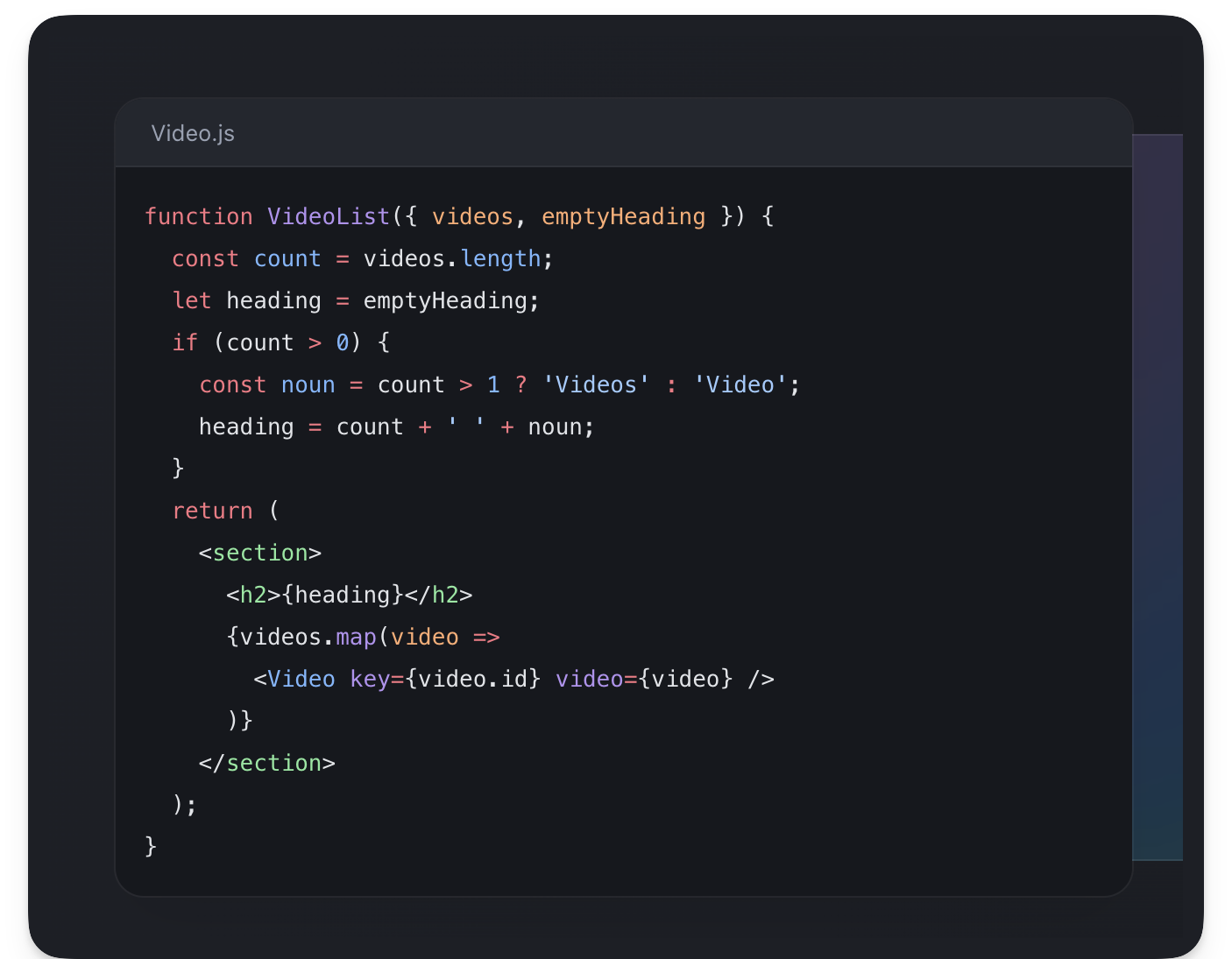
The default Code component also supports all the official Shiki themes. For example, we can change the component theme to poimandres as shown below:
<AstroCode // ... lang="jsx" theme="poimandres"/>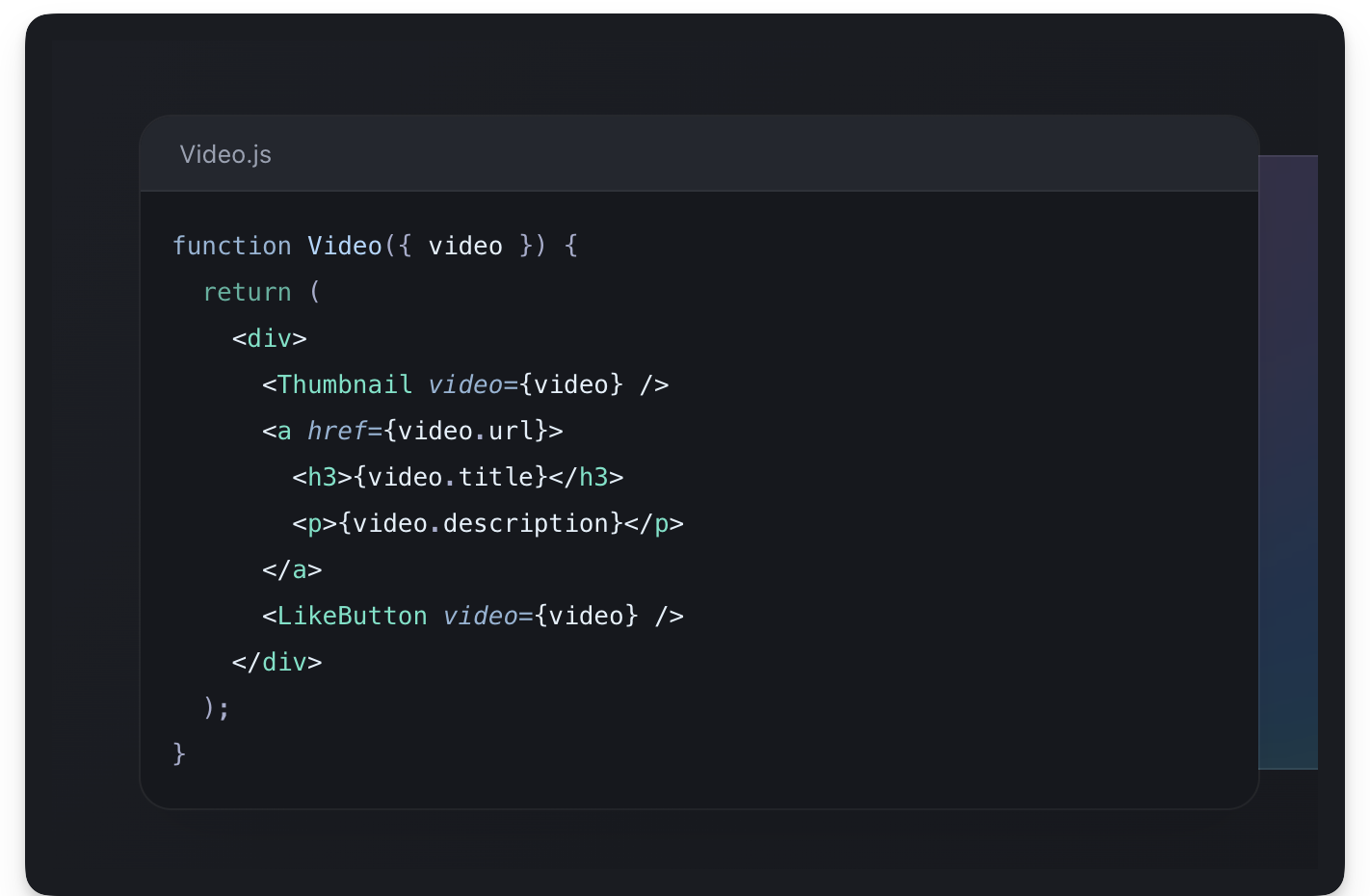
Let’s consider the PROs and CONs of using the default Code component provided by Astro.
Pros
- Easy to use
- Great results for low effort
- Lots of available themes by default
Cons
- More work is required to customise your themes e.g., Our www.react.dev clone requires its custom theme
- No default support for dark and light theme
Bring your theme
Using your specific syntax themes is probably not the top on everyone’s list.
However, Shiki supports the same syntax for VSCode themes. For example, we could load some custom open-source VSCode theme (or build on top of it) for our code blocks.
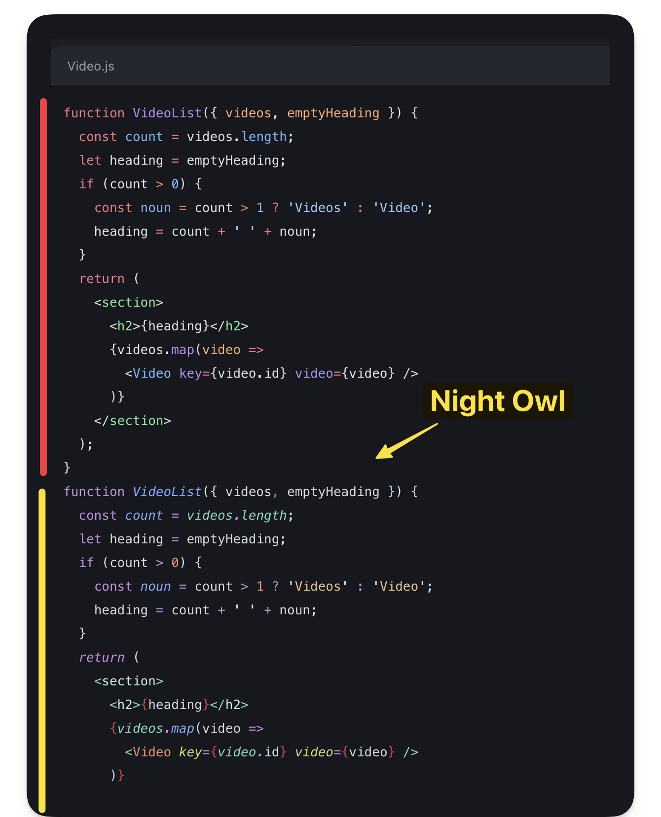
Let’s take a look at Nightowl : a VS Code dark theme for contrast for nighttime coding.
Go ahead and copy the code snippet theme to a src/snippet-theme.json file.
Next, we’ll write a simple component to load our custom theme as shown below:
// 📂 src/components/Shiki.astro
---import type { Lang } from "shiki";
// Similar to Astro's Code component, this is built on shikiimport shiki, { getHighlighter } from "shiki";
// Similar to Astro's Code component, receive lang and code as propstype Props = {  lang: Lang;  code: string;};
const { code = "", lang = "jsx" } = Astro.props;
// 👀 Load the custom themeconst theme = await shiki.loadTheme("../../snippet-theme.json");
const highlighter = await getHighlighter({  theme,  langs: [lang],});---
{/**  A fragment is an available Astro component. Use Fragment to prevent unnecessary markup.The set:html directive is used to inject an HTML string into an element e.g., similar to el.innerHTML.**/}<Fragment  set:html={highlighter.codeToHtml(code, {    lang,  })}/>
Import and use the new component:
// 📂 src/pages/index.astro---import Shiki from "@components/Shiki.astro";// ...---
// Change AstroCode to Shiki (new component)
<Shiki code={`function Video({ video }) {  return (    <div>      <Thumbnail video={video} />      <a href={video.url}>        <h3>{video.title}</h3>        <p>{video.description}</p>      </a>      <LikeButton video={video} />    </div>  );}`}  lang="jsx"/>
And there we go! We’ve successfully loaded a custom theme.
For more customisations, we could spend time tweaking the different theme tokens in the snippet-theme.json file.
Pros
- Flexibility: we can customise the theme tokens as granularly as needed
Cons
- Requires more work
- Support for dark and light theme
Handling light and dark themes
Supporting light and dark themes in Shiki (the underlying Astro syntax highlighter) is tricky because Shiki generates themes at build time.
At the time a user toggles the site theme, no changes will be made to the syntax highlighting since it was generated at build time.
When working with Astro components, a simple solution is to leverage CSS variables.
---import { Code as AstroCode } from "astro/components";---
// Among, other properties, pass a "css-variables" theme prop to the Code component <AstroCode theme="css-variables" />
Then provide style tokens for both dark and light themes. Remember that this should be global. For example, we may do this in the Baselayout.astro layout component as shown below:
// 📂 src/layouts/BaseLayout.astro<style is:global>  @media (prefers-color-scheme: dark) {    :root {      --astro-code-color-text: #ffffff;      --astro-code-color-background: black;      --astro-code-token-constant: #86d9ca;      --astro-code-token-string: #977cdc;      --astro-code-token-comment: #757575;      --astro-code-token-keyword: #77b7d7;      --astro-code-token-parameter: #ffffff;      --astro-code-token-function: #86d9ca;      --astro-code-token-string-expression: #c64640;      --astro-code-token-punctuation: #ffffff;      --astro-code-token-link: #977cdc;    }  }
  :root {    --astro-code-color-text: #24292e;    --astro-code-color-background: #ffffff;    --astro-code-token-constant: #032f62;    --astro-code-token-string: #032f62;    --astro-code-token-comment: #6a737d;    --astro-code-token-keyword: #d73a49;    --astro-code-token-parameter: #24292e;    --astro-code-token-function: #6f42c1;    --astro-code-token-string-expression: #c64640;    --astro-code-token-punctuation: #ffffff;    --astro-code-token-link: #977cdc;  }</style>
If dark and light theme syntax highlighting is critical for your application, take a look at the official documentation for more information.
Getting Started with Content Collections
Consider building a large application driven by a lot of content whether that’s Markdown (/md), MDX (.mdx), JSON (.json) or YAML (.yaml) files.
One solution to best organise the project’s content could be to save the content data in a database where we can validate the document schema and make sure the required content fits the data model we desire.
We may visually model these as collections of data saved in a database with a predefined data schema.
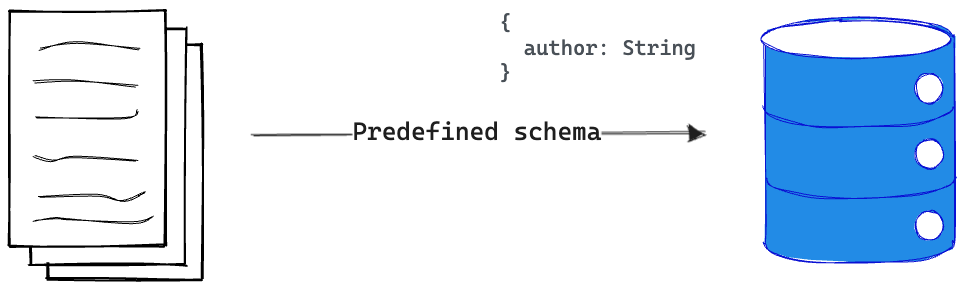
With Astro projects, we don’t particularly need a database to store and enforce our content data models.
Enter content collections.
Regardless of the size of the Astro project, content collections are the best way to organise our content document, validate the structure of the document and also enjoy out-of-the-box Typescript support when querying or manipulating the content collection.
So, what’s a content collection?
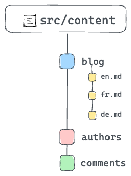
A content collection is any top-level directory in the src/content folder of an Astro project.
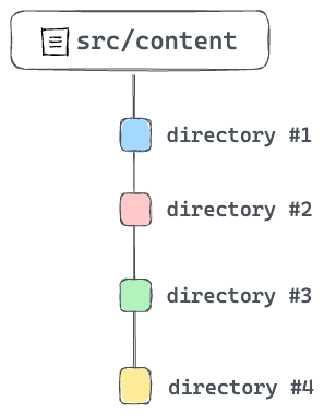
Note that the src/content directory is strictly reserved for content collections. Don’t use this directory for anything else.
Now that we know what a content collection is, the individual documents or entries within a collection are referred to as collection entries.
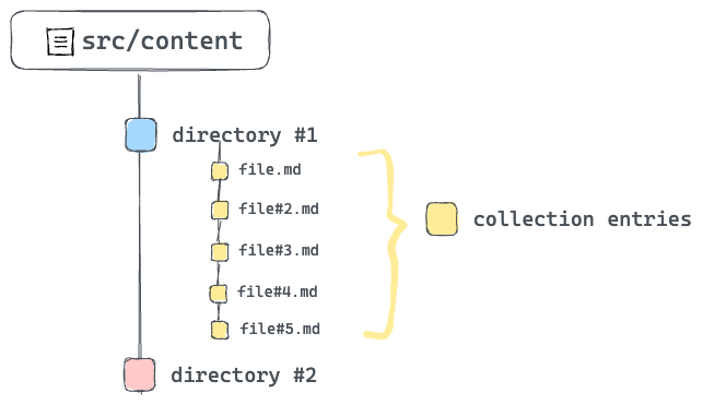
Collection entries are documents in formats such as Markdown or MDX. They can also be in data formats such as JSON or YAML. For consistency, you’ll find most collection entries with a consistent naming pattern e.g., kebab-case.
What Problems Do Content Collections Solve?
Littering a project with different content documents and no clear structure is a surefire way to create a mess.
The better solution: use content collections.
Now, content collections aim to address three main problems:
- Organising documents.
- Validating the document structure e.g., validating the frontmatter properties of a markdown file.
- Provides strong type safety while querying and working with content collections.
Organising content collections
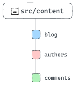
When working with content collections, note that only top-level directories in src/content count as collections. For example, with multiple collections such as blogs, authors and comments, we could accurately represent these distinct content types with three top-level directories within src/content.
If there’s a need to further organise content via subdirectories within a collection, that’s entirely acceptable! For example. The blogs content collection may have subdirectories to organise content via languages e.g., en, fr, etc.
Authoring content with MDX
Take a look at the existing content collection in the project.
What do you see?
You should find a blog collection in src/content/blog with a handful of .mdx files.
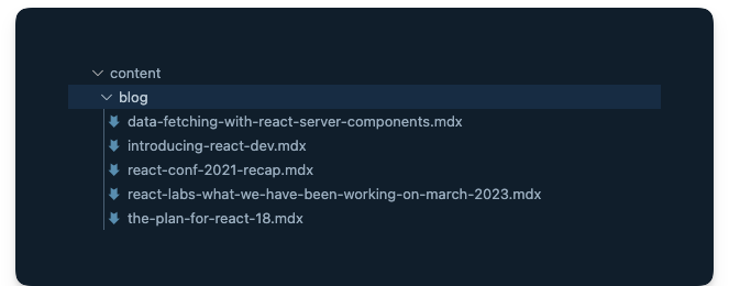
Each mdx file refers to the collection entry for the blog collection. However, what is an mdx file?
MDX touts itself as the markdown for the component era. Think, what if we could use components in markdown? Well, with MDX, we can!
In these files, we can import components and embed them within our standard markdown content.
In the installation section of this chapter, we installed the Astro MDX plugin by running npx astro add mdx.
It’s about time we got started utilising MDX.
Configuring content collections
A big part of content collections is ensuring a consistent collection entry format for every content collection.
For example, assuming a number markdown or MDX collection entries, we can go ahead and ensure that every collection entry has the same frontmatter properties. As you can imagine, this protects the integrity of each collection entry and breeds confidence that no surprising bug will spring at us when working with the entries.
So, how do we ensure such consistency?
The way we do this is by creating collection schemas.
A schema enforces consistent collection entry data within a collection. This is also what powers the Typescript support we’ll get when working with the collection entries.
To create our collection schema, go ahead and create a src/content/config.ts file with the following content:
// Import utilities from astro:contentimport { z, defineCollection } from "astro:content";
// Define the type and schema for one or more collectionsconst blogCollection = defineCollection({  type: "content",  // an object of strings - title, year, month, day, and intro  schema: z.object({    title: z.string(),    year: z.string(),    month: z.string(),    day: z.string(),    intro: z.string(),  }),});
// Export a single collections object to register the collections// The key should match the collection directory name in "src/content"export const collections = {  blog: blogCollection, // add the blog collection};
Take a look at the annotated code above.
You don’t need to memorise how to do this as you can always refer to the official documentation. However, remember that the schema for a project’s content collections is defined in a src/content/config.ts (or .js and .mjs) file.
If we break down what goes on in a collection configuration file, we have three main actions:
- Import utilities from
astro:content. - Define the content collection(s) schema via the
zutility. - Export a single object of collection name key and schema value.
The schema is the brain behind guaranteeing our content contains the right data and also provides Typescript support — autocompletion and type-checking when querying the collection.
I know the question you’re likely asking.
What’s the z utility exported from astro:content?
The z utility re-exports the widely popular zod library — a TypeScript-first schema validation library with static type inference. The z variable in the config is a convenient export from zod.
Quick Zod
While this is not a Zod book, the truth remains that if we will be defining schemas with Zod, it pays to understand the basics.
So, here’s a quick intro.
First, consider the schema for our blog collection:
z.object({ title: z.string(), year: z.string(), month: z.string(), day: z.string(), intro: z.string(),});Let’s deconstruct this.
Creating a schema starts with importing Zod. With, Astro that’s done via the import from astro:content
import { z } from "astro:content";To create a schema for a string property, use the string method as shown below:
const stringSchema = z.string();To create an object schema, you guessed right. We use the object method as shown below:
const myObjectSchema = z.object({});Now, within this object, we may define properties as shown below:
const myObjectSchema = z.object({ someString: z.string(),});In our blog collection schema, we’re essentially saying that the markdown (and MDX) files within the blog collection must have string front matter properties of title, year, month, day and intro.
The frontmatter is represented by the object schema and its properties, the object keys.
Now, go ahead and view all the collection entries in the blog collection and note how they all have defined properties.
The .astro folder
As you create and work with content collections, Astro creates a .astro directory in the root of our project to keep track of important metadata for our content collections — mostly generated type information.
It’s safe to ignore this directory.
The .astro directory is updated automatically as we run astro dev or astro build commands. However, if we find the type information not in sync, we can manually run astro sync at any time to update the .astro directory manually.
Query and render content collections
So, we know how to create content collections and define their schemas. What next?
Content collections exist to be consumed in some way — typically by querying and rendering the collections.
So, how do we get started with this?
A collection consists of one or more collection entries. So, to query an entire collection, Astro provides the getCollection() method.
Consider how we may fetch all blog posts in our project:
---import { getCollection } from 'astro:content'
// Get all entries from the blog collectionconst allBlogPosts = await getCollection('blog')---
To filter the collection entries, we may pass a second function argument to getCollection as shown below:
---import { getCollection } from 'astro:content'
// Get all entries from the blog collectionconst allBlogPosts = await getCollection('blog', ({data}) => {  // return only blogs from a certain year  return data.year === '2023'})---
Note that in our case, the data above refers to the frontmatter properties of our MDX blog entries.
How about getting a single collection entry?
Your first inclination may be to filter as shown below:
---import { getCollection } from 'astro:content'
// Get all entries from the blog collectionconst allBlogPosts = await getCollection('blog', ({data}) => {  // return only a specific title  return data.title === 'my-single-blog-title"})---
The above is technically valid. However, Astro provides a getEntry() method specifically for this case.
Consider the usage below:
import { getEntry } from "astro:content";
// Get a single blog entry with the entry slugconst blog = await getEntry("blog", "introduction-to-react");
The example above will fetch the entry in the src/content/blog/introduction-to-react.mdx route.
Note that both getCollection and getEntry return a CollectionEntry type.
Enough with the theory, let’s get back to building our project.
Find the next TODO on the blog/index.astro page:
📂 src/pages/blog/index.astro
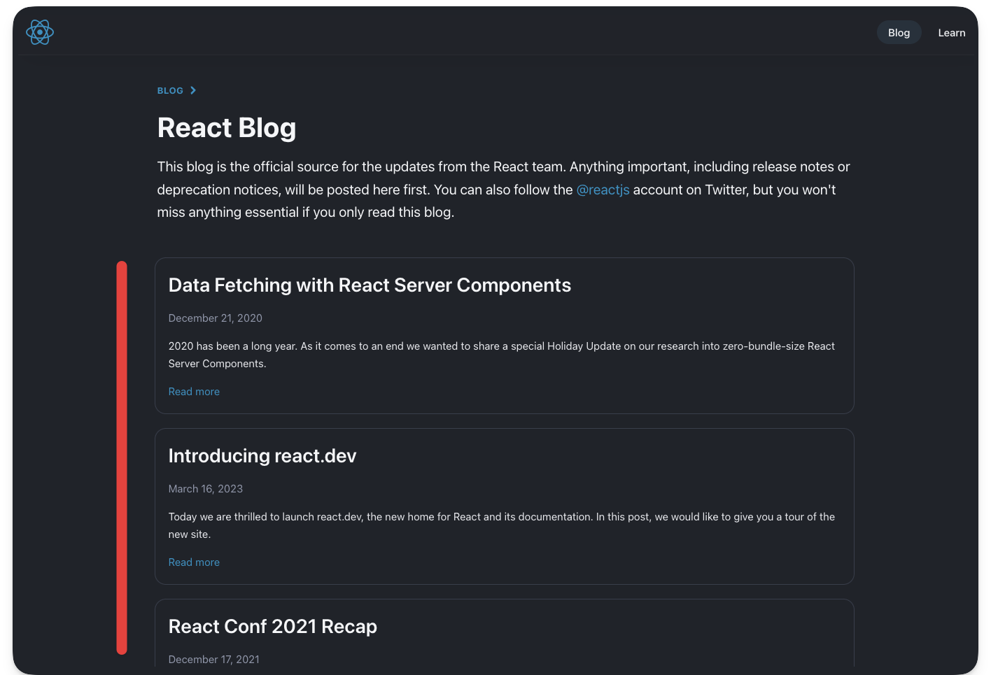
<!-- ❗️TODO: List and render (all) blog post cards -->The goal is to fetch all the blogs in the blog content collection and render visual cards for each entry. Also, note that clicking each card should point to the actual blog.
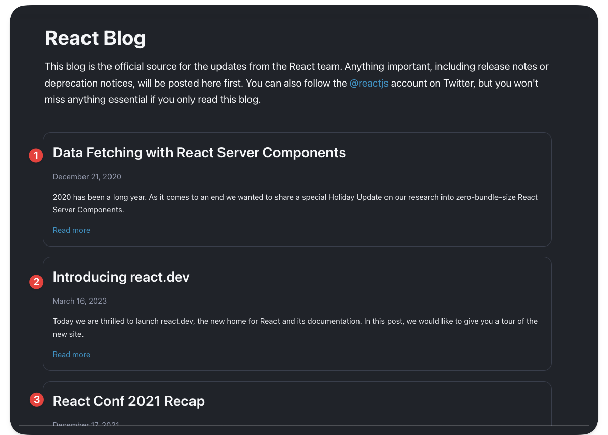
Consider the solution below:
📂 src/pages/blog/index.astro
---// Import getCollection from astro:contentimport { getCollection } from "astro:content";// Import the BlogCard visual componentimport BlogCard from "@components/BlogCard.astro";// Import the getMonthName utilityimport { getMonthName } from "@utils/getMonthName";
// Fetch all the blog postsconst allBlogPosts = await getCollection("blog");---
{/** render all blog posts **/}  <div class="mt-12 flex flex-col gap-5 px-5 sm:-mx-5 lg:px-4">    {      allBlogPosts.map(({ data, slug }) => {        const url = `/blog/${data.year}/${data.month}/${data.day}/${slug}`;
        return (          <BlogCard            url={url}            date={`${getMonthName(+data.month)} ${data.day}, ${data.year}`}            title={data.title}          >            {data.intro}          </BlogCard>        );      })    }  </div>
Note the URL of each blog constructed in the solution above:
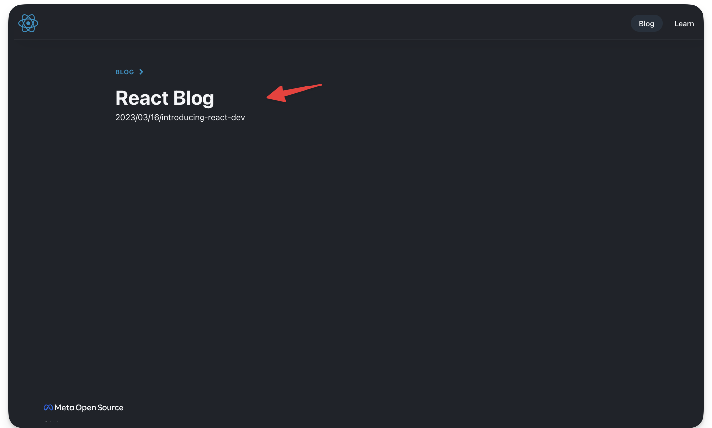
const url = `/blog/${data.year}/${data.month}/${data.day}/${slug}`;For example, the blog collection entry data-fetching-with-react-server-components.mdx will have the path: /blog/2020/12/21/data-fetching-with-react-server-components.
Go ahead and click any of the blog cards. At the moment, they should lead to an empty page.
Let’s resolve that.
Dynamic routing
Static routes are arguably easy to reason about. For example, .astro, .md and .mdx files in src/pages will automatically become pages on our website.
However, sometimes we require dynamic routes to prevent repetition. This typically happens when we have different routes with minimal UI changes between them.
For example, consider our current project. The blogs will have different routes, but each blog’s look and feel are identical.
// example routes for different blogs/blog/2020/12/21/data-fetching-with-react-server-components/blog/2023/04/24/some-other-blog-title/blog/2023/07/12/getting-started-with-react// 👀 Manually creating multiple pages for each blog/pages/2020/12/21/data-fetching-with-react-server-components.astro/pages/2023/04/24/some-other-blog-title.astro/pages/2023/07/12/getting-started-with-react.astroManually providing multiple pages for each blog is arguably tedious.
Instead of manually creating different pages to represent each blog, we may dynamically handle the routing in one of two ways.
1. Named parameters
The URL structure of the blogs could be represented by /${year}/${month}/${day}/${title} where title represents the blog’s title and year, month and day, describe when the blog was published.
We could represent the variables in the route path with named parameters surrounded by square brackets.
For example, we can create a file in the pages/blog directory with the following file name:
/[year]/[month]/[day]/[title].astroSince our pages are statically built e.g., when we run the build script, all the routes must be determined at build time.
To achieve this, we must export a getStaticPaths function that returns an array of objects that correspond to each route. Here’s how:
// 📂 pages/blog/[year]/[month]/[day]/[title].astro---import BlogLayout from "@layouts/BlogLayout.astro";
export function getStaticPaths() {    return [        {            params: {                title: "data-fetching-with-react-server-components",                year: "2020",                month: "12",                day: "21",            },        },    ];}---
Note that getStaticPaths specifically returns an object with a params field that defines all the variables in the route path i.e., title, year, month and day
To add another blog route, simply add another object with its params property:
// 📂 pages/blog/[year]/[month]/[day]/[title].astro---export function getStaticPaths() { return [ { params: { title: "data-fetching-with-react-server-components", year: "2020", month: "12", day: "21", }, }, { params: { title: "introducing-react-dev", year: "2023", month: "03", day: "16", }, }, ];}---With the route params defined, we then grab the variables and render each blog as shown below:
// 📂 pages/blog/[year]/[month]/[day]/[title].astro---import BlogLayout from "@layouts/BlogLayout.astro";
export function getStaticPaths() { return [ { params: { title: "data-fetching-with-react-server-components", year: "2020", month: "12", day: "21", }, }, { params: { title: "introducing-react-dev", year: "2023", month: "03", day: "16", }, }, ];}
// Get the path variables from Astro.paramsconst { title, year, month, day } = Astro.params;---
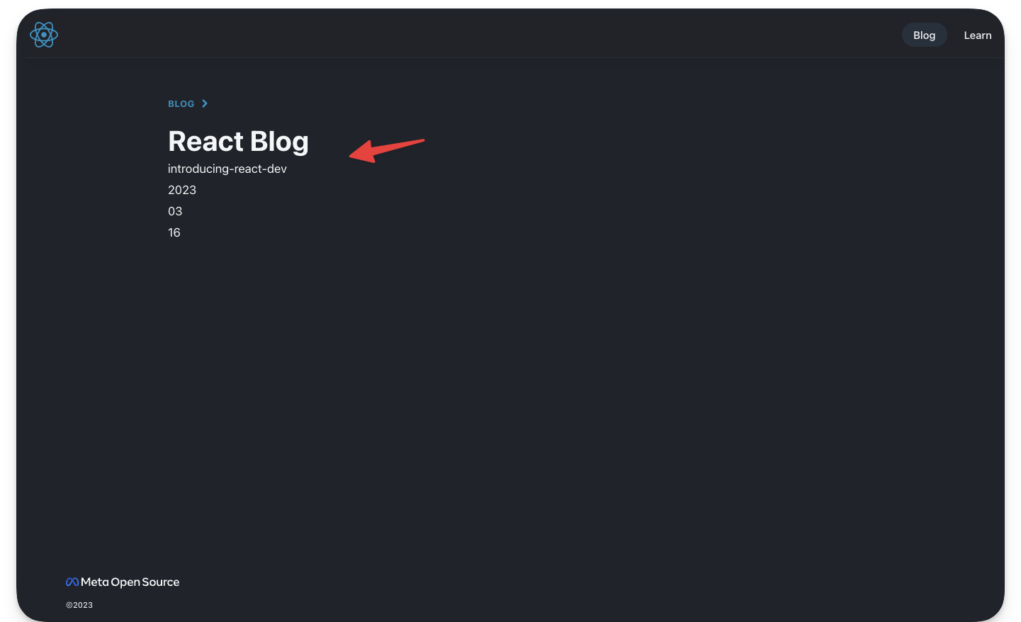
// Provide markup for each matched page<BlogLayout title="React Blog - React" header="React Blog"> <h1>{title}</h1> <p>{year}</p> <p>{month}</p> <p>{day}</p></BlogLayout>Clicking on the data fetching with react server components and introducing react dev blog cards should now render their accompanying page.
2. Rest parameters
Rest parameters provide ultimate flexibility in our URL routing. For example, we may use [...path] to match file paths of any depth. Where path could be represented by any string, e.g., [...file] or [...somestring].
Following our existing example, how may we reduce the path pages/blog/[year]/[month]/[day]/[title].astro to simply pages/blog/[...path].astro
Delete the previous directories and file that made up [year]/[month]/[day]/[title].astro and create a single blog/[...path].astro.
This new file will match the blog route.
Similarly, we need to provide a getStaticPaths function, however, the variable to be provided here is path as shown below:
---import BlogLayout from "@layouts/BlogLayout.astro";
export function getStaticPaths() {    return [        {            params: {                path: "2020/12/21/data-fetching-with-react-server-components",            },        },        {            params: {                path: "2023/03/16/introducing-react-dev",            },        },    ];}
const { path } = Astro.params;---
<BlogLayout title="React Blog - React" header="React Blog">    <h1>{path}</h1></BlogLayout>
Clicking on the data fetching with react server components and introducing react dev blog cards should now render their accompanying page.
Priority order
As we’ve discussed, URL paths can be matched in different ways, which begs the question, what happens when different file paths match the same URL path in our project?
Well, Astro needs to make a decision, and that’s following the priority list below:
- Static routes, i.e., without path parameters, have the highest priority, e.g.,
/pages/products/this-is-a-product. - Dynamic routes with named parameters have the next priority, e.g.,
/pages/products/[id]. - Dynamic routes with rest parameters have the lowest priority, e.g.,
/pages/products/[...path]. - Following the above, any ties will be resolved alphabetically.
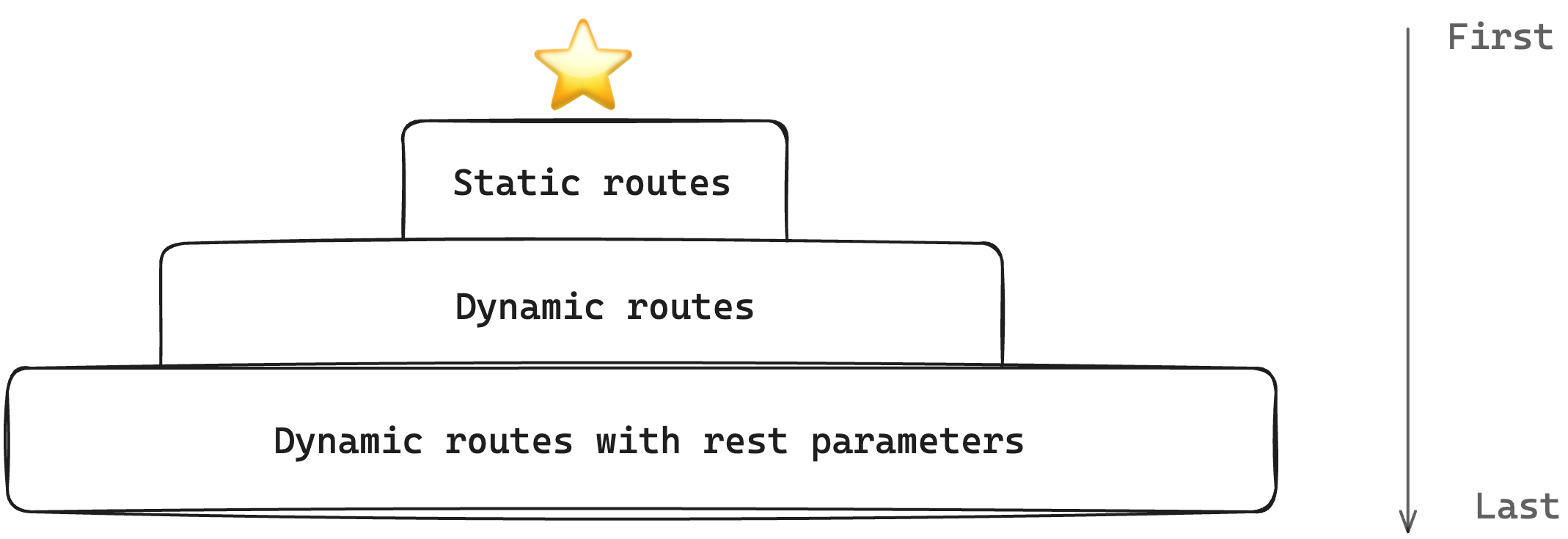
A decent example is to note that even though the dynamic path [...path.astro] matches the root path /blog, the static route blog/index.astro always takes priority while the dynamic route [...path.astro] kicks in for each blog page.
Generate routes with content collections
Right now, we’re manually adding objects to the exported getStaticPaths function to define our blog paths.
However, our desired solution is to generate these from the blog content collection.
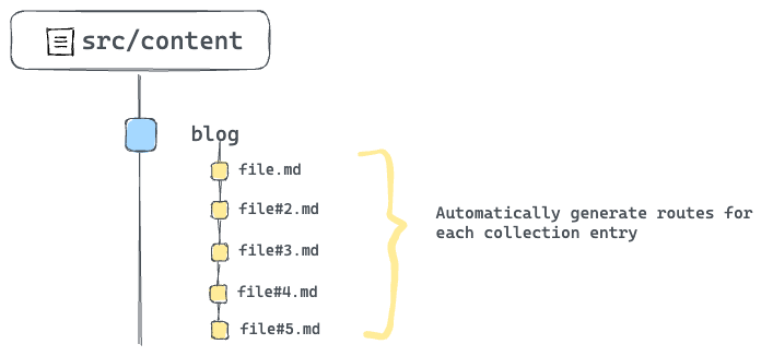
To achieve this, we need to rework the getStaticPaths implementation to fetch all blog posts from the content collection and generate the required paths.
Consider the solution below:
---import { getCollection } from "astro:content";import BlogLayout from "@layouts/BlogLayout.astro";
// Make the function asyncexport async function getStaticPaths() {    // Fetch all blog posts    const allBlogPosts = await getCollection("blog");    // Dynamically construct the blog paths    const paths = allBlogPosts.map((blogEntry) => ({        // construct params        params: {            path: `${blogEntry.data.year}/${blogEntry.data.month}/${blogEntry.data.day}/${blogEntry.slug}`,        },    }));
    // Eventually return the constructed paths    return paths;}
const { path } = Astro.params;---
<BlogLayout title="React Blog - React" header="React Blog">    <h1>{path}</h1></BlogLayout>
Now, every single blog entry now has an associating path defined. Give this a try by clicking any blog link from the home page.
Rendering each blog content
Just rendering the path of the blog was great for simplifying the previous concepts, however, that’s not quite our result.
Let’s properly render each blog content. First here’s the solution:
---import { getCollection } from "astro:content";import BlogLayout from "@layouts/BlogLayout.astro";
// Make the function asyncexport async function getStaticPaths() {    const allBlogPosts = await getCollection("blog");    // dynamically construct the blog paths    const paths = allBlogPosts.map((blogEntry) => ({        // construct params        params: {            path: `${blogEntry.data.year}/${blogEntry.data.month}/${blogEntry.data.day}/${blogEntry.slug}`,        },        // 👀 Pass blogEntry as props to be later accessed in the markup via Astro.props        props: {            blogEntry,        },    }));
    //Eventually return the constructed paths    return paths;}
// Get the blog entry from the propsconst { blogEntry } = Astro.props;
// get blog content via entry.render()const { Content } = await blogEntry.render();---
<BlogLayout title="React Blog - React" header="React Blog">    <!-- Render the Content -->    <Content /></BlogLayout>
Let’s deconstruct this solution.
The most important piece to the solution puzzle is passing every single blog entry as a prop in the getStaticPath function.
Doing this allows us to reference each entry in the component markup section via Astro.props.
Secondly, every queried collection entry has a render() method that renders the entry to HTML. The solution utilises this to render each blog.
const { Content } = await blogEntry.render();//...<Content />;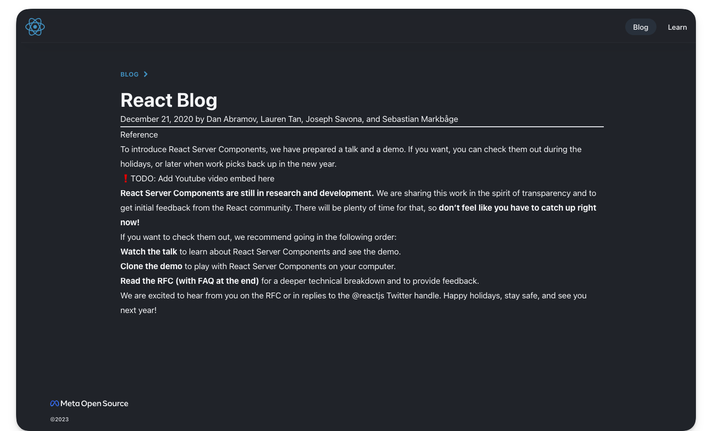
MDX components
Let’s get back to MDX.
The most impressive feature of MDX is the ability to use components with standard markdown content.
Let’s consider practical examples.
Customised HTML elements
When MDX content is rendered to HTML, the eventual output uses standard HTML elements.
For example, if we had the following MDX content:
# Title
This is a paragraph
This will yield an HTML result similar to the following:
<h1>Title</h1><p>This is a paragraph</p>The good news is, instead of relying on standard HTML elements, we can specific components to be used instead of HTML elements. For example, we may provide our own styled header and paragraph components in place of the standard h1 and p HTML elements.
To do this, create an object of HTML element to custom component mapping.
// sample MDX component map
// Provide custom header and paragraphimport H1 from "./H1.astro"; // custom Astro componentimport P from "./P.astro"; // custom paragraph component
// map of HTML element to custom componentexport const mdxComponents = {  h1: H1,  p: P,};
Now, when the MDX content is rendered to HTML, pass the component map as shown below:
---import {getEntry} from 'astro:content'// import the component mapimport { mdxComponents } from '../mdxComponents'
// Get a collection entryconst blogCollection = await getEntry('blog', 'some-title')// Get the entry Contentconst { Content } = await blogEntry.render();---
{/** Render to HTML and pass the components map**/}<Content components={mdxComponents} />
Let’s put this into action.
Take a look at the src/components/mdxComponents.ts file in the project. It contains a list of HTML elements and associated custom Astro components.
We’ll import this object and pass it to the blog entry <Content /> as shown below:
// 📂 pages/blog/[...path].astro---import { mdxComponents } from "@components/mdxComponents";// ... other imports---
<BlogLayout title="React Blog - React" header="React Blog">    {/** 👀 pass the components down to Content **/}    <Content components={mdxComponents} /></BlogLayout>
With this, we should now have properly styled components in place of the bland HTML elements.
Consider the full list of available HTML elements that can be overwritten with custom components in the official MDX documentation.
Internal components
Components can also be imported and directly rendered within MDX. That’s part of the fun!
Go ahead and open the first blog route in /blog/2020/12/21/data-fetching-with-react-server-components and find the first TODO on the page.
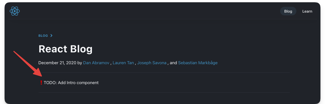
To resolve this TODO, we need to import and render the Intro component in src/components/Intro.astro.
Consider the solution below:
// 📂 src/content/blog/data-fetching-with-react-server-components.mdx---
import Intro from "@components/Intro.astro";
{/** First content after the frontmatter and other imports**/}<Intro>  2020 has been a long year. As it comes to an end we wanted to share a special  Holiday Update on our research into zero-bundle-size **React Server  Components**.</Intro>---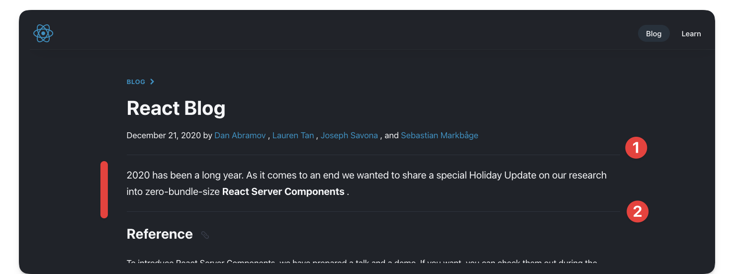
We imported and rendered an Astro component right in the MDX file. How amazing!
Note that the --- syntax represents dividers (as seen in 1 and 2 above) and not code fences as used to define markdown frontmatter.
There’s no limit to how many components we can import and render in an MDX file. So, we can go further and render another component as shown below:
{  /** Import the Note component **/}import Note from "@components/Note.astro";
{  /** Render at the bottom of the file **/}<Note>React Server Components are still in research and development.</Note>;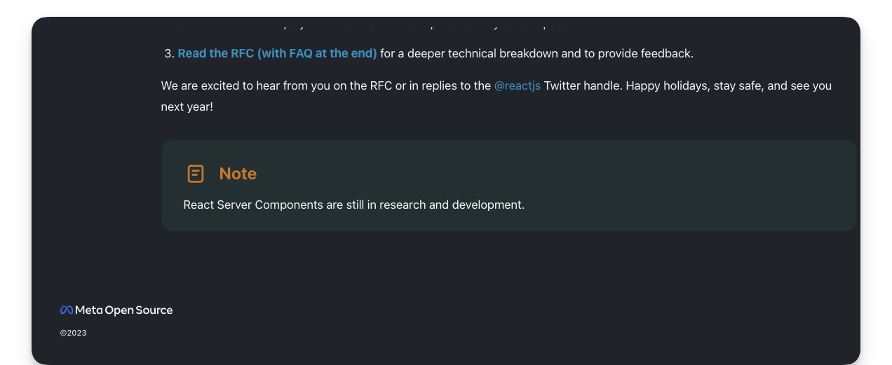
Note that, unlike JavaScript imports that must be at the top of the file, we can import components in an MDX file anywhere aside from the frontmatter section.
I typically prefer to keep the imports at the top of the document, right after the frontmatter, but you may also colocate the imports close to where they are rendered. Both options work!
External imports
We’ve seen different imported components in our MDX documents. Luckily, it gets even more fun.
We can also import and render external components e.g., from NPM in MDX.
Go ahead and install astro-embed
npm install astro-embedastro-embed lets us embed components such as Tweets and Youtube videos in an Astro project.
In the same blog in /blog/2020/12/21/data-fetching-with-react-server-components consider the next TODO:
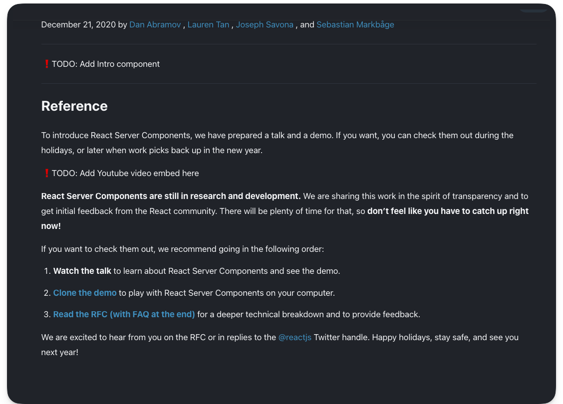
## Reference
To introduce React Server Components, we have prepared a talkand a demo. If you want, you can check them out during the.holidays, or later when work picks back up in the new year.
❗️TODO: Add Youtube video embed here
To resolve this, go ahead and import the Youtube component from astro-embed and render the component with an id prop as shown below:
## Reference
To introduce React Server Components, we have prepared a talk and a demo. If you want, you can check them out during the holidays, or later when work picks back up in the new year.
import { YouTube } from "astro-embed";
<YouTube id="https://youtu.be/TQQPAU21ZUw" />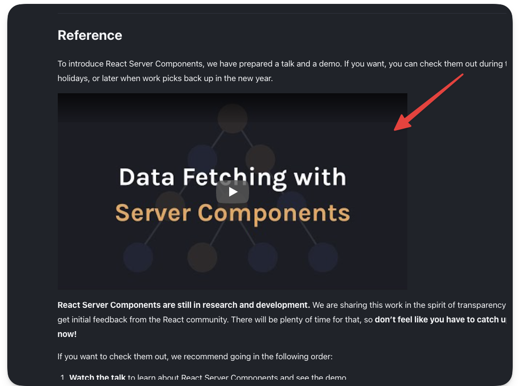
Note that we’re colocating the import statement close to the component render. However, we may move the import higher up the file as well.
{/** ✅ This is correct **/}
import { YouTube } from "astro-embed";
<YouTube id="https://youtu.be/TQQPAU21ZUw" />
{/** ✅ This is equally correct **/}
{/** Keep all imports on top, right after the frontmatter **/}
import Intro from "@components/Intro.astro";import { YouTube } from "astro-embed";
{/** Render other content ... and component much later **/}
<YouTube id="https://youtu.be/TQQPAU21ZUw" />AutoImport
The Youtube, Intro and Note components are used across all the blogs. Right now, importing the components every single time seems repetitive.
With components we want to be reused across our entire MDX files, how about we automatically import these i.e. without manually duplicating the import in every MDX document?
To achieve this, we will leverage the astro-auto-import package.
With astro-auto-import, we can easily import components or modules automatically and utilize them in MDX files without the need for manual importing.
First, install astro-auto-import:
npm install astro-auto-importastro-auto-import works as an Astro integration. To use it, we must update the project astro.config.mjs file as shown below:
// other imports ...// import AutoImportimport AutoImport from "astro-auto-import";
export default defineConfig({  integrations: [    // Pass AutoImport in the integrations array    AutoImport({      imports: [        /**         * Generates:         * import Intro from './src/components/Intro.astro';         */        "./src/components/Intro.astro",        "./src/components/Note.astro",        /**         * Generates:         * import { YouTube } from 'astro-embed';         */        { "astro-embed": ["YouTube"] },      ],    }),    react(),    tailwind(),    mdx(),  ],});
To use AutoImport we pass it into the integrations array and invoke AutoImport with an imports list:
AutoImport({ imports: [ "./src/components/Intro.astro", "./src/components/Note.astro", { "astro-embed": ["YouTube"] }, ],});The imports represents a list of imports to be automatically added to our MDX files.
A string with the path of the import such as "./src/components/Intro.astro" will generate a default import such as import Intro from './src/components/Intro.astro'.
An object such as { "astro-embed": ["YouTube"] } generates a named import such as import { Tweet, YouTube } from 'astro-embed'.
With these in place, we must now remove the manual imports in the MDX files and rely on the AutoImport magic ✨
Neat!
Integration spotlight: Astro SEO
You’ve seen a lot of Astro integrations already! Think @astrojs/react for having React islands in an Astro project, or the official @astrojs/tailwind integration for using tailwind in Astro.
Generally speaking, integrations add new functionality and behaviour to an Astro project, usually with just a few lines of code.
Sounds like a win!
In this section, let’s discuss astro-seo, an integration that makes it straightforward to add SEO-relevant information to any Astro app.
You know the rodeo.
First, install the integration:
npm install astro-seoTo use astro-seo, we import the SEO component and pass it relevant props as seen below:
// 📂 src/layouts/BaseLayout.astro---import { SEO } from "astro-seo";// ...---<html lang="en">  <head>    <meta charset="utf-8" />    <link rel="icon" type="image/svg+xml" href="/favicon.svg" />    <meta name="viewport" content="width=device-width" />    <meta name="generator" content={Astro.generator} />
    <SEO      title={title}      description={description}      openGraph={{        basic: {          title,          type: "website",          image: "https://react.dev/images/og-home.png",        },      }}      twitter={{        creator: "@reactjs",      }}      extend={{        meta: [          {            name: "twitter:image",            content: "https://react.dev/images/og-home.png",          },          { name: "twitter:title", content: "@reactjs" },          {            name: "twitter:description",            content: description,          },        ],      }}    />  {/** ... **/}</head>{/** ... **/}</html>
This will generate relevant meta tags including open-graph meta tags for a more SEO-compliant application.
Custom 404 pages in Astro
Custom 404 pages are easy to reason about in Astro. Create a 404.astro or any other relevant page file ending in src/pages. This will build a 404.html page that most deployment services will use if an invalid page is requested and not found.
Let’s do this for our project.
Create a 404.astro page in src/pages with the following content:
// 📂 src/pages/404.astro---import BaseLayout from "@layouts/BaseLayout.astro";---
<BaseLayout title="Redirecting ..." page="index" />
<script is:inline>// lazy redirect. This is better done server-side: discussed in the next book's chapterconst { pathname } = window.location;
window.location.replace(`https://www.react.dev${pathname}`);</script>
Our 404 page comes with a twist.
It renders a blank page via <BaseLayout /> and automatically redirects the user to the accompanying path on www.react.dev. Viola!
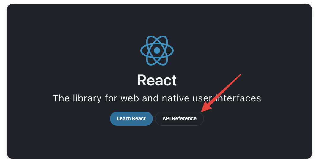
Give this a try by visiting the API reference link on the homepage.
Conclusion
Building rich content applications is right up Astro’s alley! With content collections, we can build large content-driven applications with organisation and confidence.
Footnotes
-
For Markdown files, it’s possible to use a number of plugins such as https://rehype-pretty-code.netlify.app/ ↩